Scoring genre clarity...

Terraria capsule

Terraria

Dig, fight, explore, build! Nothing is impossible in this action-packed adventure game. Four Pack also available!

$4.99Overwhelmingly Positive(7,106)
Open World Survival CraftSandboxSurvival
Re-LogicMay 16, 2011

Terraria scores 83/100 — better than 98% of Open World Survival Craft capsules (n=130).

Overwhelmingly Positive (7,106 reviews) · $4.99 · Released May 16, 2011 · By Re-Logic

Quick text summary

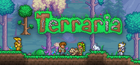
Terraria scored 83/100 on Steam Analyzer — Good for a Open World Survival Craft capsule. Top priority fix: [composition] Tighten the logo upward by 5 to 8 percent to reduce crop risk on narrow Steam display formats while keeping it anchored in the lower third

Capsule scores by dimension

  • Genre Clarity: 8/10 — Sandbox RPG adventure implied clearly. The armored knight holding a pickaxe and sword against a cave backdrop immediately signals action-adventure with mining and combat elements. Flanking creatures on both sides reinforce the monster-fighting aspect. At tiny size the knight silhouette and pixelated green logo together still communicate fantasy sandbox action, though the pickaxe detail is lost.
  • Title Readability: 9/10 — Iconic pixel logo reads at all sizes. The bright green pixelated 'Terraria' logo is high-contrast, chunky, and unmistakable against the darker mid-tone background, with a dark outline that separates it cleanly. At small and tiny sizes the bold letterforms and strong value contrast keep the title fully legible. The pixel art style of the font also reinforces the game's identity simultaneously.
  • Contrast & Color: 8/10 — Knight and logo pop against cave backdrop. The silver armored knight is well-lit with a warm glowing light source above, creating strong separation from the cool purple-blue cave background. The vivid green logo anchors the lower third with excellent value contrast against both the background and Steam's dark UI color. In grayscale the knight silhouette reads cleanly, though the flanking enemies on the edges blend slightly into the cave walls at tiny size.
  • Uniqueness & Polish: 8/10 — Distinctive pixel-font meets painterly art. The deliberate contrast between the detailed painterly character illustration and the retro pixel art logo is a memorable and genre-appropriate creative choice that immediately signals the game's hybrid identity. The glowing light source, richly detailed armor, and hand-painted cave environment elevate it above a generic indie capsule. Compared to top-tier benchmarks like Hades II or Balatro it is slightly less compositionally refined, but the visual hook is strong and recognizable.
  • Brand Consistency: 9/10 — Instantly recognizable Terraria identity. The green pixelated logo is one of the most recognizable in the indie space and functions as a standalone brand signal even at tiny size. The combination of pixel-aesthetic typography with detailed 2.5D painterly art is a consistent Terraria signature seen across its marketing materials and in-game UI. The armored knight, cave setting, and tool-plus-weapon pairing all reinforce the game's established visual identity coherently.
  • Composition: 8/10 — Strong central hero with clear hierarchy. The knight occupies the central vertical axis with the glowing light at the top creating a natural eye entry point, flowing down through the figure to the large logo at the bottom third. The flanking creatures add depth and world-building without competing with the primary focal point. At small size the logo and knight remain the dominant read, though the side characters become near-invisible and the bottom logo placement risks being cropped on some Steam display contexts.

What works

  • Pixel logo is a brand icon. The bright green chunky pixel font logo is immediately recognizable and readable even at 120px wide, functioning as both title and brand mark.
  • Clear genre signals from tool plus weapon. The pickaxe and sword combination held by the knight concisely communicates the dig-and-fight dual gameplay loop without any text needed.
  • Strong value contrast at all sizes. The warm-lit silver knight against the cool dark cave creates excellent grayscale separation that survives quick-scroll and tiny thumbnail viewing.
  • Painterly art elevates perceived quality. The detailed cave environment with waterfall, glowing orb, and richly illustrated creatures gives the capsule a premium feel above typical indie action titles.

What hurts the capsule

  • Edge characters vanish at tiny size. The flanking monsters on the left and right edges become completely invisible at 120px width, wasting compositional real estate that could strengthen genre clarity.
  • Bottom logo risks Steam crop. The logo sits very low in the frame and could be partially cut off in certain Steam capsule display formats or aspect ratio variations.
  • Cave background slightly muddy mid-tones. The purple-blue cave background has limited value differentiation in its midground, causing the right-side enemy to almost fully merge with the environment.
  • No build or exploration visual cue. The capsule emphasizes combat and setting but misses a visual hook for the building and exploration pillars, which are core to the game's unique appeal.

Priority fixes

  1. [composition] Tighten the logo upward by 5 to 8 percent to reduce crop risk on narrow Steam display formats while keeping it anchored in the lower third
  2. [genre_clarity] Add a subtle background structure or block terrain element to hint at the building mechanic and distinguish from a pure action RPG
  3. [contrast_color] Brighten or rim-light the flanking enemy characters slightly so they retain silhouette presence at small and tiny sizes
  4. [composition] Consider tightening the side crop slightly inward to keep both flanking creatures more visible within the safe zone at small sizes

Store copy priority fixes

  1. [feature_communication] Expand the Key Features section to include at least 5–6 concrete features: Boss Progression, Hundreds of Craftable Items, NPC Housing & Recruitment, Randomized Worlds, Co-op & PvP Multiplayer, and Free Major Content Updates. This is the fastest win to improve conversion.
  2. [uniqueness] Add a differentiating sentence such as 'Experience a 2D sandbox where boss progression, NPC allies, and pixel-art building create a journey unlike any other.' This sets Terraria apart from Stardew, Minecraft, and roguelikes.
  3. [audience_targeting] Add a line in the detailed description highlighting multiplayer: 'Fight alongside friends in online co-op, or compete in PvP arenas' to signal social/competitive appeal and match the Co-op and PvP categories.
  4. [feature_communication] Mention content depth and replayability explicitly: 'With hundreds of items, multiple biomes, randomized worlds, and free major updates, no two playthroughs are the same.' This conveys scope without overwhelming.

Related guides

Steam app ID: 105600 · Tags: Open World Survival Craft, Sandbox, Survival, 2D, Multiplayer