Scoring genre clarity...

Critters for Sale capsule

Critters for Sale

Experience death from the comfort of your seat.

$1.99Very Positive(42)
SurrealVisual NovelGore
SonosheeJun 3, 2021

Critters for Sale scores 60/100 — better than 0% of Surreal capsules (n=1,011).

Very Positive (42 reviews) · $1.99 · Released Jun 3, 2021 · By Sonoshee

Quick text summary

Critters for Sale scored 60/100 on Steam Analyzer — Solid for a Surreal capsule. Top priority fix: [contrast_color] Introduce a strategic accent color (warm orange, acidic green, or bold red) in a secondary element to boost visibility in quick scroll and differentiate from grayscale competitors.

Capsule scores by dimension

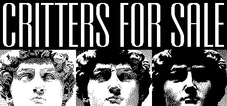
  • Genre Clarity: 4/10 — Unclear genre messaging. The black and white portrait grid suggests psychological horror or a narrative-driven indie game, but at TINY size the aesthetic reads as avant-garde art or experimental film rather than action-adventure gameplay. The tagline 'Experience death from the comfort of your seat' creates tension with the visual language, which lacks typical action or adventure iconography like weapons, movement, or environmental context.
  • Title Readability: 8/10 — Strong legible title. The all-caps sans-serif 'CRITTERS FOR SALE' is bold, high-contrast white on black background, and maintains readability down to TINY size without decorative flourishes. The title placement across the horizontal center with controlled negative space ensures it doesn't collapse or blur into surrounding elements, even at minimal viewing sizes.
  • Contrast & Color: 7/10 — High value contrast, limited saturation. The pure black background with white text and grayscale portrait faces create maximum value separation that reads clearly at all sizes against Steam's #1b2838 dark background. However, the monochromatic palette lacks color punch or warmth that would make the capsule stand out in quick scroll versus competing action-adventure titles with vibrant highlights or saturated accent colors.
  • Uniqueness & Polish: 6/10 — Conceptually distinct, execution generic. The collage of distorted faces and cryptic 'for sale' premise suggests a unique narrative hook, but the visual treatment—straightforward grid layout, stock photo aesthetic—feels like a common indie art-house approach rather than premium craft. At SMALL size, it reads as an experimental art piece more than a polished game that competes with the genre's visual benchmarks like HELLDIVERS 2 or Black Myth: Wukong.
  • Brand Consistency: 5/10 — Minimal internal identity cues. The capsule relies on a stark black-and-white palette and portrait motif that could serve as brand identity, but without additional game screenshots or UI context, the visual feels generic enough that it would not be immediately recognizable as this specific title if shown in isolation. No distinctive character, symbol, or signature color palette emerges that would anchor brand recall.
  • Composition: 6/10 — Balanced layout, unclear focal point. The eight-portrait grid is symmetrically arranged with title centered, creating visual balance but no clear primary focal point at TINY size—all faces compete equally for attention. The composition is functional and safe from cropping, but it lacks the depth layering and hierarchical focus of high-performing indie and action capsules, which typically feature a dominant subject drawing immediate eye.

What works

  • Title clarity and contrast. All-caps sans-serif 'CRITTERS FOR SALE' is legible even at tiny thumbnail size with strong white-on-black separation.
  • Crop-safe composition. Central layout with balanced spacing ensures critical elements remain visible across Steam's various display sizes without risk of important content being cut off.
  • Conceptual differentiation. The portrait grid and 'for sale' premise signal an unusual narrative premise that stands apart from typical action-adventure visual tropes.

What hurts the capsule

  • Genre ambiguity at scale. At TINY size, the monochrome portrait aesthetic reads more as art film or experimental indie than action-adventure, failing to signal gameplay type or excitement.
  • Generic visual treatment. The straightforward grid layout and stock-photo-style distorted faces lack the premium craft, effects, or distinctive style visible in top-performing genre capsules.
  • Limited color presence. The pure grayscale palette offers no saturation or warmth to create visual pop in Steam's quick-scroll environment compared to genre peers.
  • No focal point hierarchy. All eight portrait faces compete equally for attention, preventing a clear read of a primary subject or mechanical hook at reduced sizes.

Priority fixes

  1. [contrast_color] Introduce a strategic accent color (warm orange, acidic green, or bold red) in a secondary element to boost visibility in quick scroll and differentiate from grayscale competitors.
  2. [genre_clarity] Add subtle environmental or UI context within the portrait area or margins that signals action-adventure tone—weapon, environment detail, or lighting effect—to clarify gameplay intent at TINY size.
  3. [uniqueness_polish] Replace one or two generic distorted faces with a stylized character, creature, or iconic symbol unique to the game's world to anchor brand identity and premium feel.
  4. [composition] Create a clear visual hierarchy by enlarging or highlighting one central face or element to serve as the dominant focal point, moving supporting portraits to supporting roles.

Store copy priority fixes

  1. [feature_communication] Add a sentence describing one core gameplay action in concrete terms—e.g., 'Navigate branching conversations and environments, solve symbolic puzzles, and decide the fate of characters caught in supernatural forces.' This immediately clarifies what 'Point and Click' entails.
  2. [audience_targeting] Insert a brief signal phrase early in the detailed description such as 'For fans of narrative-driven indie games and experimental fiction' or 'Best experienced by players seeking surreal psychological depth over action intensity.' This pre-selects the right audience.
  3. [genre_clarity] Rewrite the short description or add a subtitle to immediately signal the hybrid visual novel / point-and-click format rather than relying on the detailed description to clarify genre.

Related guides

Steam app ID: 1078420 · Tags: Surreal, Visual Novel, Gore, Psychedelic, Psychological Horror