Scoring genre clarity...

Alan Wake capsule

Alan Wake

A Dark Presence stalks the small town of Bright Falls, pushing Alan Wake to the brink of sanity in his fight to unravel the mystery and save his love.

$2.24Very Positive(780)
ActionHorrorThird Person
Remedy EntertainmentFeb 16, 2012

Alan Wake scores 82/100 — better than 93% of Action capsules (n=8,838).

Very Positive (780 reviews) · $2.24 · Released Feb 16, 2012 · By Remedy Entertainment

Quick text summary

Alan Wake scored 82/100 on Steam Analyzer — Good for a Action capsule. Top priority fix: [genre_clarity] Clarify the glowing light mechanic visual language with subtle additional UI or environmental cues to reinforce action-survival gameplay loop

Capsule scores by dimension

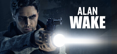
  • Genre Clarity: 8/10 — Action thriller with supernatural elements. The protagonist's pose with a glowing light source and tense stance immediately reads as action-oriented combat or survival. The dark atmospheric tones and eerie lighting suggest psychological horror or supernatural mystery, clearly positioning this in action-adventure-thriller space. At tiny size, the silhouette and glowing element remain readable enough to convey tension and genre intent, though fine details like facial expression collapse.
  • Title Readability: 9/10 — Bold white sans-serif stands out perfectly. The title 'ALAN WAKE' uses high-contrast white sans-serif typography positioned on the right side against dark background, making it highly legible at all sizes including tiny. The letterforms are clean, well-spaced, and the weight is substantial enough to survive scaling without degradation. At tiny size, both words remain clearly readable with strong optical weight.
  • Contrast & Color: 9/10 — Excellent value separation and silhouette clarity. The character's face and upper body are backlit with a bright central glow that creates strong light-dark contrast against the dark teal-blue background. The white title and glowing light source provide distinct visual separation. The silhouette reads clearly in grayscale and the lighting creates dimensional depth that pops against the Steam dark background #1b2838 even at tiny size.
  • Uniqueness & Polish: 8/10 — Premium protagonist focus with cinematic lighting. The composition shows a character-driven approach with professional photographic lighting and subtle effects around the light source that suggest gameplay mechanic (weapon or supernatural element). The mood is distinctly moody and atmospheric rather than generic, with intentional color grading and lighting design. This feels polished and premium compared to template-based designs, though it leans into established action thriller conventions rather than breaking new ground visually.
  • Brand Consistency: 7/10 — Strong protagonist identity, cohesive mood. The focused character portrayal with distinctive lighting and the glowing element create a recognizable visual identity specific to Alan Wake's supernatural action focus. The color palette of cool blues and bright white accents is consistent with psychological thriller branding. The cohesion is strong internally, though without additional reference materials, the uniqueness of the brand identity versus other premium action titles is moderate.
  • Composition: 8/10 — Clear focal point with balanced title placement. The character's face and upper body occupy the left-center, creating a natural focal point, while the title sits comfortably on the right with ample breathing room. The central glowing light element guides the eye and provides visual interest without scattering attention. The composition maintains clarity at small and tiny sizes with no critical elements lost to edge cropping, and the depth layering (dark background, mid-tone character, bright foreground light) creates visual hierarchy.

What works

  • Exceptional title legibility across all sizes. White sans-serif 'ALAN WAKE' remains perfectly readable at tiny size with clean letterforms and strong contrast against background.
  • Strong atmospheric mood and cinematic quality. Professional lighting design with the glowing light source creates premium feel and immediately signals psychological thriller action rather than generic adventure.
  • Clear focal hierarchy at all viewing scales. Character face and glowing element draw immediate attention, with title positioned to support rather than compete, maintaining clarity when scaled down.
  • Excellent grayscale value separation. The backlit character and bright glow create strong light-dark contrast that translates cleanly to grayscale for accessibility and silhouette clarity.

What hurts the capsule

  • Limited visual uniqueness versus peer titles. While well-executed, the backlit protagonist with dramatic lighting follows established premium action-thriller conventions seen in comparable releases like Star Wars Jedi: Survivor or Resident Evil 4.
  • Character facial details lose definition at tiny size. Fine facial expression and subtle features that convey character identity collapse at thumbnail scale, relying on silhouette and lighting alone.
  • No secondary visual hook or gameplay mechanic clarity. The glowing light source is ambiguous in function and could be interpreted as weapon, supernatural power, or environmental effect, missing an opportunity to reinforce core gameplay identity.

Priority fixes

  1. [genre_clarity] Clarify the glowing light mechanic visual language with subtle additional UI or environmental cues to reinforce action-survival gameplay loop
  2. [uniqueness_polish] Introduce a distinctive visual element or color accent that differentiates this from generic action-thriller templates and creates instant brand recognition
  3. [composition] Verify title placement survives Steam's responsive cropping on all device widths by testing at 231x87 and 120x45 exact aspect ratios

Store copy priority fixes

  1. [feature_communication] Replace "entertaining and original gaming experience" with a concrete example of a gameplay moment or decision type (e.g., 'manage your ammunition and light sources while uncovering story fragments that reveal the mystery').
  2. [uniqueness] Add a sentence after the TV series mention explaining what that format delivers that traditional narrative games don't (e.g., 'episodic cliffhangers and episode recaps mirror television pacing, intensifying suspense').
  3. [feature_communication] Trim or relocate the PC tech specs section to a separate 'System Features' heading rather than embedding it in the narrative description, so story and mechanics remain focal.
  4. [audience_targeting] Add explicit audience language such as 'ideal for fans of narrative-driven horror' or 'thriller enthusiasts who value psychological depth over combat complexity' to guide player self-selection.

Related guides

Steam app ID: 108710 · Tags: Action, Horror, Third Person, Story Rich, Adventure