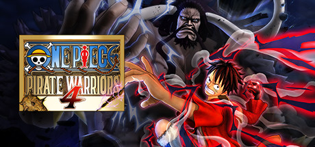
ONE PIECE: PIRATE WARRIORS 4 scores 87/100 — better than 99% of Anime capsules (n=1,670).

Quick text summary

ONE PIECE: PIRATE WARRIORS 4 scored 87/100 on Steam Analyzer — Excellent for a Anime capsule. Top priority fix: [composition] Reduce antagonist visual weight or push further into background blur to strengthen protagonist as sole focal point and improve clarity at small sizes.

Capsule scores by dimension

  • Genre Clarity: 9/10 — Anime action combat instantly recognizable. The capsule communicates anime-style action combat through dynamic pose, red energy effects, and character silhouettes engaged in combat. At tiny size, the explosive red energy vortex and martial arts stance clearly signal an action game, while the anime art style is immediately apparent even at 120x45 pixels.
  • Title Readability: 9/10 — Logo badge design maintains crisp legibility. The ONE PIECE logo is rendered in an iconic yellow-framed badge with clear letterforms and high contrast against the dark background. At small and tiny sizes, the trademark badge shape remains distinctive and readable, with PIRATE WARRIORS 4 text sitting cleanly below in a readable serif/structured font on white space.
  • Contrast & Color: 9/10 — Strong red-blue value separation pops. The bright red energy effects and warm orange tones create excellent value separation against the dark blue-black background and the cool blue energy streams. In grayscale, the silhouettes and highlights remain clear and distinct, with red/orange and blue providing strong complementary contrast that reads perfectly at tiny sizes during quick scroll.
  • Uniqueness & Polish: 8/10 — Premium anime adaptation with cinematic flair. The capsule demonstrates polish through layered energy effects, dynamic character positioning, and professional illustration quality that goes beyond generic action game templates. The combination of protagonist and antagonist in dramatic pose with environmental energy creates visual storytelling that communicates the power fantasy core mechanic, though the composition follows standard anime game conventions.
  • Brand Consistency: 9/10 — Iconic ONE PIECE branding unmistakable. The official ONE PIECE badge logo with its signature yellow frame and Jolly Roger motif is instantly recognizable and consistent with the franchise identity. The character art style, color palette of red/orange/blue, and anime aesthetic align with the established ONE PIECE visual language seen across the brand.
  • Composition: 8/10 — Clear focal hierarchy with strong center anchor. The composition places the protagonist in the lower-center-left with the antagonist looming above, creating clear depth layering and focal progression that guides the eye effectively. The logo placement top-right remains in safe margin territory and does not interfere with the character drama; however, at tiny size the secondary character in the background competes slightly for attention, though the red energy clearly anchors the primary subject.

What works

  • Iconic branded logo. The ONE PIECE badge is immediately recognizable and maintains crisp legibility even at 120x45 pixels, acting as a strong brand anchor.
  • Explosive energy effects create impact. Red and blue energy vortex reads as dynamic action at all sizes and creates strong visual separation from background elements.
  • Anime aesthetic instantly communicates genre. Character illustration style, martial arts poses, and visual effects immediately signal anime action combat to the viewer within one second.
  • Strong value contrast against dark background. Bright warm tones and cool blues create excellent separation that prevents muddy mid-tones or silhouette collapse at tiny size.

What hurts the capsule

  • Secondary character adds visual noise. The large antagonist in the background competes with the protagonist for attention and risks diluting focal clarity at small capsule sizes.
  • Generic action composition structure. While well-executed, the protagonist-vs-antagonist layout follows standard anime game templates without a distinctive compositional hook.
  • Limited unique visual selling point. The capsule shows excellent action aesthetic but does not visually communicate the specific 'battlefield destruction' or 'real ONE PIECE world' mechanics mentioned in the description.

Priority fixes

  1. [composition] Reduce antagonist visual weight or push further into background blur to strengthen protagonist as sole focal point and improve clarity at small sizes.
  2. [uniqueness_polish] Add subtle environmental destruction cue (crumbling building edge or dust cloud) to visually communicate the core 'battlefield destruction' mechanic and differentiate from generic action games.
  3. [genre_clarity] Consider adding a subtle UI element or game-world indicator (crew member silhouettes or pirate flag motif) to reinforce the PIRATE WARRIORS tactical action identity rather than just combat.

Store copy priority fixes

  1. [feature_communication] Add a dedicated 'What You'll Do' section listing 3–5 core mechanics: character progression system, co-op/PvP specifics, roster size, and one signature 'fresh element' from this entry with concrete description.
  2. [uniqueness] Replace 'fresh elements that couldn't be achieved' with a specific differentiator: e.g., 'new character abilities,' 'overhauled combat system,' or 'expanded story campaign,' and explain why it matters.
  3. [hook_strength] Rewrite the opening line to lead with player fantasy rather than repetition: 'Lead your crew through destructible ONE PIECE battlefields, commanding devastating combos and environmental takedowns' to establish immediate gameplay appeal.
  4. [feature_communication] Move edition comparison to a secondary section and dedicate the opening paragraph to core gameplay loop and character roster highlights to frontload gameplay over DLC.

Related guides

Steam app ID: 1089090 · Tags: Anime, Hack and Slash, Beat 'em up, Pirates, Fighting