Scoring genre clarity...
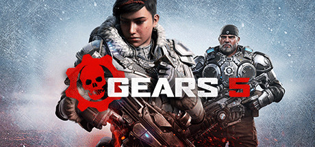
Gears 5 capsule

Gears 5

From one of gaming’s most acclaimed sagas, Gears is bigger than ever. With all-out war descending, Kait Diaz breaks away to uncover her connection to the enemy and discovers the true danger to Sera – herself.

$29.99Mostly Positive(171)
ActionAdventureThird-Person Shooter
The CoalitionSep 9, 2019

Gears 5 scores 88/100 — better than 99% of Action capsules (n=10,259).

Mostly Positive (171 reviews) · $29.99 · Released Sep 9, 2019 · By The Coalition

Quick text summary

Gears 5 scored 88/100 on Steam Analyzer — Excellent for a Action capsule. Top priority fix: [genre_clarity] Maintain current execution—this is a strength requiring no changes.

Capsule scores by dimension

  • Genre Clarity: 9/10 — Military sci-fi action instantly recognizable. The composition features armed soldiers in tactical gear, heavy weaponry, and armor clearly signaling third-person shooter combat. The distinctive Gears aesthetic—chunky armor plating, cover-based combat posture, and sci-fi military styling—is unmistakable even at tiny size. At TINY size, the silhouette of armed characters and the red Gears logo remain legible and genre-defining.
  • Title Readability: 9/10 — Bold logo with excellent contrast and scale. The 'GEARS 5' title uses a strong geometric sans-serif with the iconic Gears cog symbol integrated into the design. The white and red logo sits on the lower right against the neutral snowstorm background, ensuring clean separation. At TINY size, the bold letterforms and cog remain sharp and readable without collapse.
  • Contrast & Color: 9/10 — Strong value separation with vivid accent. The pale blue-white snowstorm background creates excellent contrast against the dark soldiers and warm gray armor tones. The bright red flame/smoke element in the center provides a bold focal point that pops against both the cool background and dark figures. In grayscale, the value hierarchy remains clear with distinct light and dark zones that maintain silhouette integrity at TINY size.
  • Uniqueness & Polish: 8/10 — Premium character-driven action storytelling. The capsule showcases professional character rendering with Kait Diaz centered and supporting cast arranged in a tactical group formation. The red smoke/ink effect adds visual sophistication and emotional weight, hinting at internal conflict tied to the narrative. The craft quality is evident in the lighting, depth layering, and cohesive integration of effects—though the concept follows expected AAA action game conventions.
  • Brand Consistency: 9/10 — Iconic Gears franchise visual identity. The chunky armor aesthetic, military sci-fi palette, and the unmistakable cog logo create strong brand recognition tied directly to the Gears franchise. Character-focused composition with supporting squad members mirrors the franchise's core identity of team-based military action. The snowy, high-contrast environment and red accent color align with Gears 5's documented visual direction from other promotional materials.
  • Composition: 9/10 — Clear hierarchy with strategic focal point. Kait Diaz anchors the center as the primary focal point, with supporting characters arranged in a balanced formation creating depth. The red smoke element guides the eye upward and draws attention to the character faces, while the logo placement in the lower right follows safe margins and avoids Steam cropping hazards. The layered arrangement (foreground faces, midground bodies, background environment) creates visual clarity that holds at SMALL and TINY sizes without clutter.

What works

  • Iconic logo integration. The Gears cog symbol is seamlessly incorporated into the title, creating instant brand recognition and reinforcing franchise identity.
  • Strong focal point clarity. Kait Diaz's face is centered and well-lit, commanding attention as the primary subject while supporting characters provide context.
  • Vivid accent color strategy. The bright red smoke/flame effect creates a memorable visual hook that stands out against the cool background and maintains impact at tiny scale.
  • Professional character rendering. Armor, lighting, and facial detail convey premium AAA production quality and tactical military aesthetic.

What hurts the capsule

  • Limited narrative differentiation. While well-executed, the composition follows conventional AAA action game design with character montage layout rather than unique visual storytelling.
  • Tagline or descriptive text absent. No secondary messaging or game hook is communicated beyond the title, reducing unique selling point clarity for new players unfamiliar with the franchise.

Priority fixes

  1. [genre_clarity] Maintain current execution—this is a strength requiring no changes.
  2. [title_readability] Maintain current execution—logo and title are exemplary.
  3. [contrast_color] Maintain current execution—contrast hierarchy is excellent.

Store copy priority fixes

  1. [hook_strength] Rewrite the short description to open with an action verb: 'Lead humanity's last stand against the Swarm in brutal three-player combat, or prove yourself in intense PvP warfare' before pivoting to Kait's personal story.
  2. [uniqueness] Add a sentence comparing Gears 5 to the prior game or competitors: 'Features reimagined multiplayer with new modes, a fully playable Escape expansion, and the deepest accessibility suite in any AAA shooter' to create differentiation.
  3. [feature_communication] Expand the 'New campaign features' line to briefly explain what character and weapon skins do (cosmetic customization? gameplay impact?), since it is mentioned but undefined.
  4. [genre_clarity] Ensure the short description explicitly includes 'third-person shooter' or 'combat' verb to signal genre within the first sentence for players who skip detailed copy.

Related guides

Steam app ID: 1097840 · Tags: Action, Adventure, Multiplayer, Third-Person Shooter, Co-op