Scoring genre clarity...

The Last Spell capsule

The Last Spell

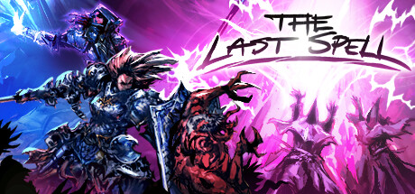
Defend the last bastion of humanity with your squad of heroes! Exterminate fiendish monsters with magic and brute force by night and re-build your battered city defenses by day in this tactical RPG with rogue-lite mechanics.

$6.24Very Positive(123)
Turn-Based StrategyStrategyRPG
Ishtar GamesMar 9, 2023

The Last Spell scores 65/100 — better than 10% of Turn-Based Strategy capsules (n=1,258).

Very Positive (123 reviews) · $6.24 · Released Mar 9, 2023 · By Ishtar Games

Quick text summary

The Last Spell scored 65/100 on Steam Analyzer — Solid for a Turn-Based Strategy capsule. Top priority fix: [title_readability] Remove or significantly reduce the 'FINAL DLC OUT NOW' text block and replace the capsule with a clean evergreen version that lets the title logo and character be the sole focus

Capsule scores by dimension

  • Genre Clarity: 7/10 — Dark fantasy action RPG cues. The armored warrior character in the foreground with a large weapon, combined with demonic/monster silhouettes in the background, clearly signals dark fantasy action or RPG. The purple magical energy and chaotic battle scene reinforce a tactical or hack-and-slash RPG subgenre. At tiny size the genre still reads as dark fantasy combat, though the tactical/rogue-lite distinction is lost entirely.
  • Title Readability: 6/10 — Title readable at full, marginal tiny. The 'The Last Spell' logo uses a stylized serif/gothic font with decent contrast against the bright purple energy burst in the upper center. At full size it is readable with some effort due to the decorative letterforms. At tiny size (120x45) the title collapses into an unreadable cluster of shapes, and the 'FINAL DLC OUT NOW' promotional text completely disappears, wasting real estate on messaging that fails at small scale.
  • Contrast & Color: 7/10 — Strong purple burst aids separation. The bright magenta-purple energy burst behind the central characters creates strong value separation from the Steam dark background (#1b2838), helping the capsule pop on the storefront. The foreground warrior has decent silhouette separation due to lighter armor highlights against the darker lower background. In grayscale the central figure reads reasonably well, though the background demon figure in the upper left merges with darker tones at tiny size.
  • Uniqueness & Polish: 6/10 — Competent but genre-generic feel. The artwork itself is detailed and energetic with clear effort in the character rendering, but the overall composition feels typical of mid-tier dark fantasy game capsules. The 'FINAL DLC OUT NOW' promotional overlay is a significant polish detractor, giving the capsule a temporary promotional feel rather than a timeless identity. Compared to benchmarks like Hades II or Lies of P, this lacks a distinctive visual hook or standout compositional idea.
  • Brand Consistency: 7/10 — Cohesive dark fantasy identity. The palette of deep purples, magentas, and dark blues with high-contrast character art appears consistent with the game's dark tactical RPG identity. The gothic logo treatment and demon-warrior aesthetic form a recognizable visual identity that would carry across marketing materials. The promotional DLC text slightly undermines the clean brand signal, but the core art direction feels internally cohesive.
  • Composition: 6/10 — Busy layout with weak hierarchy. The central armored warrior is the primary focal point, supported by the purple energy burst radiating outward, which is effective. However the 'FINAL DLC OUT NOW' text block in the lower center competes directly with both the title in the upper area and the character focal point, creating three competing elements with no clear reading order. At small size the layout reads as cluttered with no single dominant element, and the upper-left background character adds noise without contributing to hierarchy.

What works

  • Strong value contrast against Steam background. The bright magenta-purple energy burst creates immediate visual pop against the dark #1b2838 Steam background, ensuring the capsule is noticed during quick scroll.
  • Clear dark fantasy genre signaling. The armored warrior, demonic figures, and magical energy burst immediately communicate dark fantasy RPG to a viewer even at small sizes.
  • Energetic character artwork. The foreground warrior figure has detailed, dynamic rendering with strong highlights that give the capsule a premium production feel at full size.

What hurts the capsule

  • Promotional DLC text damages timeless appeal. The large 'FINAL DLC OUT NOW' overlay reduces the capsule to feeling like a temporary promotional banner rather than a permanent storefront identity, hurting long-term discoverability.
  • Title collapses at tiny size. The decorative gothic letterforms of 'The Last Spell' become unreadable at 120x45 pixels, meaning the game name is lost to new browsers at thumbnail scale.
  • Three competing focal points create clutter. The title, the DLC text, and the character are all given similar visual weight, preventing a clean reading hierarchy at small or tiny sizes.
  • Background demon figure adds noise. The upper-left hooded character blends into the dark upper tones and competes with the primary warrior without adding meaningful genre or narrative information at small sizes.

Priority fixes

  1. [title_readability] Remove or significantly reduce the 'FINAL DLC OUT NOW' text block and replace the capsule with a clean evergreen version that lets the title logo and character be the sole focus
  2. [title_readability] Increase the 'The Last Spell' logo size and add a stronger dark outline or drop shadow so it remains legible at 120x45 tiny thumbnail size
  3. [composition] Simplify to a single dominant focal point by enlarging the foreground warrior and reducing or removing the upper-left background character to eliminate competing elements
  4. [contrast_color] Darken the lower half of the background to create a stronger value ramp that better separates the warrior silhouette from the environment in grayscale

Store copy priority fixes

  1. [hook_strength] Move the tactical RPG description earlier in the detailed copy; replace the first two paragraphs of lore with a single sentence of context, then immediately explain the day-rebuild/night-defend cycle.
  2. [feature_communication] Add one concrete example to the Haven/Defense section showing how a specific defense (e.g., 'traps slow enemy waves, giving your squad more time to target Elites') impacts strategy.
  3. [uniqueness] Add a differentiator statement such as 'The Haven-building system is unique in that your rebuild choices directly affect how enemies attack each night' to clarify what sets this apart from other tactical roguelites.
  4. [audience_targeting] Add a sentence early in the detailed description signaling whether the game is solo-only or supports multiplayer, since the tags emphasize Singleplayer but this is not explicitly stated in copy.

Related guides

  • Steam page optimisationCapsule, copy, screenshots, tags — the full Steam page conversion stack.
  • Steam tags guideTag selection, ordering, and how it shapes Steam's recommendation rails.

Steam app ID: 1105670 · Tags: Turn-Based Strategy, Strategy, RPG, Singleplayer, Turn-Based Tactics