Scoring genre clarity...
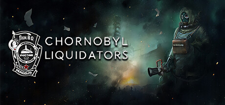
Chornobyl Liquidators capsule

Chornobyl Liquidators

Chornobyl Liquidators is not a fantastic tale of exploring the Zone. It's a story about real people facing a real threat — the CNPP disaster. Invisible radiation, KGB, difficult moral choices... Do you have enough courage and strength to take on this challenge?

$9.99Mixed(10)
Survival1980sCold War
Live Motion Games, Frozen WayJun 6, 2024

Chornobyl Liquidators scores 75/100 — better than 72% of Survival capsules (n=1,899).

Mixed (10 reviews) · $9.99 · Released Jun 6, 2024 · By Live Motion Games

Quick text summary

Chornobyl Liquidators scored 75/100 on Steam Analyzer — Good for a Survival capsule. Top priority fix: [genre_clarity] Increase the hazmat figure's action or pose dynamism—add a raised arm, tool, or defensive stance—to instantly signal survival-action gameplay and reduce generic hazmat imagery.

Capsule scores by dimension

  • Genre Clarity: 7/10 — Post-Soviet survival drama clear. The hazmat-suited figure on the right, Soviet-era emblem on the left, and murky radiation-hazard atmosphere immediately signal a grounded, historical crisis scenario rather than fantasy adventure. At tiny size, the silhouette of the suited character and the Cyrillic-influenced shield logo are recognizable survival/industrial game cues, though the exact RPG-simulation blend is less obvious without context.
  • Title Readability: 8/10 — Strong sans-serif legibility. The title 'CHORNOBYL LIQUIDATORS' uses clean, high-contrast white sans-serif lettering positioned in the upper-center region on a semi-controlled darker area, avoiding heavy texture overlap. At small and tiny sizes, the letters remain distinct and scannable; the spacing is generous enough that letterforms don't collapse or merge.
  • Contrast & Color: 8/10 — Excellent value separation. The white logo and title stand out sharply against the dark teal-green nebula background, and the hazmat figure's bright yellow-green glow on the right creates a clear focal accent. Even under grayscale simulation, the light values separate cleanly, and the yellow-orange explosion glow in the center provides warm mid-tone punctuation that prevents the image from feeling uniformly cold.
  • Uniqueness & Polish: 7/10 — Thematic polish with restraint. The capsule resists sensationalism; instead of dramatic explosions or zombie hordes, it commits to a muted, historically grounded aesthetic with the Soviet emblem, hazmat figure, and subdued particle effects. The overall presentation feels intentional and craft-conscious, though the hazmat-in-crisis-zone concept is not entirely novel within indie survival games.
  • Brand Consistency: 7/10 — Coherent Soviet-era identity. The Soviet shield emblem, Cyrillic-inspired typography, cold color palette (teals, yellows, blacks), and hazmat iconography form a recognizable visual language that signals authenticity and historical grounding. The palette and emblem style should carry across store screenshots consistently, establishing a strong period-accurate identity, though without an iconic mascot or unique motif beyond the shield.
  • Composition: 8/10 — Clear hierarchy, balanced focal points. The layout divides attention between the Soviet shield emblem and title on the left and the hazmat figure on the right, with a warm explosion glow anchoring the center. This creates depth (dark background, mid-tone glow, bright figure) and guides the eye naturally; at small and tiny sizes, the two focal zones remain distinct without competing equally, and the title sits safely above center where Steam cropping typically preserves it.

What works

  • High contrast white typography. The all-caps sans-serif title reads cleanly at full, small, and tiny sizes against the dark background without outline or shadow artifacting.
  • Thematic authenticity and restraint. The Soviet emblem, hazmat suit, and subdued color palette communicate historical grounding and realism rather than sensationalism, reinforcing the game's core premise of a real crisis.
  • Balanced left-right composition. The emblem and title anchor the left; the hazmat figure anchors the right; the warm glow in the center creates depth layering that prevents the image from feeling scattered or top-heavy.
  • Clear focal separation at small sizes. Even at thumbnail scale, the white text and bright figure remain distinct from the dark background, ensuring the capsule captures attention during a quick scroll.

What hurts the capsule

  • Crowded particle field may read as noise. The small floating debris and dust elements across the background, while thematically appropriate, add visual clutter that can blur together at tiny size and distract from the main subject.
  • Hazmat figure silhouette lacks distinctive pose. The suited character stands in a fairly neutral stance; without a strong gesture or action pose, it reads more as a generic survival game uniform than a memorable character or story beat.
  • Limited color variety constrains visual pop. The heavy reliance on cool teals and muted greens, with only the central yellow glow as warm accent, can feel somewhat monochromatic and less engaging than the best-performing genre peers that use more dynamic saturation or contrast.

Priority fixes

  1. [genre_clarity] Increase the hazmat figure's action or pose dynamism—add a raised arm, tool, or defensive stance—to instantly signal survival-action gameplay and reduce generic hazmat imagery.
  2. [uniqueness_polish] Introduce a secondary warm color accent (ochre, rust red, or golden amber) elsewhere in the composition to break the cool-teal dominance and improve visual distinctiveness.
  3. [contrast_color] Slightly desaturate or reduce opacity of the particle field to reduce mid-tone noise and allow the bright title and figure to command more visual weight at small sizes.

Store copy priority fixes

  1. [feature_communication] Add 1-2 sentences explaining the core survival loop: How does radiation accumulate? What resources must players manage? What happens if players fail? Example: 'Manage your exposure levels as radiation damage slowly accumulates—push too far and suffer permanent health loss.'
  2. [audience_targeting] Insert a sentence clarifying expected playtime, difficulty level, and accessibility: 'Designed for single-player narrative-driven gameplay, roughly 8–12 hours, with difficulty options for all experience levels.'
  3. [uniqueness] Add one sentence comparing this to other choice-driven games or emphasizing a unique mechanical hook: 'Unlike typical post-apocalyptic games, every moral choice permanently alters NPC relationships and story outcomes, with no reload option to undo decisions.'
  4. [feature_communication] Expand the detailed description's third section ('DISCOVER THE TRUTH') with concrete examples of what 'truth discovery' involves—are players piecing together documents? Interviewing NPCs? Uncovering hidden events?

Related guides

Steam app ID: 1113010 · Tags: Survival, 1980s, Cold War, Simulation, Singleplayer