Scoring genre clarity...
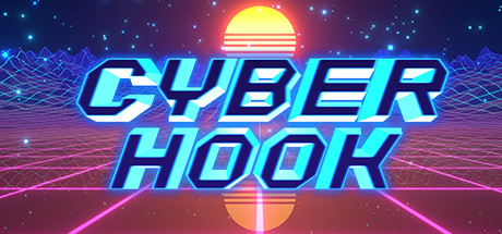
Cyber Hook capsule

Cyber Hook

Speed through a gorgeous retrowave world using parkour skills and a grappling hook to scale and ride walls in this fast-paced, 3D platformer. Blast enemies, manipulate time and abuse physics to avoid falling to your death.

$14.99Overwhelmingly Positive(23)
3D PlatformerIndieParkour
Blazing StickSep 24, 2020

Cyber Hook scores 83/100 — better than 96% of 3D Platformer capsules (n=1,456).

Overwhelmingly Positive (23 reviews) · $14.99 · Released Sep 24, 2020 · By Blazing Stick

Quick text summary

Cyber Hook scored 83/100 on Steam Analyzer — Good for a 3D Platformer capsule. Top priority fix: [contrast_color] Consider adding a subtle silhouette or hook element in the foreground to reinforce the grappling mechanic and improve genre clarity at tiny size

Capsule scores by dimension

  • Genre Clarity: 8/10 — Strong cyberpunk action identity. The retrowave aesthetic with neon cyan title, glowing sun, and grid floor immediately signal a futuristic action game. The geometric, tech-forward visual language and grappling hook mechanics are clear at full size, though at tiny size the genre reads as 'sci-fi action' rather than specifically 'parkour platformer with grappling hook.' The neon grid and sun are iconic enough to remain readable at small sizes.
  • Title Readability: 9/10 — Excellent neon legibility. CYBER HOOK is rendered in bold, high-contrast cyan with black stroke outline and strong glow effect, making it highly legible across all sizes including tiny. The all-caps geometric typeface is spaced well and positioned centrally over a controlled background region where the grid and sun provide framing without competing. Even at tiny size, the neon glow and clean letterforms ensure the title remains crisp and recognizable.
  • Contrast & Color: 9/10 — Vibrant pop against dark background. The bright cyan neon title, magenta grid lines, and yellow-orange sun create strong value separation and saturation contrast against the dark blue-purple starfield background. Key elements maintain clear silhouette edges in grayscale and the warm-cool color clash (orange sun vs cyan text vs magenta grid) ensures visual hierarchy. At small and tiny sizes, the high luminosity of the neon elements keeps them distinct and readable without any muddy blending.
  • Uniqueness & Polish: 8/10 — Polished retrowave execution. The capsule delivers a cohesive, premium retrowave aesthetic with intentional craft evident in the glow effects, grid perspective, layered sun design, and particle stars. This is a signature look that feels distinctive for an indie action game, though retrowave is a popular visual language so the originality is moderate rather than groundbreaking. The technical execution—clean gradients, consistent lighting, and balanced effects—elevates it above generic template capsules.
  • Brand Consistency: 8/10 — Strong internal retrowave cohesion. The capsule establishes a clear visual identity through consistent neon palette (cyan, magenta, orange), isometric grid perspective, and particle effects that would be recognizable across marketing materials. The retrowave theme aligns with the fast-paced cyber-action gameplay and grappling hook mechanic suggested by the visuals. Internal elements (title style, sun design, grid, stars) all reinforce the same era and feel without conflicting artistic directions.
  • Composition: 8/10 — Balanced hierarchy with clear focal point. The composition uses layered depth effectively: starfield background, receding grid middle ground, glowing sun as a secondary focal point, and dominant title in the center-upper area. The title placement is strategic and safe from crop margins, with the grid providing visual depth and the sun creating a natural balance point. At small and tiny sizes, the three-layer structure (background stars, midground grid, foreground title) remains clear with no element competition, though the sun becomes less distinct at tiny thumbnail size.

What works

  • Neon title legibility. Cyan glow-outlined text remains crisp and readable even at tiny thumbnail sizes due to high contrast and clean letterforms.
  • Retrowave aesthetic consistency. Cohesive visual identity with matching palette, perspective grid, and effects that feel intentional and polished throughout the composition.
  • Strong background contrast. Dark starfield provides excellent separation from bright foreground elements, ensuring all neon colors pop distinctly in quick-scroll viewing.
  • Clear depth layering. Starfield, grid perspective, sun, and title create distinct visual planes that guide the eye without cluttering or competing for attention.

What hurts the capsule

  • Genre specificity at tiny size. While sci-fi action is clear, the specific grappling hook and parkour mechanics are not visually obvious at thumbnail size without the context of gameplay.
  • Sun detail fades at small. The secondary focal point (layered sun design) becomes less distinct and less visually impactful as capsule size shrinks, reducing visual interest at small thumbnails.

Priority fixes

  1. [contrast_color] Consider adding a subtle silhouette or hook element in the foreground to reinforce the grappling mechanic and improve genre clarity at tiny size
  2. [composition] Ensure the sun gradient maintains visibility when scaled down by potentially increasing its size or saturation slightly to prevent it from becoming muddy at thumbnail scales

Related guides

Steam app ID: 1130410 · Tags: 3D Platformer, Indie, Parkour, Fast-Paced, Action