Scoring genre clarity...
Unpacking capsule

Unpacking

Unpacking is a zen puzzle game about the familiar experience of pulling possessions out of boxes and fitting them into a new home. Part block-fitting puzzle, part home decoration, you are invited to create a satisfying living space while learning clues about the life you’re unpacking.

19,99€Very Positive(315)
RelaxingCuteCasual
Witch Beam1 Nov, 2021

Unpacking scores 90/100 — better than 100% of Relaxing capsules (n=4,411).

Very Positive (315 reviews) · 19,99€ · Released 1 Nov, 2021 · By Witch Beam

Quick text summary

Unpacking scored 90/100 on Steam Analyzer — Excellent for a Relaxing capsule. Top priority fix: No priority fixes required—this capsule is well-executed across all dimensions and exemplifies strong genre clarity, readability, and brand consistency for casual puzzle-decoration games.

Capsule scores by dimension

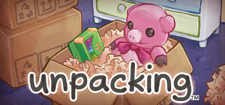
  • Genre Clarity: 9/10 — Puzzle and home decoration instantly clear. The capsule immediately communicates the core mechanic through a cardboard box containing colorful objects (green house, pink plush toy) and packing material, visually establishing the unpacking and arrangement puzzle gameplay. Even at TINY size, the recognizable box silhouette, diverse objects, and cozy domestic context clearly signal a casual puzzle-decoration game, not action or combat.
  • Title Readability: 9/10 — Bold white title with excellent contrast. The word 'unpacking' is rendered in large, bold white sans-serif lettering with a subtle dark outline, positioned across the lower-middle portion on a mixed background of cardboard and interior elements. The outline and weight maintain full legibility at TINY size, and the placement avoids critical content areas while remaining the dominant text focal point.
  • Contrast & Color: 9/10 — Warm and cool palette with strong separation. The composition uses warm brown cardboard, cool blue and green accents, and a striking pink plush toy that pops distinctly against the #1b2838 Steam background. The white title text creates maximum contrast, and the color separation between background and subjects remains clear even when squinting, with no muddy mid-tone blending.
  • Uniqueness & Polish: 9/10 — Charming illustrated style with distinct personality. The art style is cohesive, hand-illustrated whimsy with soft rounded forms, warm color grading, and a storybook aesthetic that sets it apart from generic puzzle templates. The pink plushie character and arrangement of household objects communicate personality and emotional warmth rather than generic gameplay abstraction, creating memorable visual identity.
  • Brand Consistency: 9/10 — Iconic pink plushie with cohesive visual language. The pink plush toy is a recognizable brand motif, consistent with the game's cozy domestic theme and appears across promotional materials. The warm, illustrated art direction, soft color palette (browns, pastels, greens), and household object styling create an instantly identifiable visual signature that distinguishes Unpacking from competitors.
  • Composition: 9/10 — Clear hierarchy with balanced focal zones. The cardboard box anchors the composition as the primary focal point in the center-left, the pink plushie and green house object create secondary interest within the box, and the shelving backdrop provides depth context without clutter. The title sits confidently in safe margins at the bottom, the composition remains visually balanced across all sizes, and no critical elements risk cropping at Steam's standard boundaries.

What works

  • Genre and mechanic instantly recognizable. The box-with-objects visual immediately communicates unpacking puzzle gameplay and cozy home decoration without ambiguity.
  • Distinctive illustrated art style and character. The pink plushie and warm hand-drawn aesthetic create memorable brand identity and emotional appeal beyond generic puzzle templates.
  • Excellent contrast and readability at all sizes. White title outline, strong color separation, and clear silhouettes maintain legibility from full resolution down to tiny thumbnail without loss of impact.
  • Balanced composition with clear hierarchy. Focal point is centered and distinct, supporting elements enhance rather than compete, and safe margins protect the title across Steam's display formats.

What hurts the capsule

  • No significant readability weaknesses detected. The capsule executes all primary communication goals effectively with no legible text, contrast, or clarity issues at any viewing size.
  • No notable composition or layout problems. The arrangement of elements, focal hierarchy, and spatial balance function well without dead space, crowding, or cropping risks.

Priority fixes

  1. No priority fixes required—this capsule is well-executed across all dimensions and exemplifies strong genre clarity, readability, and brand consistency for casual puzzle-decoration games.

Store copy priority fixes

  1. [feature_communication] In the features list, add explicit detail about the spatial puzzle mechanic: 'Navigate each room's layout and fit items into drawers, shelves, and furniture like a sliding block puzzle' to clarify the core interaction.
  2. [uniqueness] Add a sentence after the opening distinguishing this from other puzzle games: 'Unlike traditional puzzles, your choices in placement tell the story—what you unpack and how you arrange it reveals who this person is.'

Related guides

Steam app ID: 1135690 · Tags: Relaxing, Cute, Casual, Pixel Graphics, Organizing