Scoring genre clarity...
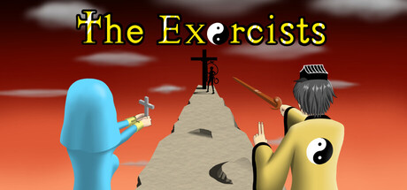
"The Exorcists" is a 2D action game. Chinese zombies, Japanese and ancient Egyptian monsters, etc. will appear in the game. After defeating them, the character will gain experience and level up. Their abilities will then be enhanced. In addition, there are various mysteries and legendary enemies.
$9.991 user reviews
ActionAdventureFantasy
KaiNov 20, 2025