Scoring genre clarity...
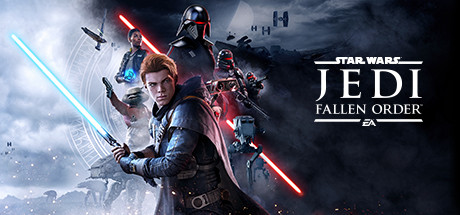
STAR WARS Jedi: Fallen Order™ capsule

STAR WARS Jedi: Fallen Order™

A galaxy-spanning adventure awaits in Star Wars Jedi: Fallen Order, a 3rd person action-adventure title from Respawn. An abandoned Padawan must complete his training, develop new powerful Force abilities, and master the art of the lightsaber - all while staying one step ahead of the Empire.

$3.99Very Positive(1,439)
Action-AdventureSouls-likeThird Person
Respawn EntertainmentNov 14, 2019

STAR WARS Jedi: Fallen Order™ scores 88/100 — better than 100% of Action-Adventure capsules (n=3,418).

Very Positive (1,439 reviews) · $3.99 · Released Nov 14, 2019 · By Respawn Entertainment

Quick text summary

STAR WARS Jedi: Fallen Order™ scored 88/100 on Steam Analyzer — Excellent for a Action-Adventure capsule. Top priority fix: [uniqueness_polish] Consider emphasizing Cal's unique visual identifier (scar, specific outfit detail, or signature pose) to differentiate from generic Jedi imagery and strengthen character recognition.

Capsule scores by dimension

  • Genre Clarity: 9/10 — Star Wars action-adventure instantly clear. The capsule communicates sci-fi action-adventure perfectly through iconic lightsaber silhouettes, Imperial ships in the background, and a combat-ready protagonist in Force-infused pose. At tiny size, the glowing red and blue lightsabers create unmistakable genre signals that read as Star Wars Jedi gameplay without ambiguity.
  • Title Readability: 9/10 — Clean, legible title hierarchy throughout. The STAR WARS JEDI FALLEN ORDER title uses a professional serif font with excellent contrast against the dark sky background, positioned in the upper right third with clean white letterforms. Even at tiny size, the title maintains full legibility with strong separation from background elements and well-spaced letterforms that don't collapse.
  • Contrast & Color: 9/10 — Striking light-dark separation with vibrant accents. The composition leverages strong value contrast between the bright protagonist in the foreground (cool blues and whites) against the dark stormy sky, with neon red and cyan lightsabers cutting through the midground. The silhouettes remain crisp and distinct in grayscale, and the warm orange city glow in the lower background adds atmospheric depth without muddying the primary focal points.
  • Uniqueness & Polish: 8/10 — Premium production with strong character focus. This capsule stands apart through professional cinematography-style composition, layered depth with ships and Imperial forces in the background, and a confident hero pose that signals both vulnerability and power. The custom lighting and particle effects (snow/debris) create premium polish, though the scene follows expected Star Wars promotional conventions rather than introducing a unique visual hook.
  • Brand Consistency: 9/10 — Strong Star Wars and Respawn identity. The capsule maintains recognizable Star Wars visual language through iconic lightsaber design, Imperial architecture, and the signature color palette (blues, reds, silvers against dark space). The character's positioning and attire align with Jedi protagonist conventions while the overall composition matches the cinematic quality of the franchise's official marketing materials.
  • Composition: 9/10 — Excellent focal hierarchy and depth layering. The protagonist anchors the foreground with a dynamic pose, supporting characters and ships recede naturally into the middle and background layers, and the title occupies strategic upper-right real estate without competing for attention. The composition survives all three size tests cleanly—at tiny size, the character silhouette and lightsaber glow remain the clear focal point, with secondary elements providing context without clutter.

What works

  • Iconic lightsaber iconography. The red and cyan glowing blades are instantly recognizable and immediately signal the Jedi action-adventure genre.
  • Deep layered composition. Foreground protagonist, midground conflict, and background Imperial forces create natural visual hierarchy that guides the eye effectively.
  • Premium cinematic presentation. Professional lighting, particle effects, and character rendering convey AAA polish and production quality.
  • Title placement and legibility. White serif text in upper right sits on controlled dark sky, maintaining 9/10 readability even at tiny thumbnail size.

What hurts the capsule

  • Follows franchise conventions closely. While professionally executed, the composition relies on expected Star Wars promotional imagery rather than introducing a distinctive visual hook unique to Fallen Order.
  • Subtle character differentiation. The protagonist reads as a generic Jedi-in-training rather than immediately establishing Cal Kestis as a memorable individual character.

Priority fixes

  1. [uniqueness_polish] Consider emphasizing Cal's unique visual identifier (scar, specific outfit detail, or signature pose) to differentiate from generic Jedi imagery and strengthen character recognition.
  2. [brand_consistency] Ensure the EA logo visibility matches sibling title Jedi: Survivor for consistent brand family recognition across the store.

Store copy priority fixes

  1. [feature_communication] Add a specific sentence early in the detailed description explaining how difficulty settings work or that the game caters to both story-focused and hardcore combat players, leveraging the Adjustable Difficulty category.
  2. [uniqueness] Include one sentence differentiating Fallen Order's lightsaber and Force combat system from other action games or Star Wars titles (e.g., 'the only Star Wars game combining souls-like tactical combat with Jedi power progression,' or specifics on what makes the parry/dodge system stand out).
  3. [feature_communication] Trim or consolidate the Empire/Jedi Order narrative repetition in the second and third paragraphs to reduce word count and make the feature breakdown more prominent and scannable.

Related guides

Steam app ID: 1172380 · Tags: Action-Adventure, Souls-like, Third Person, Open World, Story Rich