Scoring genre clarity...

Heart in the Cell: Rebirth capsule

Heart in the Cell: Rebirth

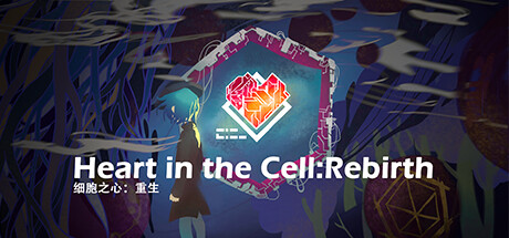
“Heart in the Cell: Rebirth” is a real-time strategy (RTS) game which integrates the UI itself into the combat system. Players will act as rebels and explore the secrets beneath the vast wings of Oniros Corporation in a world Of highly advanced artificial intelligence.

$2.995 user reviews
Strategy
Team Gingerbread ManSep 20, 2025

Heart in the Cell: Rebirth scores 65/100 — better than 10% of Strategy capsules (n=5,103).

5 user reviews · $2.99 · Released Sep 20, 2025 · By Team Gingerbread Man

Quick text summary

Heart in the Cell: Rebirth scored 65/100 on Steam Analyzer — Solid for a Strategy capsule. Top priority fix: [genre_clarity] Introduce subtle RTS or strategy visual language—consider adding a tactical grid pattern, holographic UI element, or data visualization in the background to signal gameplay genre without overwhelming the heart icon.

Capsule scores by dimension

  • Genre Clarity: 4/10 — Medical theme overshadows strategy signals. The anatomical heart illustration dominates the composition and reads as a medical or biology game rather than strategy. At tiny size, the heart alone is what registers—no RTS-specific iconography like units, bases, tech trees, or tactical elements appear. The setting feels bio-punk and science fiction, but the visual language does not clearly communicate real-time strategy gameplay or rebel/corporate conflict.
  • Title Readability: 7/10 — Title legible but unconventional layout. The main title 'Heart in ( ) the Cell' with the heart icon substituting for parentheses is readable at full size with clear white serif letterforms against black. At small and tiny sizes, the text remains mostly legible due to strong contrast and reasonable font size, though the tagline 'Rebirth' becomes cramped on the right. The parentheses-with-icon substitution is creative but adds a moment of parsing delay that slightly hurts immediate recognition at quick scroll.
  • Contrast & Color: 8/10 — Strong value separation with bold palette. White text, red anatomical heart with white outline, and pure black background create excellent value contrast that holds at all sizes. The heart silhouette reads clearly in grayscale due to internal texture detail and the white outline providing edge definition. At tiny size the contrast remains strong and the heart pops distinctly, though the red saturation against black is somewhat muted compared to pure bright red.
  • Uniqueness & Polish: 7/10 — Distinctive visual hook with solid craft. The anatomical heart as a central icon is memorable and suggests a unique thematic hook around bio-science or cellular strategy. The serif typography and graphic treatment feel intentional and premium rather than templated. However, the visual does not communicate what makes the game mechanically distinct—no UI integration cues, no rebel/corporate visual tension, and no hint of the 'Rebirth' narrative weight are present.
  • Brand Consistency: 6/10 — Minimal identity cues, lacks memorable motifs. The capsule presents a clean anatomical aesthetic but offers few recurring identity signals that would distinguish future marketing materials. The heart icon could become iconic with repetition, but the current capsule lacks supporting visual language—color palette is limited to red, white, and black; no secondary symbols or textures suggest corporate vs. rebel aesthetics. Without reference to other store assets, this design feels more like a standalone medical illustration than a cohesive brand expression.
  • Composition: 7/10 — Centered focus with solid balance. The heart sits in the strong center focal point with text distributed left and right, creating a symmetrical and balanced layout that works across all sizes. The title wraps around the heart naturally and maintains safe margins from edges. At small and tiny sizes, the composition remains legible and the heart stays the primary anchor, though the off-center subtitle 'Rebirth' sits in the upper right and risks minor crop interference on some Steam displays.

What works

  • Excellent contrast against Steam dark background. White serif text and red heart with white outline maintain strong value separation and silhouette clarity at tiny size, ensuring visibility on quick scroll.
  • Memorable central icon. The anatomical heart is distinctive and serves as a visual anchor that could become recognizable across future materials.
  • Balanced, symmetrical composition. The centered heart with flanking text distributes visual weight evenly and preserves readability at small sizes.

What hurts the capsule

  • Genre messaging misalignment. The medical/biological aesthetic dominates perception while strategy elements remain invisible, potentially confusing players about game type at discovery.
  • Limited visual world-building. No visual hints of the Oniros Corporation, rebel conflict, advanced AI, or UI-integrated combat system appear, leaving the game's unique selling points unexpressed.
  • Weak brand identity beyond the icon. Supporting visual language is absent—no secondary symbols, distinct palette extensions, or design motifs that would reinforce brand identity across touchpoints.

Priority fixes

  1. [genre_clarity] Introduce subtle RTS or strategy visual language—consider adding a tactical grid pattern, holographic UI element, or data visualization in the background to signal gameplay genre without overwhelming the heart icon.
  2. [uniqueness_polish] Integrate visual cues hinting at the Oniros Corporation vs. rebel dynamic—consider a subtle corporate tech aesthetic around the heart or ambient visual storytelling that communicates the bio-punk setting and core narrative conflict.
  3. [brand_consistency] Develop a secondary color accent or repeating motif (such as circuit patterns, cellular structure, or corporate insignia) that can anchor future brand materials and increase recognition depth.

Store copy priority fixes

  1. [hook_strength] Replace 'Without the Cell, you won't be able to move a single inch' with a verb-forward hook like 'Drag floating UI panels into battle to cast spells, summon allies, and dodge enemy fire in real-time strategy combat.'
  2. [feature_communication] Add 1-2 sentences explaining the concrete interaction model: how players grab/activate the floating Cells, where they appear on screen, and what happens when they do (e.g., 'Tap floating Cell panels during combat to instantly unleash spells or summon creatures; each Cell has a unique timing window').
  3. [audience_targeting] Clarify difficulty and pacing early: specify whether this is designed for strategy veterans, casual players, or both, and hint at expected playtime or learning curve to help self-select audience.

Related guides

  • Steam page optimisationCapsule, copy, screenshots, tags — the full Steam page conversion stack.
  • Steam tags guideTag selection, ordering, and how it shapes Steam's recommendation rails.

Steam app ID: 1172680 · Tags: Strategy