Scoring genre clarity...
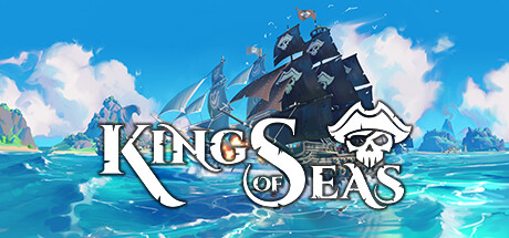
King of Seas capsule

King of Seas

King of Seas is an ARPG adventure game set in a nautical pirate world. Embark on an epic adventure across the seven seas where you’ll discover lost islands and treasures, fight rival pirates and menacing monsters, and become the most legendary pirate of all time!

$24.99Mixed(598)
PiratesNaval CombatAction RPG
3DCloudsMay 25, 2021

King of Seas scores 83/100 — better than 93% of Pirates capsules (n=160).

Mixed (598 reviews) · $24.99 · Released May 25, 2021 · By 3DClouds

Quick text summary

King of Seas scored 83/100 on Steam Analyzer — Good for a Pirates capsule. Top priority fix: [title_readability] Consider a slightly bolder or thicker outline on the white serif text to maintain crisper edges at TINY thumbnail size without losing elegance.

Capsule scores by dimension

  • Genre Clarity: 9/10 — Pirate naval action immediately clear. The black pirate galleon with sails and cannons firing, combined with the turquoise Caribbean waters, tropical islands, and skull motif logo instantly communicate nautical piracy and action-adventure gameplay. At TINY size, the ship silhouette, water, and skull logo remain distinctly readable and genre-specific without ambiguity.
  • Title Readability: 8/10 — Bold white serif logo, readable throughout. The white serif 'KING OF SEAS' text with ornate skull emblem sits cleanly on a neutral background band above the water, maintaining strong contrast against the blue sky. At SMALL and TINY sizes, the letterforms remain legible, though the decorative serif style shows minor degradation but does not collapse into illegibility.
  • Contrast & Color: 9/10 — Vibrant bright blues pop strongly. The composition uses a bright turquoise ocean and cyan sky that create striking luminous separation against the dark ship, white foam, and warm cannon fire. The high saturation and value contrast ensure the image reads powerfully at TINY size even on the dark Steam background, with clear silhouettes and distinct color zones.
  • Uniqueness & Polish: 8/10 — Polished maritime scene, distinctive hook. The image showcases a premium illustrated style with detailed ship rigging, volumetric cloud lighting, dynamic cannon fire, and a cohesive tropical environment that communicates both adventure and combat. The ornate skull logo and deliberate framing of action (firing cannons) signal intentional craft and distinctive visual storytelling that avoids generic pirate cliché.
  • Brand Consistency: 7/10 — Strong pirate identity, logo recognizable. The skull-and-crossbones integrated into the logo and the distinctive ship design with teal sails create memorable brand anchors. The art direction is consistent with pirate-adventure themes, though without access to the 15 store screenshots, internal consistency with the broader game visual language cannot be fully confirmed at full scope.
  • Composition: 9/10 — Balanced focal point, strong hierarchy. The pirate galleon dominates the center-right as the clear focal point, with the logo anchored below in safe margins and supporting islands/clouds guiding the eye naturally across the frame. At SMALL and TINY sizes, the composition maintains a single primary subject (the ship) with no dead zones, and the title placement avoids edge clipping with ample safe spacing.

What works

  • Instant genre recognition. The pirate ship, cannons, tropical waters, and skull motif communicate nautical action-adventure in under one second at any size.
  • Excellent color contrast and saturation. The bright turquoise and cyan palette pops dramatically against the dark Steam background and maintains clarity even at TINY thumbnail size.
  • Clean title placement and readability. The white serif logo sits on a neutral band with strong contrast, remaining legible from FULL to TINY without overlap or clipping concerns.
  • Polished, intentional art direction. The detailed ship rigging, volumetric lighting, and dynamic cannon fire convey premium craft and a distinctive visual hook beyond generic pirate scenes.

What hurts the capsule

  • Serif decorative font minor degradation. The ornate letterforms show subtle erosion at TINY size, though legibility is not severely compromised overall.
  • Moderate visual complexity in background. Multiple islands, cloud layers, and water effects create busy detail that could risk visual confusion at extremely low resolution on slower scrolls.

Priority fixes

  1. [title_readability] Consider a slightly bolder or thicker outline on the white serif text to maintain crisper edges at TINY thumbnail size without losing elegance.
  2. [composition] Ensure the logo skull remains distinct during Steam's lazy-load or compressed JPEG compression by adding a subtle dark outline around the emblem.

Related guides

Steam app ID: 1209410 · Tags: Pirates, Naval Combat, Action RPG, Procedural Generation, Open World