Lightphobe scores 68/100 — better than 19% of FPS capsules (n=1,272).

Quick text summary

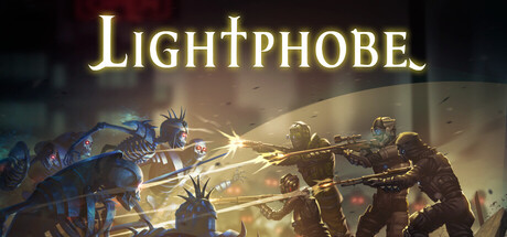
Lightphobe scored 68/100 on Steam Analyzer — Solid for a FPS capsule. Top priority fix: [genre_clarity] Introduce visual asymmetry cues—show a bright light source on one side and deep shadow on the other, or stage light-wielder vs. darkness-adapted character silhouettes to communicate the core light-versus-dark mechanic at a glance.

Capsule scores by dimension

  • Genre Clarity: 7/10 — Action combat clear, asymmetrical mechanics unclear. The capsule clearly communicates intense action gameplay through dynamic character poses, glowing weapon effects, and aggressive combat staging. However, the asymmetrical PVP stealth-versus-shooter mechanic is not visually apparent at any size—the image reads as generic action combat rather than specifically suggesting the unique light/darkness asymmetry that defines the game. At tiny size, it collapses to 'armored soldiers shooting' without genre differentiation.
  • Title Readability: 8/10 — Golden serif title stands strong at all sizes. The 'LIGHTPHOBE' title uses a bold, all-caps serif font in bright yellow-gold with consistent outline, positioned centrally at the top above clean background space. It reads clearly at full, small, and tiny sizes without collapse, and the golden color pops sharply against the dark steam background. The serif weight and spacing support legibility even when scaled down, though the typeface itself offers no thematic connection to the asymmetrical light-versus-darkness core mechanic.
  • Contrast & Color: 8/10 — Strong warm-cool separation with vibrant accents. The capsule uses a warm brown-gold mid-tone background with bright golden weapon effects and character highlights creating strong value separation from the dark steam background. Cool blue armor tones on the left and warm orange-yellow light beams create effective warm-cool contrast that reads clearly even at tiny size. In grayscale, silhouettes remain distinct, though the background is not as dark as optimal—mid-tone background compresses hierarchy slightly compared to pure blacks.
  • Uniqueness & Polish: 6/10 — Competent action staging, generic execution overall. The image shows polished 3D rendering with well-lit character models, coherent lighting direction, and dynamic action posing typical of AAA shooter marketing. However, the composition, pose choices, and visual language are nearly identical to the benchmarked titles (Helldivers 2, Space Marine 2, Armored Core)—armored soldiers in a firefight with dramatic light flares. There is no distinctive visual hook, unique color palette, or character silhouette that signals 'Lightphobe' specifically or communicates the light-versus-darkness stealth-action asymmetry.
  • Brand Consistency: 5/10 — Generic futuristic action, no memorable identity. The capsule presents standard sci-fi soldier aesthetics with no distinctive palette, icon, or motif that would be recognizable across other brand touchpoints. There are no signature characters, unique color themes, or visual symbols visible that could anchor brand recall. The image could apply to dozens of team-based shooters without alteration, signaling low internal brand identity and missed opportunity to establish visual recognition.
  • Composition: 7/10 — Clear focal point, balanced depth, strong hierarchy. The composition establishes a clear primary subject—the center-right soldier in blue armor with glowing weapons—while supporting characters left and right create depth without competing for attention. Background gradients and light flares support the focal character without overwhelming the read at small or tiny size. Title placement is well-controlled in safe margins at top, and the overall layout maintains balance across scales, though character groups are slightly dense center-left which risks minor crowding at tiny sizes.

What works

  • Title legibility across all sizes. Golden serif 'LIGHTPHOBE' maintains crisp readability from full down to tiny thumbnail due to bold weight, strategic spacing, and consistent outline stroke.
  • Strong warm-cool color contrast. Golden yellow weapon effects and blue armor create immediate visual separation against the dark Steam background and read distinctly even when squinted or grayscaled.
  • Clear focal point and depth. Center-right blue soldier anchors attention while background characters and light flares create layered composition that guides the eye without scattering focus.

What hurts the capsule

  • Generic action staging masks unique mechanics. The asymmetrical light-versus-darkness stealth-action core is completely invisible; the image reads as standard sci-fi squad combat identical to Helldivers 2 or Space Marine 2.
  • No distinctive brand identity or memorable hooks. The capsule uses off-the-shelf sci-fi soldier aesthetics with no signature character, unique palette, iconic symbol, or visual motif that would signal 'Lightphobe' specifically.
  • Mid-tone background reduces silhouette pop. The warm brown-gold background is lighter than optimal for dark Steam context, compressing value range and reducing the stark clarity achievable with pure or near-black backgrounds.

Priority fixes

  1. [genre_clarity] Introduce visual asymmetry cues—show a bright light source on one side and deep shadow on the other, or stage light-wielder vs. darkness-adapted character silhouettes to communicate the core light-versus-dark mechanic at a glance.
  2. [uniqueness_polish] Replace generic squad staging with a distinctive visual hook: a signature character pose, unique light effect signature, or thematic color accent that only 'Lightphobe' owns and would be recognizable across other brand assets.
  3. [brand_consistency] Establish and repeat a memorable identity element—a recurring color accent, character motif, or visual symbol—that appears consistently in other store screenshots and marketing to anchor brand recall.
  4. [contrast_color] Darken the background gradient to near-black or add a darker vignette to increase silhouette separation and make the golden light effects pop with even more impact against the Steam dark theme.

Store copy priority fixes

  1. [hook_strength] Replace "Beware of the darkness..." with an action-forward hook like "Light them up or hunt them down—command soldiers defending against ethereal invaders, or slip through shadows as a melee-wielding Lightphobe" to immediately convey gameplay agency and the core asymmetry.
  2. [feature_communication] Add a clear sentence about win conditions and round objectives, e.g., "Soldiers must hold the objective zone while Lightphobes attempt to breech defenses and eliminate them—complete the objective before time runs out."
  3. [tone_match] Tighten competitive language by replacing casual references like "sneaking up and knifing" with esports-aligned phrasing such as "master high-skill melee infiltration" to align better with the eSports and Tactical tags.

Related guides

Steam app ID: 1218470 · Tags: FPS, Action, Shooter, Multiplayer, Competitive