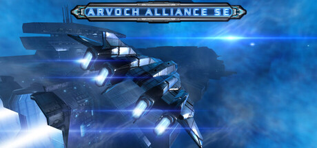
Arvoch Alliance SE scores 73/100 — better than 58% of Action capsules (n=8,534).

Quick text summary

Arvoch Alliance SE scored 73/100 on Steam Analyzer — Good for a Action capsule. Top priority fix: [uniqueness_polish] Add a unique visual identifier or signature element (ship marking, emblem, or HUD element) that reinforces brand recognition and differentiates from generic space combat aesthetics

Capsule scores by dimension

  • Genre Clarity: 8/10 — Space combat flight clearly signaled. The military spacecraft with glowing engines, weapon hardpoints, and dynamic blue space environment immediately communicate first-person space flight combat. At TINY size, the silhouette of the angular fighter and bright engine glow remain readable and unmistakably sci-fi military action.
  • Title Readability: 7/10 — Logo readable at all sizes. The 'ARVOCH ALLIANCE SE' banner sits centered at the top with clear gold/bronze framing and dark lettering that contrasts well against the blue background. At TINY size the text becomes slightly compressed but the iconic banner shape remains recognizable, though individual letters lose sharpness.
  • Contrast & Color: 8/10 — Strong blue-white dynamic separation. The bright cyan and white engine glow on the spacecraft pops distinctly against the darker blue void and atmospheric haze. The high-value engine highlights create excellent silhouette definition even at SMALL size; the grayscale test shows clear separation between craft and background, with no muddy mid-tone blending.
  • Uniqueness & Polish: 7/10 — Polished space sim aesthetic. The image showcases professional lighting, realistic metallic hull rendering, and coherent sci-fi military design with multiple weapon systems visible. While the space combat visual is competent and premium-feeling, the composition follows familiar sci-fi game conventions without a signature hook or memorable distinctive element that sets it apart from other space sims.
  • Brand Consistency: 6/10 — Clean military sci-fi identity. The gold-framed banner logo, blue-dominant palette, and angular military fighter establish a cohesive alliance aesthetic that aligns with the title. However, without reference to the 9 available screenshots, the visual feels like a generic advanced space fighter rather than showcasing a unique recognizable brand symbol or signature mechanic that could be instantly identified later.
  • Composition: 8/10 — Clear focal point, balanced layout. The spacecraft occupies the center-right to center region with the logo anchored firmly at top-center, creating a strong primary focal point without clutter. At SMALL and TINY sizes the fighter remains the dominant subject and the layout does not collapse; the negative space around the craft reinforces focus and the composition avoids edge-hugging or awkward cropping concerns.

What works

  • Excellent engine glow contrast. Bright cyan and white engine highlights create powerful visual pop and silhouette clarity against the dark space background, maintaining readability at all viewing sizes.
  • Instantly recognizable genre. The military spacecraft design, weapon systems, and glowing engines immediately signal advanced space flight combat without ambiguity.
  • Professional lighting and rendering. The metallic hull detail, realistic engine lighting, and atmospheric depth create a premium, polished appearance that feels AAA-quality.

What hurts the capsule

  • Generic space sim presentation. While well-executed, the image follows familiar sci-fi game conventions without a unique hook or memorable visual signature that distinguishes Arvoch Alliance from competitor space combat titles.
  • Limited visual storytelling. The capsule shows a beautiful spacecraft but communicates nothing about gameplay mechanics, story hook, or what makes this simulation distinctive beyond standard space combat expectations.
  • Logo text clarity at TINY size. While the banner shape remains recognizable at the smallest size, individual letters in 'ARVOCH ALLIANCE SE' become compressed and harder to read at quick scroll viewing.

Priority fixes

  1. [uniqueness_polish] Add a unique visual identifier or signature element (ship marking, emblem, or HUD element) that reinforces brand recognition and differentiates from generic space combat aesthetics
  2. [title_readability] Increase letter spacing or font weight in the logo to maintain text clarity at TINY size without relying solely on banner shape recognition
  3. [genre_clarity] Consider a subtle HUD or cockpit element in the corner to hint at first-person flight perspective and differentiate from third-person space combat

Store copy priority fixes

  1. [hook_strength] Rewrite the short description to lead with the core tension or player role: e.g., 'Command a fighter squadron through interstellar war: lead your pilots, dogfight enemies, and master unforgiving Newtonian physics' instead of generic feature listing.
  2. [uniqueness] Add 2–3 sentences after the opening narrative that explicitly differentiate this game—e.g., 'Unlike other space sims, Arvoch Alliance combines deep squadron command with full Newtonian flight physics and a branching campaign where your tactical decisions shape the war's outcome' or similar concrete differentiator.
  3. [tone_match] Inject more visceral, tactical language into the opening paragraph to match the complexity and intensity of the gameplay (e.g., 'You are the linchpin. Your orders determine survival. Your flying skill keeps you alive. Welcome to the Evochron conflict.') to shift from corporate tone to immersive voice.
  4. [audience_targeting] Add a sentence or two explicitly addressing who this is for—e.g., 'For hardcore sim pilots who want uncompromising Newtonian physics and tactical depth' or 'For both solo campaign veterans and competitive multiplayer squadrons'—to help the right players self-identify immediately.

Related guides

Steam app ID: 1219770 · Tags: Action, Simulation, Space Sim, Flight, First-Person