Scoring genre clarity...

SpaceCraft Brawl capsule

SpaceCraft Brawl

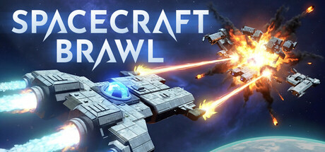
Build spacecrafts and fight with or against your friends! This game offers physics driven gameplay, with a variety of weapons and powerups. Slice your enemies in half with a laser beam, or erase them from existence with a black hole bomb!

$4.99Positive(17)
MultiplayerPvPSpace Sim
ruplozFeb 5, 2026

SpaceCraft Brawl scores 72/100 — better than 39% of Multiplayer capsules (n=2,820).

Positive (17 reviews) · $4.99 · Released Feb 5, 2026 · By ruploz

Quick text summary

SpaceCraft Brawl scored 72/100 on Steam Analyzer — Good for a Multiplayer capsule. Top priority fix: [uniqueness_polish] Introduce a distinctive visual element or signature art style—such as a unique ship silhouette, a custom color palette accent, or a thematic visual motif tied to the game's core mechanic (e.g., the black hole bomb mentioned in the description)—to differentiate from generic space combat games.

Capsule scores by dimension

  • Genre Clarity: 8/10 — Space combat action clearly telegraphed. The capsule immediately communicates multiplayer space combat through multiple armed spacecraft firing weapons at each other against a planet backdrop. Laser beams, explosions, and projectile effects strongly signal action-arcade gameplay. At tiny size, the silhouettes of fighting ships and bright weapon effects remain readable enough to identify the action space combat genre.
  • Title Readability: 8/10 — Bold title with solid contrast. SPACECRAFT BRAWL uses large white sans-serif typography positioned in the upper third against a darker sky region, maintaining clear separation from the central action. The letterforms remain legible at small and tiny sizes due to weight and positioning. The title placement avoids the densest visual activity, supporting readability across all viewing scales.
  • Contrast & Color: 8/10 — Strong value separation and bright accents. The capsule uses high-contrast lighting with bright white and cyan weapon effects against a dark blue-to-black space gradient, creating clear silhouette separation. White title text pops sharply against the darker upper region. The orange-yellow explosions add warm accent points that stand out even at tiny size without muddying the overall composition.
  • Uniqueness & Polish: 6/10 — Competent space action, familiar approach. The image presents a well-executed space combat scene with clear physics-driven destruction, but the visual treatment aligns closely with established space game aesthetics and promotional imagery. While the explosions and beam effects are polished, the overall composition and art direction feel like a standard action game trailer rather than a distinctive visual hook. The craft and rendering quality are professional, but the concept lacks a memorable distinctive element that separates it from competitor offerings.
  • Brand Consistency: 6/10 — Generic space combat visual identity. The capsule does not establish a recognizable brand motif, color palette, or character signature that could be identified across marketing materials. The spacecraft designs appear functional but not iconic. Without visual reference to the 7 store screenshots, the image could plausibly represent multiple space combat games, suggesting weak internal brand identity and limited memorability for future recognition.
  • Composition: 7/10 — Clear focal point with balanced action. The composition uses a central cluster of fighting spacecraft as the primary focal point, with weapon effects creating radial energy flow that guides the eye naturally. The title sits safely in the upper region away from critical action. At tiny size, the central combat cluster reads clearly, though some background detail noise slightly competes for attention; the overall hierarchy remains functional without strong layering between foreground, midground, and background elements.

What works

  • Immediate genre clarity. Multiple armed spacecraft, laser beams, explosions, and combat positioning instantly communicate multiplayer space action even at tiny thumbnail size.
  • Title placement and legibility. Large white sans-serif type positioned against controlled background area maintains readability across all viewing scales without competing with central action.
  • High-contrast lighting design. Bright cyan and white weapon effects against dark space background create strong silhouette separation and visual pop that supports quick scroll recognition.

What hurts the capsule

  • Lacks distinctive visual identity. The composition and art direction follow established space game conventions without a memorable signature element, character, or unique visual hook that stands out in the crowded action-game category.
  • Generic scene composition. While competently executed, the multi-ship battle scene represents a familiar marketing template rather than a unique selling point that communicates what makes this game different.
  • Weak brand memorability. The visual elements do not establish an iconic motif, color signature, or recognizable design language that would allow players to identify this game's capsule again after scrolling.

Priority fixes

  1. [uniqueness_polish] Introduce a distinctive visual element or signature art style—such as a unique ship silhouette, a custom color palette accent, or a thematic visual motif tied to the game's core mechanic (e.g., the black hole bomb mentioned in the description)—to differentiate from generic space combat games.
  2. [brand_consistency] Establish and use a consistent iconic element across all marketing visuals, such as a signature spacecraft design, emblem, or color accent that becomes recognizable as the game's visual brand identity.
  3. [composition] Add a clear depth layer separation between foreground action, midground spacecraft, and background planet/space to create more sophisticated visual hierarchy and premium presentation.

Store copy priority fixes

  1. [uniqueness] Add a sentence in the short description that explicitly differentiates this game, e.g., 'Every part of every ship can be destroyed and rebuilt on the fly' or 'The only space combat game where ship design determines physics and survivability.'
  2. [tone_match] Rewrite the 'Weapons' and 'Powerups' sections in the detailed description to match the energetic, specific language of the short description (e.g., replace 'each with its own strengths and weaknesses' with concrete weapon examples and tactical use cases).
  3. [hook_strength] Strengthen the opening by leading with the core unique mechanic rather than social play, e.g., 'Design and pilot physics-driven spacecrafts where every part can be destroyed, then battle friends and rivals with weapons ranging from laser beams to black holes.'

Related guides

Steam app ID: 1236770 · Tags: Multiplayer, PvP, Space Sim, Sci-fi, Building