Scoring genre clarity...
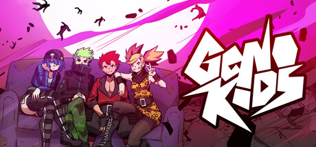
A bizarre music band named Genokids is rocking one of their best concerts to date when The Infinite Empire of Zenodia decides to invade Earth and assimilate mankind, landing right on top of the band and ruining both their concert and mood.
$19.99Very Positive(211)
ActionHack and SlashCharacter Action Game
NukefistOct 2, 2025