Scoring genre clarity...
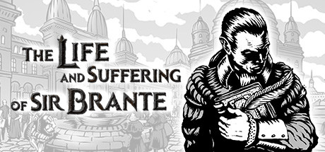
The Life and Suffering of Sir Brante capsule

The Life and Suffering of Sir Brante

A narrative-driven hardcore RPG set in a gritty world ruled by real but unrelenting gods. Set out on a challenging lifetime journey, where every choice has a price and entails consequences. Will you become an inquisitor, a judge, or conspire against the old order? Dare to decide!

$7.99Very Positive(81)
Choices MatterStory RichRPG
Sever, Schisma GamesMar 4, 2021

The Life and Suffering of Sir Brante scores 85/100 — better than 98% of Choices Matter capsules (n=2,191).

Very Positive (81 reviews) · $7.99 · Released Mar 4, 2021 · By Sever

Quick text summary

The Life and Suffering of Sir Brante scored 85/100 on Steam Analyzer — Excellent for a Choices Matter capsule. Top priority fix: [genre_clarity] Consider adding a subtle visual cue (weathered metal texture, scar, chains) to the protagonist silhouette to hint at the 'suffering' and 'hardcore' nature at tiny size.

Capsule scores by dimension

  • Genre Clarity: 8/10 — Medieval RPG narrative clear. The monochromatic medieval architecture, bearded protagonist in period armor, and ornate cathedral-dominated cityscape immediately signal a historical or fantasy RPG with narrative weight. At tiny size, the character silhouette and gothic architecture remain recognizable enough to convey 'serious medieval game,' though the specific 'suffering' tone and hardcore RPG elements are less obvious without reading the title.
  • Title Readability: 9/10 — Bold serif typography excellent. The title uses a strong, high-contrast serif typeface positioned clearly over a clean sky background on the left side, avoiding the busy cityscape. At tiny size, 'THE LIFE AND SUFFERING OF SIR BRANTE' remains legible due to thick letter forms, generous line spacing, and placement on a relatively uncluttered region. The serif weight and all-caps treatment ensure the text doesn't collapse even at 120×45 resolution.
  • Contrast & Color: 8/10 — Strong monochromatic separation. The black-and-white engraving style creates exceptional value separation against the Steam dark background (#1b2838). The white sky and light architectural detail pop clearly, while the solid black character and heavy ink linework create sharp silhouettes that read instantly at any size. In grayscale, the entire composition already operates in pure contrast, making edge definition excellent.
  • Uniqueness & Polish: 9/10 — Distinctive engraving art style. The hand-drawn engraving aesthetic—reminiscent of classical woodcut or etching—sets this apart from typical photorealistic or painted RPG capsules. The deliberate monochromatic treatment, intricate architectural detail, and period-accurate costume design on the protagonist convey premium craft and a specific artistic vision aligned with the game's narrative gravity. This is a memorable and cohesive visual identity that clearly distinguishes the title in a genre often dominated by photorealism.
  • Brand Consistency: 9/10 — Iconic monochrome identity. The black-and-white engraving style appears to be the game's signature visual language and should be recognizable across marketing materials. The bearded protagonist in period armor and the gothic cathedral motif establish strong iconography that could be identified in subsequent store screenshots or promotional assets. The consistent rendering technique and historical-serious tone create an unmistakable brand voice within the narrative RPG space.
  • Composition: 8/10 — Balanced focal hierarchy. The title occupies the left third with clear priority, while the character portrait on the right serves as a powerful secondary focal point that balances without competing. The cityscape background provides atmospheric depth without cluttering the read. At small and tiny sizes, the left-right split remains clear and the character silhouette stays prominent; no critical elements are lost to edge cropping or safe margin violations.

What works

  • Exceptional monochromatic style. The engraving aesthetic is instantly distinctive and conveys premium craft, setting it apart from generic RPG capsules in the benchmark list.
  • Title placement and legibility. Bold serif typography placed over clean sky background remains perfectly readable even at 120×45 pixel tiny size.
  • Strong value contrast. Black and white composition pops aggressively against the Steam dark background with crisp silhouettes that survive squint and grayscale tests.
  • Clear visual hierarchy. Title and character portrait are spatially separated, creating a balanced composition that guides the eye effectively without scattered attention.

What hurts the capsule

  • Mood over genre clarity. While 'serious medieval RPG' reads clearly, the specific 'hardcore,' 'choice-driven,' or 'simulation' aspects are not visually apparent at tiny size—mood is prioritized over mechanical specificity.
  • Subtlety of 'suffering' theme. The title promises 'suffering' and 'consequences,' but the visual tone reads as historical-serious rather than explicitly dark or gritty, potentially under-selling the game's thematic intensity.

Priority fixes

  1. [genre_clarity] Consider adding a subtle visual cue (weathered metal texture, scar, chains) to the protagonist silhouette to hint at the 'suffering' and 'hardcore' nature at tiny size.
  2. [uniqueness_polish] Ensure the monochromatic engraving style is consistently applied across all store screenshots and promotional assets to reinforce brand recognition.

Store copy priority fixes

  1. [uniqueness] Add a comparative statement such as 'Unlike choice-heavy games where your past is locked in, the resurrection system lets you revisit and reshape entire chapters of your life.' This elevates the distinctive mechanic.
  2. [feature_communication] In the short description, add one mechanical verb: 'develop skills, face moral choices, and shape the Empire's fate' to anchor the abstract theme in concrete gameplay.
  3. [audience_targeting] Insert explicit text: 'A single-player, text-based narrative RPG for players who value consequence-driven storytelling over action' to remove ambiguity about format and player fit.
  4. [hook_strength] Expand the resurrection system mention in the short description or opening paragraph; it is a strong differentiator but currently appears only in the detailed feature list where it risks being missed on first skim.

Related guides

Steam app ID: 1272160 · Tags: Choices Matter, Story Rich, RPG, Interactive Fiction, Choose Your Own Adventure