Scoring genre clarity...
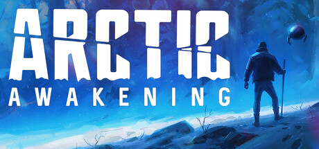
A first-person narrative adventure set in the unforgiving Arctic. Your plane crashed in a storm, leaving only your court-mandated therapy bot for company as you journey to find your co-pilot and uncover the mysteries buried beneath the ice.
$19.99Very Positive(315)
Story RichAtmosphericMystery
GoldFire StudiosSep 18, 2025