Scoring genre clarity...
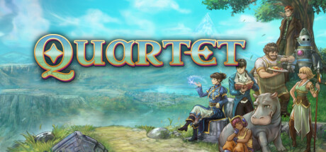
A series of unlikely train robberies. A mysterious deck of cards. A fleet of deadly airships. An accidental mage. Choose from four stories, in any order, and discover how they intertwine in this turn-based RPG.
$19.99Very Positive(13)
IndieJRPGTurn-Based Combat
Something Classic Games LLCAug 26, 2025