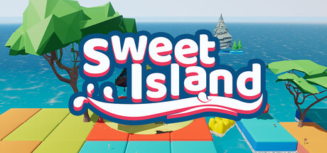
Sweet Island scores 80/100 — better than 93% of 3D Platformer capsules (n=1,396).

Quick text summary

Sweet Island scored 80/100 on Steam Analyzer — Good for a 3D Platformer capsule. Top priority fix: [uniqueness_polish] Introduce a small iconic character or mascot element (e.g., a candy creature) in the corner to create a memorable brand identity differentiating from similar platformers.

Capsule scores by dimension

  • Genre Clarity: 8/10 — Colorful casual platformer clearly signaled. The candy and cake environment, bright pastel color palette, and whimsical tree design immediately communicate a lighthearted 3D platform game. The stylized, non-threatening aesthetic distinctly rules out action or combat genres. At tiny size, the vibrant color blocks and organic candy shapes remain readable enough to convey the casual platforming focus.
  • Title Readability: 9/10 — Bold legible title with strong hierarchy. The 'SWEET ISLAND' text uses thick white letterforms with a navy and red curved ribbon underline, creating excellent contrast against the sky background. The title remains fully readable at small and tiny sizes due to generous letter spacing and bold weight. Strategic placement in the upper-center avoids busy texture zones.
  • Contrast & Color: 9/10 — High-value palette pops against dark background. Bright cyan water, vibrant greens, warm yellows, and white title create strong value separation and saturation that will read clearly at tiny size against Steam's #1b2838 background. The silhouettes of trees, buildings, and geometric platform blocks remain distinct even in grayscale. Clean edge definition and no muddy mid-tones.
  • Uniqueness & Polish: 7/10 — Polished and charming but genre-familiar. The execution is clean with cohesive 3D art style, intentional color choices, and a distinctive candy-world hook that communicates the core appeal. The visual storytelling clearly shows 'whimsical puzzle platformer' without being generic. However, colorful casual platformers are common on Steam, so the design feels competent and appealing rather than groundbreaking.
  • Brand Consistency: 7/10 — Consistent art style with memorable theme. The candy and cake aesthetic is consistently rendered across visible elements—tree candy, geometric cake-block platforms, and pastel buildings. The thick white typeface with playful ribbon underline feels distinctly branded for this game. The palette and visual language would be recognizable in marketing materials, though no single iconic mascot or motif dominates.
  • Composition: 8/10 — Balanced hierarchy with clear focal point. The title is the primary focus in the upper-center, with supporting environmental elements layered behind (foreground platform, midground trees, background water and buildings). The composition uses depth effectively and avoids clutter. Safe margins appear respected, and the design will likely survive Steam's standard cropping without losing key readable elements at small sizes.

What works

  • Excellent title contrast and legibility. White bold letterforms with navy/red ribbon underline remain crisp and readable even at tiny thumbnail size against the dark Steam background.
  • Strong color palette and visual appeal. Vibrant cyan, green, yellow, and pastel tones create immediate visual interest and clearly communicate a lighthearted, casual game target.
  • Clear genre communication via environment. Candy trees, cake platforms, and whimsical architecture instantly signal a playful 3D platformer with no genre ambiguity.
  • Balanced composition with clear depth layering. Foreground, midground, and background elements guide the eye naturally without scattering attention across the design.

What hurts the capsule

  • Limited visual uniqueness within genre. Colorful casual platformers are well-established on Steam, and while this execution is solid, the overall concept lacks a standout distinctive hook or memorable mascot.
  • No iconic brand symbol or character. The capsule relies entirely on the candy-world theme rather than introducing a recognizable character or visual motif that could become iconic.
  • Ribbon underline may reduce polish at full size. The curved red/navy ribbon under the title, while decorative, adds visual complexity that could feel slightly busy compared to minimalist top-tier capsules.

Priority fixes

  1. [uniqueness_polish] Introduce a small iconic character or mascot element (e.g., a candy creature) in the corner to create a memorable brand identity differentiating from similar platformers.
  2. [composition] Verify safe title margins at the smallest Steam crop size to ensure no text clipping during display on different store layouts.
  3. [brand_consistency] Consider adding a subtle signature visual motif (e.g., a candy wrapper or cake stamp) that could appear across future marketing materials to strengthen brand recall.

Store copy priority fixes

  1. [feature_communication] Complete the three placeholder sections under 'gliding:', 'jump:', and 'sprint:' with 1–2 sentences each explaining how each mechanic works, what challenges they solve, and how they feel in practice.
  2. [hook_strength] Replace 'fresh and cute' in the short description with a specific gameplay-focused hook: 'Bounce, dash, and glide across candy-themed platforms in a race against time—or take your own pace.'
  3. [uniqueness] Add a concrete differentiator in the detailed description: identify one signature mechanic, visual style choice, or level design philosophy that distinguishes Sweet Island from other 3D platformers.
  4. [feature_communication] Specify total level count, estimated playtime, presence of collectibles or challenges, and whether progression is linear or open-ended to answer 'what will I actually do for how long?'

Related guides

Steam app ID: 1308420 · Tags: 3D Platformer, Adventure, Action, Cartoony, Runner