Scoring genre clarity...

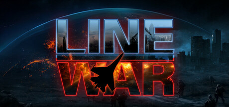
Line War capsule

Line War

A new type of RTS with elements from 4X, Wargame, and Real-Time Tactics. Draw commands and execute a superior strategy to defeat your opponent, focusing on high-level decisions rather than constant micromanagement.

$12.49Very Positive(1,069)
RTSStrategyAction RTS
Studio CenturionMay 5, 2022

Line War scores 60/100 — better than 0% of RTS capsules (n=528).

Very Positive (1,069 reviews) · $12.49 · Released May 5, 2022 · By Studio Centurion

Quick text summary

Line War scored 60/100 on Steam Analyzer — Solid for a RTS capsule. Top priority fix: [genre_clarity] Add a visual element that hints at the draw-command mechanic—such as glowing command lines, targeting reticles, or a stylized strategy grid overlay—to immediately communicate the RTS identity and core gameplay hook.

Capsule scores by dimension

  • Genre Clarity: 5/10 — Generic sci-fi warfare, unclear RTS. The image shows a futuristic cityscape with explosions and a glowing planet, which suggests action or conflict but does not clearly communicate strategy game mechanics or the distinctive draw-command RTS identity. At tiny size, it reads as generic sci-fi warfare rather than a strategy-focused title with unique mechanics like drawing commands.
  • Title Readability: 8/10 — Clear neon text, readable at all sizes. The title 'LINE WAR' uses a bold neon-style font with bright cyan and red glow effects that separates well from the dark background. Text remains legible at small and tiny sizes due to strong contrast and letter spacing, though the decorative glow adds visual punch without sacrificing clarity.
  • Contrast & Color: 8/10 — Strong neon glow, excellent dark separation. Bright cyan and red neon lettering contrasts sharply against the dark space and city silhouettes, creating clear value separation across all viewing sizes. The orange explosion effects in the lower half add warmth and visual interest while maintaining silhouette clarity in grayscale; the overall palette reads distinctly even at tiny thumbnail size.
  • Uniqueness & Polish: 5/10 — Polished but generic sci-fi aesthetic. The neon-text treatment and explosion effects are well-executed technically with clean gradients and glow work, but the composition relies on familiar sci-fi tropes (planet, city, explosions) without visual hints of the game's unique draw-command strategy mechanics. Compared to top competitors like Manor Lords or Frostpunk 2, it lacks a distinctive gameplay visual hook or memorable icon.
  • Brand Consistency: 4/10 — No recognizable identity or signature motif. The capsule shows polished technical execution but no distinctive brand markers, iconic character, symbol, or consistent palette that would signal 'Line War' on a second viewing. The generic futuristic setting offers no internal cohesion cues that differentiate this RTS from countless other sci-fi strategy games, making it difficult to build brand recall.
  • Composition: 6/10 — Balanced but unfocused visual hierarchy. The title dominates center with neon glow, but the background cityscape and explosions compete for attention without a clear primary focal point beyond text. The composition works functionally at all sizes but lacks depth layering and a memorable subject or mechanic visualization that would anchor the design and guide eye movement effectively.

What works

  • Title legibility and contrast. Bold neon cyan and red lettering maintains excellent readability from full size down to tiny thumbnail due to strong value contrast and clean letterforms.
  • Color and glow execution. Neon effect and warm orange explosions create visual polish and saturation that pops against the dark Steam background without feeling cheap or over-processed.
  • Overall professional rendering. The image demonstrates competent technical craft with smooth gradients, clean silhouettes, and intentional lighting that feels premium rather than template-based.

What hurts the capsule

  • No gameplay mechanic communication. The visual conveys generic sci-fi warfare rather than the unique draw-command RTS identity; no UI hints, strategic elements, or visual cues suggest the core mechanic of drawing commands to execute strategy.
  • Generic brand identity. No memorable icon, signature character, or distinctive visual motif that would allow players to recognize 'Line War' on a second glance or build brand recall in a crowded genre.
  • Unclear focal hierarchy. While the title anchors the center, the background city, planet glow, and explosion effects compete equally for attention without a clear primary subject or strategic composition that guides the eye.
  • Indistinguishable from competitor capsules. The sci-fi explosion aesthetic does not differentiate from hundreds of other strategy and action games; benchmarks like Manor Lords and Frostpunk 2 use distinct art directions or gameplay visuals for immediate recognition.

Priority fixes

  1. [genre_clarity] Add a visual element that hints at the draw-command mechanic—such as glowing command lines, targeting reticles, or a stylized strategy grid overlay—to immediately communicate the RTS identity and core gameplay hook.
  2. [brand_consistency] Develop a recognizable icon or motif (e.g., a signature unit design, faction symbol, or visual theme) that can appear consistently across store assets and become the game's visual shorthand for brand recall.
  3. [uniqueness_polish] Replace or supplement the generic cityscape explosion with a scene that visually demonstrates the strategy focus—such as a tactical map overlay, unit formations drawn with command lines, or a distinctive game board aesthetic that differentiates from competitor sci-fi action games.
  4. [composition] Reorganize the background elements to create a clear focal point (e.g., a prominent strategy command interface or lead character/unit) that works as the primary subject and guides eye movement, reducing visual competition between text and scenery.

Related guides

Steam app ID: 1309610 · Tags: RTS, Strategy, Action RTS, Real Time Tactics, Auto Battler