Scoring genre clarity...

VLADiK BRUTAL capsule

VLADiK BRUTAL

Fight under the onslaught of mutated monsters, obsessed soldiers and even darker bosses. Just try to survive and find out what to do next in this life, simultaneously tearing your enemies to pieces.

$5.99Very Positive(98)
FPSShooterFirst-Person
BRUTAL SOFTWAREAug 9, 2024

VLADiK BRUTAL scores 60/100 — better than 0% of FPS capsules (n=1,345).

Very Positive (98 reviews) · $5.99 · Released Aug 9, 2024 · By BRUTAL SOFTWARE

Quick text summary

VLADiK BRUTAL scored 60/100 on Steam Analyzer — Solid for a FPS capsule. Top priority fix: [title_readability] Switch VLADIK to a heavy sans-serif or stencil font that maintains stroke weight and legibility below 120px width.

Capsule scores by dimension

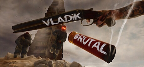
  • Genre Clarity: 7/10 — Action combat clear, setting ambiguous. The shotgun-as-title treatment, red glowing effect, and brutalist tower setting strongly signal action-oriented combat gameplay. At TINY size the gun silhouette and explosive visual language communicate 'shooter' or 'action' without confusion. However, the post-apocalyptic aesthetic with mutated creature silhouettes on the left reads as survival-horror adjacent rather than pure action, creating slight genre ambiguity about whether this is combat-focused or exploration-survival.
  • Title Readability: 6/10 — Title readable at full, loses clarity tiny. VLADIK is legible at full size in white serif letters overlaid on the shotgun barrel, and BRUTAL remains readable on the red banner below. At TINY size (120x45), the serif font compresses and the two-line title structure causes visual competition; BRUTAL becomes a small red shape that reads as secondary. The serif choice, while stylish, sacrifices compression clarity compared to sans-serif alternatives that maintain legibility at all scales.
  • Contrast & Color: 7/10 — Strong value separation, warm palette works. The warm brown-gold tower and ochre landscape read clearly against the cool gray-beige sky, creating decent value separation from Steam's dark background. The red glowing accents (eyes, BRUTAL banner) provide bright focal points. At TINY size the warm-cool split still registers, though fine details like the red glow and muzzle detail dissolve; the overall warm foreground vs. cool background contrast survives squinting and grayscale conversion reasonably well.
  • Uniqueness & Polish: 5/10 — Competent but derivative post-apocalypse. The shotgun-as-title treatment and brutalist tower are solid visual hooks, but the overall composition—weathered gun, mutant silhouettes, apocalyptic ruin—follows familiar post-apocalyptic action game tropes seen in Borderlands, Fallout, and Warhammer aesthetics. The craft is competent: lighting is coherent, the gun texture has detail, and the banner placement is intentional. However, there is no distinctive visual signature or unique mechanic communicated beyond 'mutant shooter,' keeping it in the competent-but-generic range.
  • Brand Consistency: 5/10 — No recognizable identity across frames. The capsule relies on a single-use visual hook (shotgun title overlay) with no recurring motif, character, or palette visible across hypothetical store screenshots or franchise identity. The warm ochre palette is generic to the genre. Internal coherence is solid—all elements fit a brutalist sci-fi aesthetic—but there is no memorable signature that would allow recognition of VLADiK from visual cues alone if the title were removed, which limits brand consistency scoring.
  • Composition: 6/10 — Clear focal point, safe margins respected. The shotgun barrel anchors the center as primary focal point, with the tower providing depth in the midground and mutants filling the left edge. The two-line title sits in safe horizontal space without edge clipping risk. At SMALL size the gun-title relationship reads cleanly; at TINY the tower becomes a vertical spike that competes slightly with the gun for attention. The composition is balanced but lacks dynamic depth layering—it feels flat horizontally despite the tower's vertical mass.

What works

  • Strong action genre signaling. The shotgun centerpiece with red glow and explosive setting immediately communicate combat-heavy gameplay.
  • Effective warm-cool contrast. Gold-brown foreground elements separate clearly from gray-blue sky, surviving TINY size and maintaining readability.
  • Safe title placement and margins. Both VLADIK and BRUTAL sit in protected zones without edge clipping or obscuration by action elements.

What hurts the capsule

  • Generic post-apocalypse aesthetic. The weathered gun, mutants, and brutalist tower follow familiar genre tropes without a distinctive visual signature or unique hook.
  • Serif font loses legibility at tiny. VLADIK's serif letterforms compress and blur at TINY size, reducing title impact compared to bold sans-serif alternatives.
  • Two-line title creates visual conflict. BRUTAL as a secondary banner competes with the primary gun focal point at small scales, diluting visual hierarchy.

Priority fixes

  1. [title_readability] Switch VLADIK to a heavy sans-serif or stencil font that maintains stroke weight and legibility below 120px width.
  2. [uniqueness_polish] Add a signature visual motif or character silhouette that recurs across marketing (e.g., a distinctive enemy type, mutation symbol, or protagonist pose) to create brand memorability.
  3. [composition] Consider moving BRUTAL text off the red banner onto the environment or removing it entirely to reduce focal point competition at SMALL and TINY sizes.
  4. [genre_clarity] Add one subtle UI element (ammo counter, mutation indicator, or HUD fragment) to clarify whether this is survival-focused or pure action-shooter.

Related guides

Steam app ID: 1316680 · Tags: FPS, Shooter, First-Person, Action, Dystopian