Scoring genre clarity...
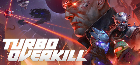
Turbo Overkill capsule

Turbo Overkill

Enter Paradise as Johnny Turbo—half-metal, half-human, all-murder machine. Clean up the streets with a chainsaw leg, 15+ weapons and your hovercar as you battle the rogue AI Syn, rival bounty hunters and cyberpunks aplenty. Apogee’s most outrageous FPS since Duke Nukem 3D. Good hunting, Sir!

$19.99Very Positive(49)
FPSBoomer ShooterAction
Trigger Happy InteractiveAug 11, 2023

Turbo Overkill scores 87/100 — better than 97% of FPS capsules (n=1,600).

Very Positive (49 reviews) · $19.99 · Released Aug 11, 2023 · By Trigger Happy Interactive

Quick text summary

Turbo Overkill scored 87/100 on Steam Analyzer — Excellent for a FPS capsule. Top priority fix: [composition] Consider slightly reducing opacity or size of secondary spacecraft to strengthen Johnny Turbo as the single clear focal point and reduce visual competition at small sizes.

Capsule scores by dimension

  • Genre Clarity: 9/10 — Cyberpunk action FPS instantly clear. The capsule unmistakably communicates a sci-fi action shooter through the protagonist's half-metal cyborg face, glowing neon orange/red laser lines, armed spacecraft, and explosive energy effects. At tiny size, the glowing red geometry and metallic character silhouette immediately signal a high-tech combat game with confident genre positioning. The visual language leaves no ambiguity about genre or tone.
  • Title Readability: 9/10 — Bold italic title dominates clearly. TURBO OVERKILL uses aggressive white italic letterforms with an angled outline that creates strong contrast against the darker background and fiery imagery. The title placement in the lower portion of the composition keeps it away from busy character details, and the thick strokes maintain legibility even at tiny thumbnail size. Strategic positioning and weight make it impossible to miss or misread.
  • Contrast & Color: 9/10 — Hot red-orange pops against dark. The dominant warm orange-red glow of laser lines, explosions, and character lighting creates excellent separation from the cool purple-dark space background and Steam's #1b2838 interface color. In grayscale, the bright value contrast between the neon effects and dark void remains strong, ensuring the focal elements punch through at all sizes. The silhouette of Johnny Turbo's profile and the geometric laser beams are crisp and unmistakable even at tiny scale.
  • Uniqueness & Polish: 8/10 — Retro-futuristic style with distinctive edge. The capsule captures a bold, unapologetic 90s arcade-meets-modern-indie aesthetic that mirrors Apogee's Duke Nukem legacy while maintaining contemporary polish. The half-cyborg character design, neon laser geometry, and dynamic particle effects convey a playful, over-the-top personality that differentiates it from generic sci-fi shooters. While the execution is excellent, the visual approach draws from established cyberpunk tropes rather than inventing entirely new ground.
  • Brand Consistency: 8/10 — Cohesive retro-futuristic identity. The capsule establishes a clear visual identity through consistent use of warm neon lighting, geometric laser effects, metallic character rendering, and a recognizable protagonist silhouette that reinforces Johnny Turbo's memorable design. The white italic typography and neon color palette create an iconic look that feels proprietary to Turbo Overkill and should be recognizable in store screenshots and promotional materials. The retro-arcade energy and chromatic glow effects form a distinctive house style without feeling derivative.
  • Composition: 9/10 — Strategic focal hierarchy with depth. The composition places Johnny Turbo's profile as the dominant left-center focal point, with supporting spacecraft and geometric elements creating depth layers that guide the eye without competing for attention. The title anchors the bottom-right negative space while laser lines create dynamic leading lines that connect the character to action. At small and tiny sizes, the clear silhouette of the protagonist and bold neon geometry maintain strong visual hierarchy without clutter or edge crowding.

What works

  • Genre immediately recognizable. Cyberpunk action shooter identity is unmistakable from the cyborg character, neon lasers, and armed spacecraft, requiring no context to understand gameplay intent.
  • Title legible at all scales. White italic TURBO OVERKILL maintains crisp readability even at tiny thumbnail size through bold strokes, high contrast, and strategic placement away from busy details.
  • Vibrant contrast pops on dark background. Hot orange-red neon effects create excellent separation from the cool purple void and Steam's dark interface, ensuring strong visual impact in quick scrolling.
  • Distinctive personality and polish. The retro-futuristic aesthetic, chromatic neon effects, and recognizable protagonist create a memorable brand identity that stands out among generic sci-fi shooters.

What hurts the capsule

  • Dense particle and detail layering. The abundance of glowing lines, spacecraft, and character details creates visual complexity that could feel cluttered on very small displays, though hierarchy mostly holds.
  • Secondary spacecraft compete slightly for attention. While the protagonist is clearly primary, the armed drone and opposing ships in the composition could be subordinated further to strengthen singular focal dominance.

Priority fixes

  1. [composition] Consider slightly reducing opacity or size of secondary spacecraft to strengthen Johnny Turbo as the single clear focal point and reduce visual competition at small sizes.
  2. [uniqueness_polish] Ensure game screenshots reinforce the neon laser and retro-futuristic identity established in the capsule to maintain consistent brand recognition across store presence.

Store copy priority fixes

  1. [feature_communication] Move the detailed gameplay section ("Turbo Time, wall-running...") earlier, immediately after the opening character description, to reward skimmers with feature details before review quotes.
  2. [uniqueness] Expand the comparison to Tony Hawk (referenced only in the Fanbyte quote) into the main copy to explain how wall-running and movement mechanics differentiate this from other boomer shooters.
  3. [audience_targeting] Explicitly mention speedrunning or skill-based progression early in the detailed description to confirm that the game targets experienced action players, not general audiences.

Related guides

Steam app ID: 1328350 · Tags: FPS, Boomer Shooter, Action, Shooter, Cyberpunk