Scoring genre clarity...
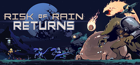
Risk of Rain Returns capsule

Risk of Rain Returns

Carefully designed, beautifully remastered, and loaded with new ways to play—Risk of Rain is back and better than ever! Dive into the iconic roguelike full of unique loot combinations, enhanced with new Survivors, overhauled multiplayer, fan favorite content from Risk of Rain 2, and more!

$7.49Very Positive(49)
Action RoguelikeOnline Co-OpMultiplayer
Hopoo GamesNov 8, 2023

Risk of Rain Returns scores 75/100 — better than 68% of Action Roguelike capsules (n=1,730).

Very Positive (49 reviews) · $7.49 · Released Nov 8, 2023 · By Hopoo Games

Quick text summary

Risk of Rain Returns scored 75/100 on Steam Analyzer — Good for a Action Roguelike capsule. Top priority fix: [title_readability] Increase title outline thickness and letter spacing by 5–10% to maintain crispness at thumbnail scale (120x45) without obscuring starfield background.

Capsule scores by dimension

  • Genre Clarity: 8/10 — Clear action roguelike identity. The capsule effectively communicates an action-focused sci-fi game through the armed soldier silhouette, heavy weaponry, and alien/technological enemies in the foreground. At tiny size, the combat-ready pose and military aesthetic remain readable, though the roguelike-specific elements (loot variety, procedural nature) are not visually distinct—this is expected for the genre but limits perfect clarity.
  • Title Readability: 7/10 — Bold title, minor size challenges. The title 'RISK OF RAIN RETURNS' uses a strong geometric sans-serif with good letter spacing and decent contrast against the dark starfield background. At small size it remains legible, but at tiny size (120x45) the letter forms compress slightly and lose crispness; the two-line layout helps but the overall readability drops below excellent threshold.
  • Contrast & Color: 8/10 — Strong value separation, warm tones pop. The warm peachy-orange character tones and bright white title create excellent silhouette separation against the cool dark blue starfield and navy background. The grayscale test shows clear light-dark distinction between foreground subjects and background, with solid edge definition even at small size; however, some mid-tone blending in the creature details softens contrast slightly at tiny scale.
  • Uniqueness & Polish: 7/10 — Polished but genre-familiar composition. The capsule demonstrates clean craft with layered depth, intentional character posing, and a cohesive sci-fi aesthetic that matches AAA action standards. The alien character design and weapon details show care, but the overall composition—character-forward, action stance, enemy horde backdrop—follows common action game capsule patterns; without unique visual hooks or story beats, it reads as well-executed rather than standout.
  • Brand Consistency: 7/10 — Consistent style, recognizable franchise tone. The capsule maintains visual cohesion with a unified color palette (warm flesh tones, cool blues, metallic accents) and consistent pixel-art-influenced rendering style that aligns with Risk of Rain's established aesthetic. The title treatment and character design are recognizable as the franchise, though without iconic character faces, mascots, or signature motifs that would create instant recognition at future encounters.
  • Composition: 8/10 — Balanced hierarchy, strong focal point. The composition uses effective depth layering with the armed soldier as the dominant central figure, background creatures providing scale and genre context, and a starfield setting that grounds without overwhelming. The title sits cleanly in the upper-left quadrant with safe margins; at small and tiny sizes the soldier remains the clear focal point, though the right-side character details (arm/weapon) extend near the margin and could risk cropping on some platform variations.

What works

  • Excellent silhouette readability. The soldier and weapon profile stand out clearly against the dark background even at tiny size, with strong light-dark contrast that aids quick recognition during scrolling.
  • Layered depth and spatial hierarchy. The foreground character, midground creatures, and starfield background create clear visual separation that gives the capsule cinematic depth and guides the eye effectively.
  • Title placement and contrast. The geometric sans-serif title sits on a controlled background region with good letter spacing and maintains reasonable legibility at small sizes without being obscured by noise.
  • Genre-appropriate aesthetic polish. The overall craft quality, character rendering, and color harmony match AAA action game standards and reinforce professional presentation.

What hurts the capsule

  • Title loses sharpness at tiny size. The two-line text compresses and fine letterforms become less crisp at 120x45 thumbnail scale, slightly hurting immediate recognition during quick scroll.
  • Limited unique visual identity. The capsule relies on genre-standard composition (soldier + enemies + sci-fi backdrop) without distinctive brand hooks, iconic characters, or narrative storytelling that would differentiate it from competitors.
  • Right-edge element risk. The character arm and weapon details on the right side sit close to the margin and could be partially cropped on certain platform variations, reducing compositional resilience.

Priority fixes

  1. [title_readability] Increase title outline thickness and letter spacing by 5–10% to maintain crispness at thumbnail scale (120x45) without obscuring starfield background.
  2. [uniqueness_polish] Add a signature visual motif or color accent that uniquely identifies Risk of Rain Returns (e.g., iconic item glow, franchise symbol, or narrative moment) to differentiate from generic action game capsules.
  3. [composition] Tighten right-side character framing by 10–15px to ensure weapon and arm details remain fully visible under standard Steam crop margins and improve safety.

Store copy priority fixes

  1. [hook_strength] Replace "loaded with new ways to play" in the short description with a specific, concrete feature: e.g., "...with 15 unique Survivors, game-changing Artifacts, and dynamic loot synergies that create wildly different runs."
  2. [uniqueness] Add a 1-2 sentence clarification of what Returns offers compared to Risk of Rain 2: is it a return to the original 2D formula, a content bridge, or a definitive collection? State this explicitly early in the detailed description.
  3. [feature_communication] Insert a brief sentence about progression or meta goals after describing the loot system: e.g., "Master each Survivor's strengths to unlock new abilities and advance through increasingly challenging tiers."
  4. [audience_targeting] Add a sentence signaling solo vs. group appeal balance early in the copy, e.g., "Whether you're speedrunning solo or coordinating a four-player squad, every choice shapes your survival." This reorients dual targeting.

Related guides

Steam app ID: 1337520 · Tags: Action Roguelike, Online Co-Op, Multiplayer, 2D, PvE