Scoring genre clarity...
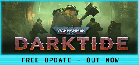
Warhammer 40,000: Darktide capsule

Warhammer 40,000: Darktide

Take back the city of Tertium from hordes of bloodthirsty foes in this intense and brutal action shooter. Warhammer 40,000: Darktide is the new co-op focused experience from the award-winning team behind the Vermintide series. As Tertium falls, Rejects Will Rise.

$9.99Mostly Positive(1,015)
Co-opPvEFPS
FatsharkNov 30, 2022

Warhammer 40,000: Darktide scores 87/100 — better than 95% of Co-op capsules (n=2,336).

Mostly Positive (1,015 reviews) · $9.99 · Released Nov 30, 2022 · By Fatshark

Quick text summary

Warhammer 40,000: Darktide scored 87/100 on Steam Analyzer — Excellent for a Co-op capsule. Top priority fix: [contrast_color] Deepen background charcoal value to near-black #0a0e1a to maximize separation of armor and glow elements at thumbnail size

Capsule scores by dimension

  • Genre Clarity: 9/10 — Grim grimdark shooter instantly clear. The armored Space Marine with glowing blue weapon effects, heavily weathered power armor, and hostile horde composition immediately communicates Warhammer 40K action combat. At TINY size, the iconic silhouette, orange-red debris spray, and military sci-fi aesthetic remain unmistakable, clearly signaling brutal co-op shooter gameplay.
  • Title Readability: 9/10 — Bold metallic text pops cleanly. DARKTIDE logo uses bold, distinct serif lettering with warm orange-red metallic treatment that separates cleanly from the dark background. At SMALL and TINY sizes, the logo remains fully readable with strong letterform definition; the WARHAMMER header above provides context without competing for attention.
  • Contrast & Color: 9/10 — Excellent value separation throughout. The warm orange-red armor and glowing cyan weapon effects create strong contrast against the dark charcoal background, with multiple layers of light separation. In grayscale, the bright mid-tones of armor and glows maintain clear silhouettes; the composition uses backlighting and radiating red spikes to define edges powerfully at all sizes.
  • Uniqueness & Polish: 8/10 — Premium grimdark aesthetic distinctive. The composition shows intentional cinematic staging with dynamic pose, gritty weathered details, and thematic glowing weaponry that communicates Warhammer 40K identity clearly. While grimdark action is genre-expected, the specific execution with radiating destruction spikes, squad layering, and meticulous armor detailing demonstrates high craft polish and visual storytelling of brutal urban combat.
  • Brand Consistency: 8/10 — Strong Warhammer 40K visual language. The capsule reinforces Warhammer franchise identity through iconic Space Marine proportions, gothic architecture hints, glowing blue plasma effects, and orange-rust decay aesthetic. The Warhammer 40K branding treatment is consistent with franchise visual expectations; the color palette and grimdark atmosphere would be recognizable to series fans without generic sci-fi ambiguity.
  • Composition: 9/10 — Excellent focal hierarchy layered depth. The lead Space Marine occupies prime center-upper space with supporting squad members arranged in dynamic depth, guiding eyes naturally through layers. At SMALL and TINY sizes the primary armored figure remains unambiguous; safe margins protect the logo placement, and the radiating spike composition adds visual energy without cluttering critical areas or edge-cropping important elements.

What works

  • Iconic Space Marine silhouette. Immediately recognizable armor proportions and pose communicate Warhammer 40K identity and heavy shooter gameplay at all viewing sizes.
  • Strong warm-cool color contrast. Orange-red metallic armor and cyan plasma effects create visual pop against dark background with excellent silhouette separation in grayscale.
  • Clean, readable typography. DARKTIDE and WARHAMMER text maintain full legibility at tiny size with bold metallic treatment and strategic placement avoiding texture interference.
  • Layered compositional depth. Squad members in background create natural depth hierarchy that keeps focus on lead character while suggesting co-op gameplay at all scales.

What hurts the capsule

  • Dense detail complexity. Multiple armor panels, weapon effects, and squad members create visual busyness that may reduce impact during quick scrolls despite maintaining readability.
  • Slight mid-tone saturation. The charcoal background, while appropriately dark, sits in mid-tone range that could be slightly deeper to maximize contrast separation at smallest sizes.

Priority fixes

  1. [contrast_color] Deepen background charcoal value to near-black #0a0e1a to maximize separation of armor and glow elements at thumbnail size
  2. [composition] Ensure the radiating red spike effects remain clear at TINY size by slightly reducing particle density or increasing opacity contrast

Store copy priority fixes

  1. [feature_communication] Remove the verbatim repetition of the short description at the start of the detailed description; use that space to explain progression systems, gear mechanics, or provide 2–3 specific examples of mutator conditions that players will encounter.
  2. [uniqueness] Rewrite the Vermintide legacy section to emphasize what Darktide innovates beyond melee—e.g., 'Built on Vermintide 2's melee mastery, Darktide pioneers [specific 40K-unique system], creating a [specific gameplay difference].'
  3. [feature_communication] Expand the mutator paragraph with concrete examples: 'Adapt to conditions like [example mutator 1], [example mutator 2], forcing your team to rethink strategy and loadouts mid-mission.'
  4. [audience_targeting] Add a sentence about solo vs. squad expectations early in detailed description—e.g., 'Darktide is designed for squad play; the cooperative mechanics reward coordinated teams and actively punish lone wolves.'

Related guides

Steam app ID: 1361210 · Tags: Co-op, PvE, FPS, Class-Based, Combat