Scoring genre clarity...
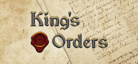
King's Orders capsule

King's Orders

King's Orders is a simplified historical strategy game with an important innovation. You command your armies by sending letters with orders. Messengers with these letters travel the land and can be lost or intercepted. Generals execute orders upon receipt and send you reports the same dangerous way.

$6.44Mostly Positive(12)
MilitaryPoliticalTactical
AFTERLIFE👻Oct 25, 2024

King's Orders scores 73/100 — better than 63% of Military capsules (n=534).

Mostly Positive (12 reviews) · $6.44 · Released Oct 25, 2024 · By AFTERLIFE👻

Quick text summary

King's Orders scored 73/100 on Steam Analyzer — Good for a Military capsule. Top priority fix: [genre_clarity] Add a subtle visual element that hints at the unique messenger/letter mechanic (e.g., a wax seal, rolled letter, or messenger silhouette) to differentiate from generic historical strategy games.

Capsule scores by dimension

  • Genre Clarity: 7/10 — Historical strategy evident with map. The parchment map background with territorial divisions and the ornate crown icon clearly signal a historical strategy game. At TINY size, the map texture and crown remain recognizable enough to suggest the genre, though the specific messenger-based mechanic is not visually apparent from this capsule alone. The warm medieval aesthetic supports genre expectations.
  • Title Readability: 8/10 — Strong legibility with metallic styling. The title 'King's Orders' uses a metallic blue-silver font with red embossed outlines that contrasts well against the orange parchment background. The text remains readable at SMALL size (231x87) with clear letter forms. At TINY size (120x45) the title becomes slightly soft but still decipherable due to the outline weight and value contrast against the background.
  • Contrast & Color: 8/10 — Warm palette pops against dark background. The orange-gold parchment, red territorial borders, and metallic blue title create strong warm-to-cool separation that stands out clearly against the dark Steam background (#1b2838). The saturated reds and golds maintain high visual separation even in grayscale, with the metallic text providing additional edge definition. At TINY size the warm mass still reads as a cohesive focal point.
  • Uniqueness & Polish: 7/10 — Polished historical aesthetic, moderate uniqueness. The parchment map treatment and ornamental crown create a premium, intentional feel consistent with the historical strategy theme. However, the visual approach is somewhat familiar within the strategy genre—aged maps and royal iconography are established tropes. The capsule executes this well but does not strongly communicate the game's unique innovation (messenger-based order delivery system), which would differentiate it from similar titles.
  • Brand Consistency: 7/10 — Cohesive medieval aesthetic throughout. The capsule establishes a consistent visual identity through the parchment texture, metallic typography, and heraldic crown symbol. The warm color palette and ornamental design language align with historical strategy expectations. Internal elements (text styling, decorative borders, symbolic crown) work together coherently, though without a truly distinctive signature element that would make this unmistakable on repeat viewing compared to other medieval strategy games.
  • Composition: 7/10 — Clear hierarchy with centered focal point. The title text is prominently centered with the decorative crown positioned as a supporting emblem below, creating a clear visual hierarchy. The map texture fills the background effectively without overwhelming the primary text. Safe margins are maintained around the title area, though the ornate borders edge close to the frame at full size—at SMALL and TINY sizes the core elements (title and crown) remain well-positioned within safe zones.

What works

  • Metallic text contrast. The blue-silver with red outline typography reads clearly at all sizes and pops well against the warm background.
  • Thematic parchment design. The aged map texture and ornamental borders immediately establish historical strategy context without requiring gameplay knowledge.
  • Warm-cool color harmony. Orange-gold parchment combined with cool metallic text and red accents creates visual interest that maintains separation against the dark Steam background.
  • Readable at scale. Core elements (title and crown emblem) remain comprehensible even at TINY thumbnail size due to weight and outline treatment.

What hurts the capsule

  • Generic strategy presentation. The aged parchment and crown motif are familiar within the strategy genre and do not visually communicate the unique messenger-delivery mechanic that differentiates this game.
  • Ornamental borders compete visually. The complex decorative vine and ribbon borders, while thematic, add visual noise that slightly dilutes the focus from the title at smaller sizes.
  • No distinctive brand signature. Unlike top-performing peers, the capsule lacks a memorable icon, color combination, or visual motif that would be instantly recognizable on repeat viewings.

Priority fixes

  1. [genre_clarity] Add a subtle visual element that hints at the unique messenger/letter mechanic (e.g., a wax seal, rolled letter, or messenger silhouette) to differentiate from generic historical strategy games.
  2. [uniqueness_polish] Simplify or refine the ornamental borders to reduce visual competition and increase perceived polish, allowing the title to command stronger focus.
  3. [brand_consistency] Develop a signature icon or motif (e.g., a stylized seal or messenger emblem) that appears consistently across promotional materials to build recognizable brand identity.

Related guides

Steam app ID: 1369690 · Tags: Military, Political, Tactical, War, Strategy