Scoring genre clarity...
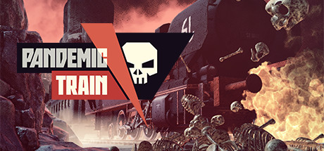
Pandemic Train capsule

Pandemic Train

In Pandemic Train you are in charge of the crew aboard a train roaming the postapocalyptic wasteland, ravaged by both war and a deadly plague. Your goal is to survive long enough to discover the cure… or die trying. Humanity’s fate is in your hands! Start your journey now!

$3.39Mixed(233)
SurvivalTrainsAtmospheric
Trigger LabsOct 18, 2023

Pandemic Train scores 70/100 — better than 31% of Survival capsules (n=1,907).

Mixed (233 reviews) · $3.39 · Released Oct 18, 2023 · By Trigger Labs

Quick text summary

Pandemic Train scored 70/100 on Steam Analyzer — Good for a Survival capsule. Top priority fix: [uniqueness_polish] Add a visual signature element that distinguishes the train crew or management mechanic—such as a unique character silhouette, cargo indicator, or UI hint that sets it apart from standard post-apocalyptic games.

Capsule scores by dimension

  • Genre Clarity: 7/10 — Post-apocalyptic action clear. The skull icon, burning wreckage, skeletal figures, and war-torn industrial setting immediately signal post-apocalyptic action-survival. The train as a central asset suggests a unique management survival angle distinct from typical shooters. At TINY size, the skull emblem and fiery atmosphere still read as hostile survival, though the management simulation aspect is less obvious.
  • Title Readability: 8/10 — Bold, high-contrast legible. PANDEMIC TRAIN uses chunky white sans-serif lettering on a bold red-orange angular banner, creating strong contrast against the dark background and busy scene. The title maintains clarity at SMALL size with clean letter spacing and no decorative collapse. At TINY size it compresses but remains readable due to weight and value separation from the background.
  • Contrast & Color: 8/10 — Strong warm-dark separation. The orange-red gradient dominates the upper half with bright fire and light sources that pop sharply against the dark #1b2838 background and murky ruins. Skull emblem in cream white stands out crisply; skeletal figures below have distinct silhouettes against burnt orange and darker tones. Grayscale squint test holds well—light sources and title remain separated from mid-tone wreckage.
  • Uniqueness & Polish: 6/10 — Competent but genre-familiar. The post-apocalyptic train concept with plague-survival framing is thematically distinct, but the visual execution follows familiar post-apocalyptic game visual language: burning ruins, skulls, skeletal imagery, industrial decay. The skull badge and angular red banner show intentional graphic design, but the overall mood and aesthetic feel derivative of established post-apocalyptic titles rather than visually distinctive.
  • Brand Consistency: 6/10 — Consistent internal palette. The capsule maintains a cohesive warm-toned (orange-red-brown), desaturated palette with consistent rendering of industrial ruins and period-appropriate assets. The skull motif and angular red banner serve as identity anchors, but without access to the full game visual language, these feel functional rather than iconic or uniquely memorable as a franchise marker.
  • Composition: 7/10 — Clear hierarchy, balanced layout. The red angular banner with title sits prominently in upper-center with the skull badge anchoring the right; the burning train dominates center-left with skeletal figures below creating foreground interest. Focal point is clear and layered from background ruins through midground train to foreground figures. At SMALL and TINY sizes the composition remains readable, though the bottom-right skull badge competes slightly for attention at tiny sizes.

What works

  • High-impact title treatment. Chunky white lettering on bold red-orange banner delivers immediate readability and visual punch that holds even at TINY thumbnail size.
  • Strong value contrast. Bright warm fire and light sources create distinct separation from dark background and supporting elements, ensuring silhouettes read clearly in quick-scroll conditions.
  • Thematic visual storytelling. Train, ruins, fire, skeletal imagery, and skull motif work together to communicate post-apocalyptic survival without ambiguity about subject matter or tone.

What hurts the capsule

  • Generic post-apocalyptic aesthetic. While competently executed, the skull, fire, and industrial decay imagery closely mirror established genre conventions and lack a distinctive visual hook or memorable identity.
  • Management simulation angle underplayed. The capsule emphasizes action-survival atmosphere rather than communicating the unique crew-management or strategic decision-making aspects that differentiate it in the crowded genre.
  • Skull badge position clutter. The cream-colored skull emblem in the upper right competes with the title for focus and can feel scattered at small-to-medium sizes rather than supporting a clear primary focal point.

Priority fixes

  1. [uniqueness_polish] Add a visual signature element that distinguishes the train crew or management mechanic—such as a unique character silhouette, cargo indicator, or UI hint that sets it apart from standard post-apocalyptic games.
  2. [composition] Reposition or scale the skull badge to strengthen focal hierarchy; consider anchoring it as a secondary accent below or integrated into the banner rather than floating upper-right.
  3. [genre_clarity] Include a subtle management or crew-based visual cue (e.g., small character portraits or supply indicator) to hint at the simulation-strategy layer and differentiate from pure action titles.

Related guides

Steam app ID: 1379600 · Tags: Survival, Trains, Atmospheric, Strategy, Singleplayer