Scoring genre clarity...
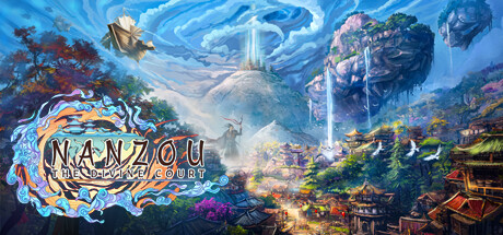
Nanzou: The Divine Court capsule

Nanzou: The Divine Court

Nanzou: The Divine Court is a genre-mixing city builder set in a dynamic world inspired by Chinese mythology. As the Exceptional Soul summoned by the Emperor of the Divine Court, you'll manage souls to carry out divine commands on the mystical floating island of Nanzou.

BuildingStrategyHistorical
Live Motion GamesComing soon

Nanzou: The Divine Court scores 78/100 — better than 78% of Building capsules (n=1,528).

Released Coming soon · By Live Motion Games

Quick text summary

Nanzou: The Divine Court scored 78/100 on Steam Analyzer — Good for a Building capsule. Top priority fix: [genre_clarity] Add subtle city management UI elements (grid overlay, building silhouettes, or soul/resource icons) to the landscape to immediately signal strategy/builder gameplay at small sizes.

Capsule scores by dimension

  • Genre Clarity: 7/10 — Mythological setting, genre ambiguous. The Chinese mythology aesthetic with floating islands, pagodas, and divine architecture clearly signals a fantasy or strategy setting, but the city-builder aspect is not immediately obvious from the landscape alone. At tiny size, the ornate environment and architectural complexity suggest strategy or management, though the flying bird and sweeping sky could read as action-adventure instead. The decorative UI logo helps anchor the game identity but doesn't strongly communicate 'city builder' mechanics.
  • Title Readability: 8/10 — Logo readable, subtitle challenging small. The 'NANZOU' title in the ornate white and blue circular badge is clearly readable at full, small, and even tiny sizes due to strong contrast against the lighter logo background and strategic center placement. The subtitle 'THE DIVINE COURT' in smaller text becomes difficult at tiny size but does not critically impair recognition since the main logo carries the brand. The logo itself maintains structural integrity at all viewing sizes with its bold outline and centered design.
  • Contrast & Color: 8/10 — Strong light values, good silhouette. The bright white and gold-accented title logo pops strongly against the mid-blue sky and darker landscape foreground, creating excellent value separation. The floating islands and pagodas benefit from warm orange and green color accents that stand out against the cool blue atmosphere, maintaining readability in grayscale. The composition relies on atmospheric perspective with lighter sky behind and darker structures below, which holds up well at small and tiny sizes, though some mid-tone vegetation detail softens slightly in the background.
  • Uniqueness & Polish: 8/10 — Premium art direction, distinctive aesthetic. The hand-painted illustration style with soft atmospheric lighting and detailed Chinese architectural elements creates a premium, cohesive visual identity that stands apart from typical strategy game capsules. The floating island concept, divine court theme, and specific color palette of teals, golds, and magentas signal a carefully crafted world rather than generic fantasy. The ornate logo badge itself is a strong branding element that communicates quality and intentional design polish.
  • Brand Consistency: 8/10 — Coherent mythology theme, iconic logo. The entire composition reinforces Chinese divine mythology through consistent architectural style, color warmth in the lower city contrasting cool sky, and mystical atmospheric effects. The ornate circular badge logo with its flowing blue and golden accents is a distinctive identity marker that would be recognizable across marketing materials. The bird silhouette in the upper left and the overall painting style create a unified, recognizable brand voice without feeling generic or borrowed.
  • Composition: 8/10 — Balanced focal points, clear depth layers. The composition uses effective depth layering: cool blue sky and clouds (background), floating islands and structures (midground), and warm city details with purple and orange accents (foreground), guiding the eye naturally. The title logo is positioned slightly left-of-center in the upper-middle area, avoiding clutter while the landscape breathes below it. At small and tiny sizes, the logo remains the primary focal point with the landscape providing context; the flying bird adds secondary interest without overwhelming the title.

What works

  • Ornate logo stands out at all sizes. The circular badge with white and blue coloring reads clearly from full size down to tiny thumbnails due to strong contrast and compact design.
  • Premium atmospheric illustration style. Hand-painted aesthetic with soft lighting, detailed architecture, and layered depth creates a distinctive, high-quality visual that differentiates from generic strategy game templates.
  • Color palette reinforces mythology theme. Cool blues in the sky contrast with warm oranges and golds in the city below, supported by mystical magentas and greens that signal the divine court setting.
  • Effective depth and focal hierarchy. Clear background-midground-foreground separation with the logo anchoring the composition while landscape elements support without competing for attention.

What hurts the capsule

  • Genre ambiguity at tiny size. While the setting is clear, the city-builder/strategy mechanics are not visually emphasized; the landscape alone could suggest action or adventure games instead.
  • Subtitle becomes illegible at thumbnail. The 'THE DIVINE COURT' text is too small to read comfortably at tiny viewing sizes, relying solely on the main logo for recognition.
  • Busy landscape details soften clarity. Multiple architectural elements and vegetation in the midground create visual complexity that reduces contrast clarity when squinting or viewing at thumbnail scale.

Priority fixes

  1. [genre_clarity] Add subtle city management UI elements (grid overlay, building silhouettes, or soul/resource icons) to the landscape to immediately signal strategy/builder gameplay at small sizes.
  2. [title_readability] Increase outline thickness or add a subtle dark shadow behind the subtitle text to improve legibility at thumbnail size without altering the logo's premium aesthetic.
  3. [contrast_color] Darken or desaturate mid-tone vegetation in the midground slightly to increase overall value separation and ensure the landscape reads cleanly at tiny size.

Store copy priority fixes

  1. [feature_communication] Dedicate 1–2 sentences in the detailed description to explaining the 'soul management' mechanic: what role souls play in city building, combat, or diplomacy, and how this core pillar differs from traditional city management.
  2. [uniqueness] Add a sentence that explicitly differentiates Nanzou from other Chinese-themed or mythology-inspired strategy games—e.g., 'the only city builder where procedurally generated allies actively reshape your world' or a specific mechanical innovation.
  3. [tone_match] Reduce or remove corporate marketing phrases like 'Magnificent genre mix!' and 'Simple Rules, Complex Interactions,' replacing them with in-world or narrative-driven explanations that maintain the mystical voice established in the opening.
  4. [hook_strength] Rewrite the short description opening to lead with a specific gameplay payoff rather than lore: e.g., 'Build a city, command mythical heroes, and defend against sieges on the mystical floating island of Nanzou' to immediately engage strategic players.

Related guides

Steam app ID: 1390760 · Tags: Building, Strategy, Historical, Simulation, Tactical