Scoring genre clarity...

Umami Grove capsule

Umami Grove

A deliciously interactive VR journey awaits! Jump, climb, duck, and swing through vibrant worlds on a quest to help cute characters gather luscious ingredients and create mouthwatering dishes—hands-on!

$19.99Positive(37)
First-PersonColorfulCooking
Pomshine GamesApr 24, 2025

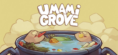
Umami Grove scores 72/100 — better than 49% of First-Person capsules (n=4,392).

Positive (37 reviews) · $19.99 · Released Apr 24, 2025 · By Pomshine Games

Quick text summary

Umami Grove scored 72/100 on Steam Analyzer — Good for a First-Person capsule. Top priority fix: [contrast_color] Increase value separation by darkening the vessel rim or adding a deeper shadow beneath the pot to create a stronger silhouette that pops at TINY size.

Capsule scores by dimension

  • Genre Clarity: 7/10 — Casual adventure with food theme. The vibrant, whimsical art style with cute character hands in a cooking pot clearly signals casual/family-friendly adventure gameplay. The food ingredients visible (vegetables, items in water) and cooking vessel directly communicate the culinary theme. However, at TINY size, the specific VR interaction and platforming mechanics (jumping, climbing, swinging) are not clearly telegraphed—it reads more as a cooking game than an action-adventure with movement challenges.
  • Title Readability: 8/10 — Bold, readable title with good contrast. The 'UMAMI GROVE' title uses thick outlined lettering in brown/tan with white fill, positioned prominently across the top center against a pale background. The letterforms remain legible even at SMALL size due to the strong outline weight and spacing. At TINY size there is minor collapse of fine details in the outline, but the title silhouette remains recognizable.
  • Contrast & Color: 7/10 — Warm palette reads well against dark Steam background. The warm cream, tan, and blue color scheme creates good separation from Steam's dark #1b2838 background. The blue water and darker vessel provide mid-tone anchoring. However, the entire composition skews toward warm pastels, which reduces dramatic value separation; a quick scroll shows it as a warm blob rather than a sharp silhouette. The grayscale test shows adequate but not exceptional contrast.
  • Uniqueness & Polish: 7/10 — Charming art style with cohesive visual identity. The soft, hand-drawn aesthetic with rounded forms, warm color palette, and cute character design creates a distinctive and polished feel compared to generic adventure games. The composition of hands interacting with a cooking pot is visually memorable and directly tied to gameplay. The execution shows intentional craft, though it does not reach the level of standout premium polish seen in top-tier indie titles like DREDGE or Harold Halibut.
  • Brand Consistency: 7/10 — Consistent warm aesthetic with character focus. The capsule establishes a recognizable soft, warm art direction with friendly proportions and a cohesive color palette centered on cream, tan, and blue tones. The cute character hands and food-centered imagery create a memorable brand hook tied to the cooking/gathering mechanic. Without cross-referencing all 15 store screenshots, the internal consistency within this capsule is strong, though the identity may benefit from more distinctive iconography or a signature character silhouette.
  • Composition: 7/10 — Clear focal point with good balance. The cooking pot with hands and ingredients occupies the center-lower portion of the frame as the primary focal point, while the title anchors the top, creating a top-to-bottom hierarchy. Cloud elements frame the sides softly without clutter. At SMALL and TINY sizes, the pot and hands remain the clear subject, and the layout avoids edge-hugging. The only minor weakness is that at TINY size the secondary ingredients and details within the pot become muddled, reducing visual hierarchy clarity.

What works

  • Strong title legibility. Thick outlined letterforms with good contrast and spacing maintain readability even as the capsule scales down to small sizes.
  • Memorable visual concept. The hands-in-pot composition paired with food ingredients communicates the core cooking and gathering mechanic immediately and creates a distinctive brand image.
  • Cohesive warm color palette. Consistent use of cream, tan, and blue tones creates a unified, friendly aesthetic that appeals to the casual audience and stands out against the dark Steam background.
  • Clear focal point hierarchy. The pot and hands occupy the visual center and remain the primary subject at all viewing sizes without competing secondary elements.

What hurts the capsule

  • VR and platforming mechanics unclear. The capsule emphasizes cooking and gathering but does not visually communicate the jumping, climbing, and swinging action elements described in the game summary.
  • Limited value contrast. The warm palette reads as a soft, cohesive blob rather than a high-contrast silhouette; grayscale conversion shows mid-tone saturation that reduces pop against the dark Steam background.
  • Interior pot detail becomes muddy at tiny size. Ingredients and water details within the vessel lose clarity at TINY viewing size, reducing visual interest at the most critical thumbnail scale.

Priority fixes

  1. [contrast_color] Increase value separation by darkening the vessel rim or adding a deeper shadow beneath the pot to create a stronger silhouette that pops at TINY size.
  2. [genre_clarity] Incorporate a subtle visual cue of motion or action (arc, dust, dynamic pose) to signal the platforming/jumping mechanic alongside the cooking theme.
  3. [composition] Reduce internal detail complexity within the pot; simplify ingredient shapes to maintain clarity at TINY scale while keeping the focal point striking.

Store copy priority fixes

  1. [feature_communication] Add 1–2 sentences explaining the cooking loop: how recipes are unlocked, what the progression looks like, and how cooking ties into world exploration or NPC rewards.
  2. [audience_targeting] Insert a brief line about VR comfort and accessibility: 'Designed for VR players of all experience levels with [X locomotion options]' or similar.
  3. [uniqueness] Reframe the cooking-platformer connection with a stronger differentiator, such as 'the only VR game where [specific mechanic] combines cooking puzzles with parkour exploration' to clarify why this blend matters.
  4. [feature_communication] Expand the 'Overcome challenges' bullet to specify challenge types: are they environmental puzzles, timed cooking tasks, physics-based obstacles, or a mix?

Related guides

Steam app ID: 1394470 · Tags: First-Person, Colorful, Cooking, Casual, VR