Scoring genre clarity...
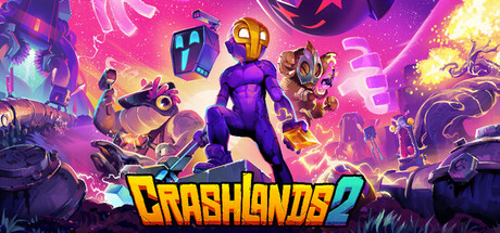
Slap your way across a vibrant world where interstellar friendships are the key to your survival. Befriend eccentric aliens, craft bizarre weaponry, and stick it to the man in this sequel to the award-winning Action RPG Crashlands.
$14.99Very Positive(22)
ActionCozyRPG
Butterscotch ShenanigansApr 10, 2025