Scoring genre clarity...

Syder Reloaded capsule

Syder Reloaded

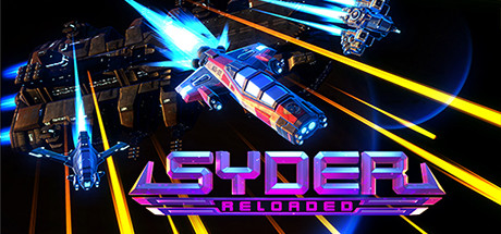
Syder Reloaded revives the Syder series in this love-letter to 90s Amiga shmups with upgraded graphics and refined gameplay. Challenging levels, a fleet of ships and a motherload of alien invaders. Get back to your roots and curse at your monitor in this skills-first shooter.

$11.99Positive(23)
IndieActionShoot 'Em Up
Studio EvilApr 9, 2025

Syder Reloaded scores 78/100 — better than 85% of Indie capsules (n=11,449).

Positive (23 reviews) · $11.99 · Released Apr 9, 2025 · By Studio Evil

Quick text summary

Syder Reloaded scored 78/100 on Steam Analyzer — Good for a Indie capsule. Top priority fix: [composition] Inset the top-right enemy ship further from the edge to ensure safe margin and protect against Steam layout shifts.

Capsule scores by dimension

  • Genre Clarity: 8/10 — Classic shmup DNA clear. The diagonal spaceship formation, bright energy beams, and fast-moving projectiles immediately signal a shoot-em-up arcade experience. At tiny size, the neon glow and layered ship silhouettes still read as high-speed action, though the specific retro-90s Amiga nostalgia angle requires full-size context to fully land.
  • Title Readability: 8/10 — Bold neon logo legible. The magenta and cyan 'SYDER RELOADED' logo is thick, well-outlined, and maintains strong contrast against the dark background with the secondary line providing hierarchy. At small and tiny sizes the logo remains readable, though the 'RELOADED' text becomes compressed and slightly harder to parse at minimal scales.
  • Contrast & Color: 9/10 — Excellent neon separation. The electric blue and orange beam lines create strong value contrast against the black background, and the magenta title pops distinctly in the lower third. The grayscale test confirms clear light-dark separation; the cyan and orange rays read as bright silhouettes even when desaturated, and the neon palette is a hallmark of the shmup era.
  • Uniqueness & Polish: 7/10 — Retro-modern polish solid. The 3D-rendered ships with neon accents and dynamic beam effects show production care and aesthetic commitment to 90s arcade revival. The design avoids generic sci-fi cliché by doubling down on the specific neon-soaked retro arcade language, though the core composition (ships + beams) is a familiar shmup trope that limits standout distinctiveness.
  • Brand Consistency: 7/10 — Cohesive neon arcade identity. The magenta-cyan-orange palette, dynamic beam effects, and 3D ship rendering establish a recognizable visual signature aligned with the Syder legacy and 90s arcade aesthetics. The bold neon type and consistent lighting language across the capsule reinforce the brand, though without a unique character or icon it relies heavily on genre conventions for memorability.
  • Composition: 8/10 — Strong layered hierarchy. The diagonal beam lines and staggered ship formation create clear depth and lead the eye through the frame, with the title anchored firmly in the lower third away from the busy action above. At small and tiny sizes the composition remains readable with a clear focal point; the safe margin on the title and the balanced ship arrangement resist cropping collapse, though the top-right ship edges slightly close to margin for safety.

What works

  • Neon palette unmistakable. The electric cyan, orange, and magenta color language instantly communicates 90s arcade nostalgia and stands out on Steam's dark background with no effort.
  • Logo holds legibility at scale. Bold outlines and thick letterforms ensure 'SYDER RELOADED' remains readable even when compressed to tiny thumbnail size.
  • Layered depth and motion. The diagonal beam lines and staggered ship silhouettes create genuine spatial hierarchy that guides focus and avoids flat, static appearance.
  • Genre instantly recognizable. Projectiles, ship formation, and fast-action composition leave no doubt this is a shmup, even at quick scroll glance.

What hurts the capsule

  • Generic shmup composition. Ships and beams are classic tropes; the capsule executes them well but does not feel unique within the oversaturated shmup visual landscape.
  • No iconic character or symbol. The design leans on palette and effects rather than a distinctive mascot, ship design, or visual motif that would aid brand recall.
  • Top-right ship edges risky. The small vessel in the upper right sits close enough to the margin that careless Steam cropping could clip or weaken the composition balance.

Priority fixes

  1. [composition] Inset the top-right enemy ship further from the edge to ensure safe margin and protect against Steam layout shifts.
  2. [uniqueness_polish] Consider adding a signature visual element—unique ship design detail, gameplay hint, or memorable icon—that distinguishes Syder from generic retro shmups.
  3. [brand_consistency] Reinforce the 'SYDER' series identity with a recurring motif or character silhouette visible at full and small sizes to improve long-term brand recognition.

Store copy priority fixes

  1. [uniqueness] Add 1-2 sentences directly comparing or contrasting Syder Reloaded to other modern shmup revivals or its predecessor, explaining what makes this the superior choice for players familiar with the genre.
  2. [feature_communication] Expand the 'Choose Your Ship' bullet point to briefly detail 2-3 ships and their distinct playstyles (e.g., speed vs. firepower), giving players a sense of strategic variety.
  3. [hook_strength] Reduce repetition by removing the second full restatement of the pitch in the detailed description; instead lead with 'What's New?' or the grazing mechanic as the primary hook.
  4. [audience_targeting] Add a single sentence acknowledging difficulty scalability for newcomers (e.g., 'Start on Casual and work your way up, or dive straight into the deep end') to broaden appeal without diluting the core message.

Related guides

Steam app ID: 1407150 · Tags: Indie, Action, Shoot 'Em Up, Arcade, Bullet Hell