Scoring genre clarity...

Hellscreen capsule

Hellscreen

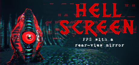
Use a rearview mirror to fight through a horror-filled hellscape in this Doom-inspired retro-fps. Shoot behind you, detect invisible enemies & never fall victim to enemy traps.Find new weapons, unlock abilities & warp to maps at any time!Objects In Mirror Are Closer Than They Appear!

$17.99Mostly Positive(44)
Boomer ShooterFast-PacedRetro
Jamie D, Mixtape Games UKFeb 13, 2026

Hellscreen scores 82/100 — better than 95% of Boomer Shooter capsules (n=263).

Mostly Positive (44 reviews) · $17.99 · Released Feb 13, 2026 · By Jamie D

Quick text summary

Hellscreen scored 82/100 on Steam Analyzer — Good for a Boomer Shooter capsule. Top priority fix: [title_readability] Increase tagline font size or weight so 'FPS with a rear-view mirror' remains readable at small capsule size (231×87).

Capsule scores by dimension

  • Genre Clarity: 8/10 — Strong FPS horror identity. The red biomechanical weapon with glowing central eye immediately signals sci-fi action shooter, while the hellish blue-teal environment conveys horror atmosphere. At tiny size, the bold red silhouette and weapon focus read as action-oriented, though the rearview mirror mechanic is not visually apparent from the capsule alone. The tagline 'FPS with a rear-view mirror' adds clarity that the mechanic demands, making genre intent clear when readable.
  • Title Readability: 9/10 — Bold red title excellent readability. HELLSCREEN uses a strong, angular, all-caps serif font in bright red that contrasts sharply against the dark background and holds legibility at tiny size. The title occupies upper-right prime real estate with clean spacing and no competing visual noise underneath. The smaller tagline text remains readable at full size but becomes soft at tiny size—however, the main title alone is iconic and unmistakable even at 120×45.
  • Contrast & Color: 9/10 — Striking red-to-teal value separation. The bright crimson weapon and title create extreme value contrast against the deep teal-blue hellscape and dark navy background, achieving strong silhouette clarity even under grayscale conversion. The glowing red eye focal point pops distinctly, and the warm-to-cool color split (red weapon vs. cold environment) reinforces visual hierarchy without muddy midtones. At tiny size, the red mass reads as a clear primary subject with no blending into background.
  • Uniqueness & Polish: 8/10 — Distinctive weapon design, solid craft. The bioluminescent red weapon with segmented ribs and central targeting reticle feels purposeful and unique—not a generic gun—suggesting a custom, carefully designed asset rather than stock inventory. The color grading and lighting treatment give a premium indie or AA-tier polish feel, and the visual hook (rear-view mechanic implied by the mirror framing) shows intentional art direction. Compared to genre benchmarks, it avoids cliché demon/gore imagery and opts for sleek sci-fi horror instead.
  • Brand Consistency: 7/10 — Coherent retro-futuristic aesthetic. The capsule establishes a consistent identity: red neon-tech weapon, teal cyberpunk environment, and angular typography that all reinforce a retro-futuristic Doom-inspired universe. The color palette and weapon design feel recognizable as a distinct visual signature, though without access to the 8 store screenshots, internal consistency across materials cannot be fully verified. The aesthetic is cohesive within itself but relatively understated on iconic branding motifs that would make it instantly memorable across disparate materials.
  • Composition: 8/10 — Clear focal point, balanced layout. The red weapon anchors the left-center composition with strong visual weight, while the title sits securely in upper-right safe margin, creating a natural diagonal flow that guides eye movement. The background hellscape provides atmospheric depth without competing for attention. At tiny size, the weapon silhouette and title remain distinct primary elements with no cropping risk; margins are generous and hierarchy survives compression well.

What works

  • Bright red title pops at all sizes. HELLSCREEN in bold red serif reads cleanly at tiny 120×45 and maintains full legibility without outline tricks or outline decay.
  • Unique weapon focal point. The biomechanical red gun with glowing center eye signals sci-fi action immediately and feels custom-designed rather than generic.
  • Strong value contrast across backgrounds. Red weapon and title create extreme separation from teal-blue hellscape, ensuring silhouette clarity in both color and grayscale.
  • Safe composition with no crop risk. Key elements (weapon, title) sit well within safe margins and maintain hierarchy even if Steam crops slightly at edges.

What hurts the capsule

  • Tagline text unreadable at tiny size. The 'FPS with a rear-view mirror' tagline becomes illegible at thumbnail scale, forcing viewers to rely on title alone for context.
  • Rear-view mirror mechanic not visually implied. The unique selling point (rearview mirror combat) is not communicated through visual cues—only through text that is too small at small/tiny sizes.
  • Busy background texture could compete at scale. The scattered hellscape detail (rocks, particles, distant elements) adds atmosphere but risks visual noise when compressed, though weapon silhouette still holds.

Priority fixes

  1. [title_readability] Increase tagline font size or weight so 'FPS with a rear-view mirror' remains readable at small capsule size (231×87).
  2. [genre_clarity] Add a subtle visual indicator of the rear-view mechanic—such as a mirror frame, reflective element, or crosshair in the weapon—to communicate the core hook without relying on text.
  3. [uniqueness_polish] Ensure the weapon's red neon glow remains consistent and crisp at compressed sizes; test anti-aliasing at 120×45 to prevent halo blur that could muddy the silhouette.

Store copy priority fixes

  1. [feature_communication] Expand the short description to explain how the rearview mirror changes combat—e.g., 'Enemies attack from ahead and behind: use your mirror to spot and eliminate threats you cannot see forward,' to show mechanical depth beyond the gimmick.
  2. [hook_strength] Consolidate the short description capitalization to match the full-width aesthetic used in the detailed description for visual consistency and stronger retro authenticity.
  3. [feature_communication] Replace or significantly abbreviate the story section with a one-sentence summary, then dedicate that space to explaining progression systems (how soulcores unlock abilities, what weapon upgrades do mechanically, trap mechanics).
  4. [audience_targeting] Add a single sentence signaling difficulty, replayability, or challenge philosophy—e.g., 'Designed for boomer shooter veterans who crave fast-paced, unforgiving combat' or 'Perfect for players seeking a punishing 2-3 hour gauntlet'—to clarify who will thrive.

Related guides

Steam app ID: 1410090 · Tags: Boomer Shooter, Fast-Paced, Retro, Metroidvania, Shooter