Scoring genre clarity...
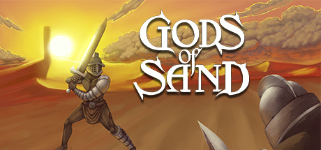
Train gladiators. Manage a ludus. Fight in the arenas. Conquer the tower. Gods of Sand is a gladiator manager with intense turn-based combat, inspired by the Swords and Sandals series, in a dark and unforgiving setting.
$9.99Very Positive(11)
Turn-BasedManagementRome
Achenar StudiosApr 14, 2026