Scoring genre clarity...
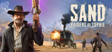
SAND: Raiders of Sophie capsule

SAND: Raiders of Sophie

In SAND you build your highly customizable walking mech fortress. Squad up or go solo. Scavenge the dunes, gather loot, weapons, priceless artifacts, survive and extract. Clash with other players in a brutal procedurally generated desert set in an alternate 1910.

$24.99Mixed(4,753)
Early AccessPvPExtraction Shooter
Hologryph, TowerHausJun 22, 2026

SAND: Raiders of Sophie scores 73/100 — better than 54% of Early Access capsules (n=3,143).

Mixed (4,753 reviews) · $24.99 · Released Jun 22, 2026 · By Hologryph

Quick text summary

SAND: Raiders of Sophie scored 73/100 on Steam Analyzer — Good for a Early Access capsule. Top priority fix: [composition] Reduce midground clutter by removing or fading secondary figures and explosion, letting the cowboy and mech fortress dominate the focal area for stronger tiny-size readability.

Capsule scores by dimension

  • Genre Clarity: 7/10 — Western mech action clear. The capsule immediately communicates action-adventure through the rugged cowboy character, desert setting, armed mech walker, and explosion in the midground. At tiny size, the silhouette of the protagonist with rifle and the distinctive steam-powered mech are recognizable enough to signal action gameplay, though the specific mech-building mechanic is not visually obvious without context.
  • Title Readability: 8/10 — Bold title, readable at all sizes. SAND in large sans-serif capitals sits in the upper right with strong white contrast against the sky gradient, remaining legible even at tiny size. The subtitle RAIDERS OF SOPHIE is smaller but maintains readability due to clean spacing and outline clarity; at tiny size the title hierarchy collapses slightly but the main word SAND stays distinct.
  • Contrast & Color: 8/10 — Strong warm lighting separation. The capsule uses a warm orange-gold gradient sky that provides excellent value separation from the dark Steam background #1b2838, with the protagonist's silhouette and mech fortress clearly defined against the sky. The bright explosion and golden dunes create depth layering; in grayscale test, dark cowboy and light sky maintain strong contrast, though the mech's mid-tone metal blends slightly into sandy backgrounds.
  • Uniqueness & Polish: 7/10 — Western-steampunk fusion distinct. The collision of 1910 cowboy aesthetic with mechanized walker fortress is a memorable hook that stands apart from typical action game covers, with cohesive art direction blending period costume with industrial machines. The character's posed stance and mustache add character, but the scene reads somewhat familiar as a standard action hero in epic landscape, lacking the visual storytelling surprise of top-tier benchmarks like Hellblade II or Lies of P.
  • Brand Consistency: 7/10 — Cohesive western-industrial palette. The capsule establishes a consistent art direction with warm earthy tones, period-appropriate costume details, and steampunk machinery that should align well with in-game visuals. The protagonist's iconic hat, mustache, and cross necklace are memorable identity cues; however, without reference to the 10 store screenshots provided, internal brand cohesion appears solid but not yet distinctively iconic like established franchises.
  • Composition: 7/10 — Clear hierarchy, well-balanced layout. The foreground cowboy commands attention on the left, the mech fortress and supporting characters occupy the midground and right, and the sky fills the background, creating effective depth layering. The title placement in the upper right avoids clashing with the protagonist; at small and tiny sizes, the composition remains readable with the cowboy and mech as clear focal points, though the crowded midground elements (explosion, multiple figures) create slight visual noise.

What works

  • Strong genre hook fusion. The western-steampunk mech aesthetic immediately differentiates the game and is memorable enough to stand out in a scrolling list of action games.
  • Excellent title contrast and placement. Large white sans-serif text positioned against clear sky ensures SAND remains readable at all sizes, including tiny thumbnails.
  • Warm color palette pops. The golden-orange sky and desert tones create strong value separation from the dark Steam background, ensuring the capsule catches attention in dark mode browsing.

What hurts the capsule

  • Crowded midground competes for focus. The explosion, multiple armed figures, and mech walker create visual noise that dilutes the primary subject hierarchy at small sizes.
  • Mech fortress lacks iconic clarity. While visually present, the walking mech is less distinctive than the cowboy character and does not read as the core gameplay hook (building and customizing) at tiny size.
  • Generic action-game composition. The hero-in-epic-landscape formula, while competent, lacks the narrative or mechanic storytelling that elevates top benchmarks like Black Myth: Wukong or Armored Core VI.

Priority fixes

  1. [composition] Reduce midground clutter by removing or fading secondary figures and explosion, letting the cowboy and mech fortress dominate the focal area for stronger tiny-size readability.
  2. [genre_clarity] Add a subtle UI element or equipment callout near the protagonist to visually hint at customization and mech-building without text, improving genre specificity.
  3. [uniqueness_polish] Increase the mech walker's prominence and distinctive silhouette by repositioning it slightly or adding a signature design flourish that makes it iconic and instantly recognizable.

Store copy priority fixes

  1. [hook_strength] Strengthen the short description opening by leading with 'Pilot customizable walking mech fortresses in a brutal extraction shooter where you scavenge, battle rivals, and extract' to clarify the extraction genre upfront while maintaining the mech hook.
  2. [feature_communication] Add a brief 1–2 sentence explanation of what Upiors are and how they differ mechanically from player encounters to clarify the PvPvE threat model.
  3. [uniqueness] Expand the alternate 1910s setting with 1–2 specific worldbuilding details (e.g., 'a steampunk desert colonized by fallen airship fleets') to justify it as a differentiator rather than flavor text.
  4. [audience_targeting] Add a sentence that explicitly addresses whether this is aimed at hardcore extraction shooter veterans or accessible to casual players (e.g., 'designed for both extraction shooter veterans and newcomers seeking a vehicle-combat twist').

Related guides

Steam app ID: 1431300 · Tags: Early Access, PvP, Extraction Shooter, Vehicular Combat, Battle Royale