Scoring genre clarity...
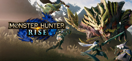
MONSTER HUNTER RISE capsule

MONSTER HUNTER RISE

Rise to the challenge and join the hunt! In Monster Hunter Rise, the latest installment in the award-winning and top-selling Monster Hunter series, you’ll become a hunter, explore brand new maps and use a variety of weapons to take down fearsome monsters as part of an all-new storyline.

$39.99Very Positive(631)
ActionOnline Co-OpHunting
CAPCOM Co., Ltd.Jan 12, 2022

MONSTER HUNTER RISE scores 90/100 — better than 100% of Action capsules (n=9,649).

Very Positive (631 reviews) · $39.99 · Released Jan 12, 2022 · By CAPCOM Co., Ltd.

Quick text summary

MONSTER HUNTER RISE scored 90/100 on Steam Analyzer — Excellent for a Action capsule. Top priority fix: [genre_clarity] Slightly enlarge or brighten the hunter figure to ensure weapon and human protagonist remain visible at tiny size without losing scale contrast.

Capsule scores by dimension

  • Genre Clarity: 9/10 — Monster hunter action immediately clear. The massive creature dominates the frame with aggressive posture, sharp spines, and open maw—classic monster hunter iconography. A hunter figure with weapon is visible lower left in tactical stance. Even at tiny size, the scale disparity and creature design unmistakably signal action-adventure hunting gameplay.
  • Title Readability: 9/10 — Bold white title stands out sharply. MONSTER HUNTER RISE uses clean white sans-serif text with strong black outline, positioned center-left over controlled mid-tone background. The blue emblem beneath adds brand recognition without compromising legibility. At tiny size, the two-line title hierarchy remains perfectly readable with excellent contrast against the darker lower background.
  • Contrast & Color: 9/10 — Warm-cool separation with vivid accents. The creature's yellow-green spines and warm sunlit upper background contrast sharply against blue creature accents and cooler sky tones. The blue logo gem pops distinctly. Strong value separation between the monster silhouette and sky background maintains clarity even when squinting, with the title's white-black combination providing maximum legibility against the darker ground area.
  • Uniqueness & Polish: 9/10 — Premium creature showcase with cinematic depth. This is not a generic fantasy monster—the design demonstrates franchise-signature detail with spikes, teeth, and anatomical distinctiveness. Lighting and particle effects (fog, sun rays) create a premium cinematic feel. The composition feels like a hero moment from the game itself rather than a stock scene, elevating it above typical action game capsules.
  • Brand Consistency: 9/10 — Iconic Monster Hunter visual language. The blue emblem, fearsome creature focus, hunter silhouette, and natural landscape setting are all signature Monster Hunter elements. The art direction matches the game's signature approach of showcasing individual monster designs as the centerpiece. This capsule would be instantly recognizable to series fans and clearly communicates the core identity.
  • Composition: 9/10 — Excellent focal hierarchy and depth. The massive creature anchors the upper-center composition while the tiny hunter silhouette in lower left creates immediate scale context and visual interest. Background mountains provide depth layering. The title sits in a safe zone with breathing room. No important elements crowd edges, and the design maintains strong visual impact across full, small, and tiny viewing sizes.

What works

  • Franchise-defining creature prominence. The monster design is distinctive and detailed enough to signal Monster Hunter specifically, not just generic fantasy action.
  • Exceptional title legibility and placement. White text with black outline on a controlled background ensures perfect readability from full size down to tiny thumbnail.
  • Premium cinematic presentation. Lighting, particle effects, and environmental depth create a high-production-value feel that competes with top-tier action game capsules.
  • Strong value and color contrast. Warm and cool tones separate clearly, maintaining silhouette distinction and readability even in grayscale or quick-scroll scenarios.

What hurts the capsule

  • Hunter character nearly invisible at tiny size. While intentional for scale storytelling, the hunter silhouette becomes a minor pixel at thumbnail size and doesn't reinforce gameplay clarity.
  • No visible UI or weapon clarity. The game's combat and weapon variety is a core differentiator but remains unexpressed visually in this composition.

Priority fixes

  1. [genre_clarity] Slightly enlarge or brighten the hunter figure to ensure weapon and human protagonist remain visible at tiny size without losing scale contrast.
  2. [uniqueness_polish] Consider adding subtle UI elements or a weapon glow accent that hints at combat mechanics beyond the monster itself.

Store copy priority fixes

  1. [feature_communication] Move the DLC disclaimer to a collapsible FAQ or footer section and restore the 'About the Game' paragraph as the opening, or rewrite it to emphasize what makes Rise's core gameplay unique rather than repeating 'latest installment.' [hook_strength]
  2. [uniqueness] Add a 1-2 sentence differentiator for new players: e.g., 'Experience a revolution in hunter mobility with Wirebugs, which let you scale terrain and pull off weapon-exclusive aerial combos—transforming how you approach every hunt.' This positions the flagship innovation as a genuine evolution.
  3. [tone_match] Inject more personality into weapon descriptions or Kamura Village framing—currently the copy reads like a feature checklist rather than an invitation to a specific hunting culture or playstyle community.
  4. [audience_targeting] Clarify the story-to-systems ratio early: add a sentence indicating whether players should expect 30+ hours of narrative-driven progression or if the endgame is primarily systems-focused grinding and multiplayer hunts.

Related guides

Steam app ID: 1446780 · Tags: Action, Online Co-Op, Hunting, Character Customization, RPG