Scoring genre clarity...
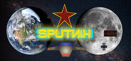
Sputnik is an indie arcade space game where player needs to repair old Soviet Union Space Settlements. It's a singleplayer game with cyberpunk style graphics and real retro feel. Gameplay is based on old school games from 1980's and 1990's with lives and permadeath.
$1.99
SpaceAtmosphericCyberpunk
Kelobyte OyMay 6, 2026