Scoring genre clarity...
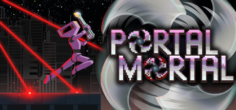
Portal Mortal capsule

Portal Mortal

Portal Mortal is a hardcore 2D puzzle platformer spiced with blood and guts! Explore unique environments, face challenging obstacles and get creative. Play alone or have fun online with up to 32 friends and build your own levels together!

$1.24Positive(17)
Precision PlatformerPuzzle PlatformerOnline Co-Op
Coil GamesApr 1, 2022

Portal Mortal scores 73/100 — better than 54% of Precision Platformer capsules (n=793).

Positive (17 reviews) · $1.24 · Released Apr 1, 2022 · By Coil Games

Quick text summary

Portal Mortal scored 73/100 on Steam Analyzer — Good for a Precision Platformer capsule. Top priority fix: [title_readability] Simplify the title font or increase letter weight to maintain legibility at 120x45 pixel thumbnail size without relying on gradient effects.

Capsule scores by dimension

  • Genre Clarity: 8/10 — Clear action platformer with sci-fi setting. The centered character in a combat-ready pose, flanked by large mechanical turrets, immediately signals action-platformer gameplay. The futuristic environment with glowing red energy beam and industrial structures supports a sci-fi action theme. At tiny size, the silhouette and weapon placement remain legible enough to communicate 'action game' despite some detail loss.
  • Title Readability: 6/10 — Readable at full, struggles at tiny. The all-caps title 'PORTAL MORTAL' uses a bold, geometric sans-serif with thick letterforms and pink-to-white gradient that contrasts against the dark starfield background. However, at tiny thumbnail size (120x45), the gradient effect and letter definition break down, and the pixelation of the font makes it harder to parse quickly; taglines and small text are entirely illegible at small size.
  • Contrast & Color: 8/10 — Strong value separation, vibrant accents. The pink/magenta title pops sharply against the near-black starfield, and the character's purple suit creates clear silhouette separation from the gray mechanical structures. The orange glow of the floor and red energy beam provide warm focal points that guide the eye effectively even at small scale. Grayscale analysis confirms strong light-dark separation throughout the composition.
  • Uniqueness & Polish: 7/10 — Polished retro style with cohesive execution. The pixel-art aesthetic is clean and deliberate, with consistent sprite work, smooth gradients, and intentional lighting effects that avoid the 'generic asset' trap. The combination of 2D character against 3D-modeled mechanical turrets creates visual interest, though the overall scene relies on familiar platformer tropes rather than a wholly distinctive hook. The execution quality is solid and recognizable as premium indie work.
  • Brand Consistency: 7/10 — Cohesive pixel-art direction, identifiable. The capsule establishes a clear internal identity: retro pixel-art protagonist, industrial sci-fi environment, and a consistent purple-pink-orange color palette. These cues align with the game's hardcore action-puzzle positioning and could be recognized in subsequent marketing materials. The style feels intentional and owned, though not iconically unique compared to other retro action games.
  • Composition: 8/10 — Strong hierarchy, centered focal point. The character is the clear primary subject positioned centrally with symmetrical mechanical turrets flanking left and right, creating natural framing and balance. The title sits securely in the upper third with breathing room, and the red energy beam draws the eye downward without clutter. At small and tiny sizes, the central figure remains the dominant read, though the turrets compress and lose some defining detail.

What works

  • Vibrant color pop against dark background. The pink title and purple character create immediate visual contrast and grab attention during quick scrolling without feeling garish or oversaturated.
  • Clear action-platformer genre signaling. The combat-ready character pose, flanked turrets, and sci-fi environment unambiguously communicate action gameplay at a glance.
  • Balanced symmetrical composition. The mirrored turret placement and centered character create stable visual equilibrium that reads well even when compressed to small sizes.
  • Consistent pixel-art aesthetic quality. The sprite work and rendering style feel intentional and premium, avoiding the cheap-asset trap common in indie platformers.

What hurts the capsule

  • Title illegibility at thumbnail size. The gradient effect and font detail collapse significantly at 120x45 pixels, making the pink lettering harder to parse in quick-scroll conditions.
  • Generic platformer scene composition. While well-executed, the 'character-between-two-threats' setup relies on familiar tropes rather than communicating a distinctive selling point or unique mechanic.
  • Limited visual storytelling about core gameplay. The capsule does not clearly hint at the 'puzzle' or 'multiplayer building' aspects, focusing only on the action-combat angle.

Priority fixes

  1. [title_readability] Simplify the title font or increase letter weight to maintain legibility at 120x45 pixel thumbnail size without relying on gradient effects.
  2. [genre_clarity] Add a subtle visual cue (portal glow, level editor icon, or multiplayer indicator) to hint at the puzzle and co-op building mechanics beyond combat.
  3. [composition] Test title placement in a controlled background band (e.g., semi-transparent overlay bar) to ensure it remains readable when compressed without competing with the character.

Store copy priority fixes

  1. [feature_communication] Replace 'spiced with blood and guts' with a specific gameplay mechanic—for example, 'respawn instantly on deadly hazards' or 'navigate lethal traps' to make the difficulty and death mechanic concrete rather than metaphorical.
  2. [uniqueness] Add a 1-2 sentence section in the detailed description explaining what makes this game's portal or puzzle mechanic distinct—e.g., 'Portal mechanics allow you to solve puzzles in ways no other platformer permits' or reference a specific combination of features that competitors lack.
  3. [tone_match] Remove or rewrite the final line 'Something is not right. I can feel it.' to either tie into the story narrative more clearly or replace it with a call-to-action that matches the casual, upbeat tone of the rest of the copy.
  4. [hook_strength] Open the short description with a verb-forward hook like 'Master precise platforming and solve mind-bending puzzles' instead of leading with 'Portal Mortal is' to immediately engage players on what they'll do rather than what the game is called.

Related guides

Steam app ID: 1486790 · Tags: Precision Platformer, Puzzle Platformer, Online Co-Op, Multiplayer, Level Editor