Scoring genre clarity...
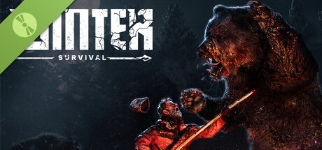
Winter Survival Demo capsule

Winter Survival Demo

Winter Survival is a story-driven survival game where trauma turns reality into a reflection of your breaking mind. Battle cold, hunger, hallucinations, and adapt to the wilderness as it adapts to you.

Free to Play9 user reviews
ActionAdventureAction-Adventure
DRAGO entertainmentFeb 3, 2021

Winter Survival Demo scores 72/100 — better than 45% of Action capsules (n=8,838).

9 user reviews · Free to Play · Released Feb 3, 2021 · By DRAGO entertainment

Quick text summary

Winter Survival Demo scored 72/100 on Steam Analyzer — Good for a Action capsule. Top priority fix: [uniqueness_polish] Layer subtle environmental details into the dark background (snow particles, frost patterns, or landscape hints) to reinforce winter survival theme and add visual depth without cluttering the creature focus.

Capsule scores by dimension

  • Genre Clarity: 7/10 — Survival horror with psychological edge. The burnt, demonic creature figure on the right clearly signals threat and dark psychological horror, supported by the survival theme text. At TINY size, the glowing orange creature and silhouette are recognizable as hostile, establishing action-horror genre messaging. The imagery does lean slightly ambiguous between pure survival and psychological horror, but the burning figure with aggressive posture communicates danger effectively.
  • Title Readability: 8/10 — Bold white text, readable at all sizes. The white WINTER SURVIVAL logotype is cleanly rendered with strong contrast against the dark background, maintaining legibility from FULL down to TINY size. The all-caps sans-serif treatment with the arrow underline is crisp and functional. At TINY size the text remains readable though slightly compressed, and the green logo badge in the upper left adds visual interest without interfering with core title clarity.
  • Contrast & Color: 8/10 — Strong warm-cool separation. The fiery orange-red creature figure pops dramatically against the cool dark blue-black background, creating excellent value separation and saturation contrast. The warm glow of the burning elements stands out clearly even when squinting, and the silhouette reads distinctly at TINY size. The green badge provides an additional accent that further separates from the dominant color scheme without clashing.
  • Uniqueness & Polish: 7/10 — Distinctive creature design, competent execution. The demonic burning creature is a memorable visual hook that differentiates this from generic survival games, and the psychological horror angle is visually communicated through the grotesque form and fiery distortion effects. Rendering quality is solid with good detail on the creature's texture and glow, though it stops short of exceptional polish compared to AAA benchmarks like Hellblade II or Resident Evil 4. The concept feels intentional and thematic rather than generic, landing it above baseline competency.
  • Brand Consistency: 6/10 — Single asset driven, limited identity cues. The burnt creature appears to be the core visual signature, but without seeing the 10 store screenshots it is difficult to assess whether this creature returns consistently or if there are recognizable motifs beyond it. The color palette of dark tones with orange-red accents and the green badge are present, but these feel more functional than iconic. The capsule reads as a cohesive single piece, but lacks obvious recurring identity signals that would make it immediately recognizable in future marketing.
  • Composition: 7/10 — Clear focal point with strong balance. The creature is positioned right of center as the dominant focal point, with the title safely anchored upper left where it reads without interference. The composition uses depth effectively with the creature in the foreground against a dark receding background, creating clear hierarchy. At SMALL and TINY sizes the creature remains the clear hero and the title stays legible; however, the lower right corner feels slightly empty, and the creature's left arm extends near the right edge risking minor crop concerns on some Steam placements.

What works

  • Strong creature design and focal point. The demonic burning figure is visually distinctive and commands attention, clearly communicating threat and psychological horror while remaining readable as a cohesive silhouette at TINY size.
  • Excellent contrast and color separation. Warm orange-red glow against cool dark background creates strong visual pop, with the green accent badge adding secondary emphasis without clashing or muddying the read.
  • Title legibility across all viewing sizes. White sans-serif logotype with underline maintains crisp clarity from FULL to TINY size, positioned safely in the upper left without competing with the focal creature.

What hurts the capsule

  • Limited brand identity beyond single creature. The capsule relies heavily on one striking asset without apparent recurring motifs or iconic symbols that would differentiate Winter Survival from other psychological horror titles in future marketing.
  • Generic dark background treatment. The solid dark blue-black backdrop, while functional for contrast, feels flat and uninspired compared to top-performing peers like Hellblade II or DREDGE which layer environmental storytelling into the background.
  • Minor compositional imbalance in lower half. The lower right quadrant is noticeably empty, creating a slight sense of weight pulling toward the upper left and creature figure rather than a fully integrated balanced composition.

Priority fixes

  1. [uniqueness_polish] Layer subtle environmental details into the dark background (snow particles, frost patterns, or landscape hints) to reinforce winter survival theme and add visual depth without cluttering the creature focus.
  2. [brand_consistency] Develop a recognizable secondary motif or color accent system beyond the creature figure to create repeatable brand identity cues across marketing materials and store presence.
  3. [composition] Extend the composition lower right with supporting visual elements (debris, snow, UI elements) or reposition the creature slightly left to achieve more balanced weight distribution across the frame.

Store copy priority fixes

  1. [feature_communication] Add a concise bulleted feature list or structured paragraph that eliminates repetition and clearly separates exploration, resource management, combat, and the sanity system into distinct, skimmable sections.
  2. [audience_targeting] Add one sentence explicitly addressing the intended player: 'Perfect for players seeking a story-driven survival experience that blends psychological horror with wilderness strategy' or similar to clarify the audience overlap.
  3. [feature_communication] Clarify what the demo includes versus the full game: specify which story chapters, mechanics, or locations are available in this early-access build to manage player expectations.

Related guides

Steam app ID: 1489650 · Tags: Action, Adventure, Action-Adventure, Open World Survival Craft, Singleplayer