Scoring genre clarity...

A Musical Story capsule

A Musical Story

‘A Musical Story’ is a rhythm game set against a 70s backdrop. Explore the memories of Gabriel, a young man trying to come to terms with his situation through the connections to his musical memory.

$2.24Very Positive(244)
RhythmMusicAdventure
Glee-Cheese StudioMar 4, 2022

A Musical Story scores 83/100 — better than 90% of Rhythm capsules (n=360).

Very Positive (244 reviews) · $2.24 · Released Mar 4, 2022 · By Glee-Cheese Studio

Quick text summary

A Musical Story scored 83/100 on Steam Analyzer — Good for a Rhythm capsule. Top priority fix: [genre_clarity] Add subtle 70s environmental details like concert poster typography or era-specific clothing silhouettes to reinforce the narrative period setting at small sizes

Capsule scores by dimension

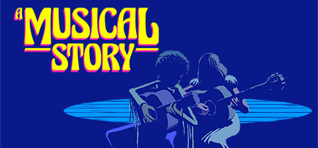
  • Genre Clarity: 8/10 — Music rhythm game with narrative. Two silhouetted figures playing guitars against a vibrant blue background immediately signals music as the core mechanic, reinforced by the acoustic instruments and stage-like lighting setup. At tiny size, the guitar shapes and duo composition remain readable enough to suggest a music-focused experience, though the 70s narrative context is not visually apparent without the title.
  • Title Readability: 9/10 — Bold yellow text excellent contrast. The all-caps 'A MUSICAL STORY' in bright yellow with red outline sits centered at the top against the deep blue background, creating exceptional legibility at all sizes. At tiny and small sizes, the thick letterforms and high contrast with the background ensure the title remains sharp and readable without any collapse or blur.
  • Contrast & Color: 9/10 — Strong vibrant blue with cyan accent. The rich navy blue background (#1b2838 adjacent) contrasts sharply with the bright yellow title and cyan stage light beneath the figures, creating excellent pop against Steam's dark interface. The value separation between the silhouetted performers and the background is clean, and the cyan accent pool draws the eye effectively even at tiny size without becoming muddy.
  • Uniqueness & Polish: 8/10 — Retro 70s aesthetic, cohesive style. The capsule employs a distinctive 70s visual language with the bold geometric sans-serif title treatment, warm color blocking, and stylized silhouette art that feels intentional and polished rather than generic. The neon-lit stage concept and figure composition effectively communicate a rhythm game with narrative depth, standing apart from typical casual game capsules through confident art direction.
  • Brand Consistency: 8/10 — Recognizable 70s identity throughout. The color palette, typography, and silhouette style create a cohesive internal identity that aligns with the game's 70s memory-driven narrative and musical focus, using consistent rendering and deliberate design choices. The yellow-on-blue contrast and geometric composition establish a memorable visual signature that would be recognizable across multiple promotional materials.
  • Composition: 8/10 — Balanced focal point with clear hierarchy. The title anchors the top third, the two guitar players occupy the centered middle focal point, and the cyan stage light at the base creates a grounded triangle composition that guides attention naturally. At small and tiny sizes, this hierarchical layout remains intact with no dead space or edge-hugging elements that risk cropping, and the subjects maintain clear separation from the uniform background.

What works

  • Exceptional title contrast and legibility. Yellow text with red outline on navy blue reads perfectly at all sizes, from full header to tiny thumbnail, with no loss of clarity or letterform integrity.
  • Strong genre and tone communication. The guitar silhouettes, stage lighting, and 70s aesthetic immediately convey a music-focused game with narrative depth and nostalgic atmosphere.
  • Cohesive retro visual identity. Every element—palette, typography, composition, silhouette style—reinforces a consistent 70s aesthetic that feels premium and intentional rather than templated.
  • Clean balanced composition. Hierarchical layout with title, figures, and stage light creates visual flow that works across all viewing sizes without clutter or wasted space.

What hurts the capsule

  • Narrative context not visually apparent. While the music genre reads clearly, the game's story-driven nature around Gabriel's memory and emotional journey is not communicated through visuals alone.
  • Limited environmental storytelling. The stage-lit silhouettes lack specific 70s cultural markers (era clothing, hairstyles, decor) that could deepen the period setting beyond abstract color choice.

Priority fixes

  1. [genre_clarity] Add subtle 70s environmental details like concert poster typography or era-specific clothing silhouettes to reinforce the narrative period setting at small sizes
  2. [uniqueness_polish] Consider incorporating a distinctive visual motif (signature color gradient, iconic prop, or character mark) that could become a recognizable brand signal across all game materials

Store copy priority fixes

  1. [hook_strength] Rewrite the short description to lead with a gameplay verb: 'Unlock Gabriel's forgotten memories by playing rhythm-based melodies set in a nostalgic 70s world—a wordless love story told through music and art.'
  2. [feature_communication] Add a brief difficulty/accessibility line such as 'Play at your own pace with no fail states' or 'Master challenging rhythms' to clarify intended audience skill level.
  3. [uniqueness] Expand the wordless storytelling claim with a concrete example: 'Follow a wordless narrative through animated scenes, dialogue-free conversations, and a 26-track original score—no text required.'

Related guides

Steam app ID: 1546100 · Tags: Rhythm, Music, Adventure, Story Rich, Casual