Scoring genre clarity...

Cold Breath capsule

Cold Breath

Cold, wolves, bears and more.A struggle for survival in the north of Norway. Improve your skills and fight the challenges in this nature!

$12.99Mostly Negative(10)
ActionCasualAdventure
celikgamesApr 22, 2025

Cold Breath scores 63/100 — better than 5% of Action capsules (n=8,534).

Mostly Negative (10 reviews) · $12.99 · Released Apr 22, 2025 · By celikgames

Quick text summary

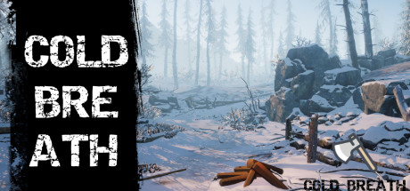
Cold Breath scored 63/100 on Steam Analyzer — Solid for a Action capsule. Top priority fix: [uniqueness_polish] Add a distinctive creature silhouette (wolf or bear) in the middle distance to communicate the specific threat identity and differentiate from generic survival games.

Capsule scores by dimension

  • Genre Clarity: 7/10 — Survival action in snowy wilderness. The snowy Norwegian landscape, armed figure with rifle, fallen logs, and wildlife survival context read clearly at full size. At TINY size the snow environment and weapon silhouette still communicate action-adventure survival, though specific enemy types (wolves, bears) are not identifiable. Genre messaging is solid but not genre-iconic enough for 8+.
  • Title Readability: 6/10 — Readable at full, questionable tiny. The left-side white text 'COLD BREATH' has good contrast against the black bar and remains legible at SMALL size with clear letterforms. At TINY size the text becomes compressed and harder to parse, though still technically readable due to high value contrast. The secondary 'COLD BREATH' text on the right at landscape scale is decorative and unreadable at thumbnail.
  • Contrast & Color: 7/10 — Strong light-dark separation with ice tones. White title text pops well against the black left margin and snowy background creates good value separation from darker forest elements. The warm-toned character and logs provide mid-tone anchoring that prevents the design from feeling too pale. In grayscale, the silhouette of the armed figure remains distinct from the landscape, though the snowy midground risks some visual blending at TINY size.
  • Uniqueness & Polish: 6/10 — Competent survival scene, generic execution. The snowy wilderness setting with armed survival character is thematically correct but visually common in survival game marketing—similar compositions appear across multiple indie survival titles. Professional rendering quality and clear asset placement show competence, but the scene lacks a distinctive visual hook or signature art direction that would elevate it above template-like presentation. No unique mechanical or narrative visual storytelling elevates this beyond baseline execution.
  • Brand Consistency: 5/10 — Limited identity signals, generic aesthetic. The capsule shows a functional survival scene but provides no memorable character, motif, or signature color palette that would be recognizable across marketing materials. The snowy wilderness is setting-appropriate but not proprietary to Cold Breath—this landscape and survival setup could describe dozens of games. Without access to confirm all 12 screenshots' visual language, the internal cohesion appears competent but lacks distinctive brand markers.
  • Composition: 7/10 — Clear focal point, good depth layering. The armed figure positioned right of center serves as the primary focal point with clear foreground (logs, equipment), midground (character), and background (forest) depth. The left margin black bar with title text provides strong framing without crowding the image. At SMALL and TINY sizes the character silhouette remains the clear anchor point, though the scattered equipment on the ground becomes less readable at thumbnail scale.

What works

  • Strong title contrast and margin framing. White 'COLD BREATH' text against black left bar ensures excellent legibility at both full and small sizes, with intentional safe margin protecting readability.
  • Clear focal point and depth hierarchy. Armed figure positioned as definitive primary subject with layered foreground elements and receding forest background create visual structure that reads at SMALL size.
  • Thematically appropriate Norwegian survival setting. Snow environment, wilderness landscape, and weapon choice correctly communicate the survival-action genre and geographic setting described.

What hurts the capsule

  • Generic survival game presentation. The snowy wilderness with armed character setup is visually common across indie survival titles and lacks distinctive visual identity or memorable hook.
  • Decorative secondary title unreadable at scale. The small 'COLD BREATH' text overlaid on the right landscape becomes illegible at SMALL and TINY sizes and adds clutter without benefit.
  • Limited brand identity cues. No iconic character, signature color palette, or visual motif that would make this capsule recognizable as belonging specifically to Cold Breath rather than a generic survival game.
  • Equipment detail loses clarity at thumbnail. Scattered logs and gear on the ground that anchor thematic detail become muddy and unreadable at TINY size, reducing narrative impact.

Priority fixes

  1. [uniqueness_polish] Add a distinctive creature silhouette (wolf or bear) in the middle distance to communicate the specific threat identity and differentiate from generic survival games.
  2. [title_readability] Remove the small landscape-overlaid 'COLD BREATH' text and consolidate title presence to the left black bar for cleaner, scalable hierarchy.
  3. [brand_consistency] Introduce a signature visual element such as a recognizable character design, iconic weapon detail, or Scandinavian aesthetic motif that would appear consistently across marketing materials.
  4. [composition] Ensure the armed character's weapon and pose remain visually distinct at TINY size by increasing silhouette contrast or repositioning secondary equipment clutter away from the figure.

Store copy priority fixes

  1. [hook_strength] Rewrite the opening line to lead with a specific emotional hook or unique survival challenge—e.g., 'Stranded in Norway's frozen wilderness, you have three days before hypothermia takes you. Survive by hunting, gathering, and managing your body's heat.' This creates urgency and specificity.
  2. [feature_communication] Restructure the detailed description with a clear section header for each mechanic (Hunting, Fishing, Crafting, Survival Systems) and use consistent, grammatically correct explanations of what the player must do and why it matters.
  3. [tone_match] Proofread and rewrite all grammatically incorrect sentences to establish a consistent, professional tone—either immersive and atmospheric or clear and instructional, but not both randomly mixed.
  4. [audience_targeting] Add 1–2 sentences explaining who this game is for—e.g., 'For survival enthusiasts who want a challenging, realistic experience' or 'For casual explorers who enjoy nature without extreme difficulty'—to align the vague genre tags with player expectations.

Related guides

Steam app ID: 1548590 · Tags: Action, Casual, Adventure, Action-Adventure, Life Sim