Scoring genre clarity...

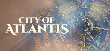
City of Atlantis capsule

City of Atlantis

The legendary City of Atlantis has emerged from underwater. This time you are in charge. Build, plan, upgrade and survive!

StrategyCity BuilderGod Game
Innominate GamesTo be announced

City of Atlantis scores 72/100 — better than 43% of Strategy capsules (n=5,329).

Released To be announced · By Innominate Games

Quick text summary

City of Atlantis scored 72/100 on Steam Analyzer — Good for a Strategy capsule. Top priority fix: [uniqueness_polish] Introduce a signature visual element or iconic gameplay cue (e.g., a distinctive resource, character silhouette, or building motif) that communicates the core management/survival mechanic and differentiates from generic city-builders.

Capsule scores by dimension

  • Genre Clarity: 7/10 — Mythic city-builder with clear intent. The aerial perspective of a spiral city arrangement immediately signals strategy and city-building gameplay. The Atlantis theme and architectural focus communicate building/management mechanics effectively at full size. At tiny size, the circular city pattern still reads as a constructed settlement, though specific genre nuance (builder vs. strategy vs. adventure blend) becomes less distinct due to scale.
  • Title Readability: 8/10 — Large serif text, clear hierarchy. The title 'CITY OF ATLANTIS' uses substantial white serif letterforms positioned in the upper-left to center region with excellent contrast against the softer background. At small and tiny sizes, the large letterforms maintain legibility, though the elegant serif style remains readable without collapse. Strategic placement over a lighter portion of the image prevents text from fighting with busy city detail.
  • Contrast & Color: 8/10 — Strong light-to-dark gradient separation. The composition uses warm tan-to-brown tones in the left and upper portions, transitioning to cooler blue-teal in the water and sky, creating natural value separation from the dark Steam background. The white title pops strongly against both warm and cool regions. In grayscale, the mid-to-light value range of the city structures maintains clear silhouette definition and does not muddy or blend into the dark background.
  • Uniqueness & Polish: 7/10 — Polished mythic aesthetic, somewhat familiar. The aerial spiral-city perspective and Atlantis mythology positioning feel intentional and thematic rather than generic. Rendering quality and atmospheric lighting (sun rays, water reflection) suggest premium production value. However, the concept of floating/spiral cities is not uncommon in indie strategy, and the visual does not immediately communicate a unique mechanic or distinctive art hook that separates it from other mythic city-builders.
  • Brand Consistency: 6/10 — Thematic but minimal identity cues. The capsule strongly reinforces the Atlantis mythological theme through spiral architecture and aquatic setting, and the serif typography suggests classical grandeur. Without access to other marketing materials, the internal cohesion appears solid—warm/cool palette, architectural focus, and legible hierarchy work together. However, there are no obvious iconic character, logo, or signature visual motif that would make the brand instantly recognizable on repeat exposure.
  • Composition: 7/10 — Clear focal point, good depth layering. The spiral city overhead view anchors the center and draws the eye naturally, with atmospheric haze and water creating foreground-to-background depth. Title placement in the upper-left avoids the focal point and maintains safe margins. At small and tiny sizes, the circular city structure remains the primary subject and the composition does not collapse into clutter, though some fine architectural detail becomes illegible at extreme reduction.

What works

  • Excellent title contrast and size. White serif text reads clearly at all sizes and is positioned strategically over a controlled background region, not on busy city texture.
  • Strong thematic value separation. Warm and cool tones combined with natural lighting create silhouette clarity that holds up in grayscale and against the dark Steam background.
  • Intentional spiral composition. The overhead city perspective immediately communicates strategy and building gameplay, reinforcing the city-building premise.
  • Atmospheric depth and polish. Layered lighting, water effects, and sun rays convey production value and a cohesive artistic vision.

What hurts the capsule

  • Limited unique identity signals. No iconic character, logo, or signature visual motif present to make the brand instantly recognizable on subsequent exposures.
  • Generic mythic city aesthetic. While polished, the spiral-city concept and Atlantis theme do not communicate a distinctive core mechanic or gameplay hook that stands out in the indie strategy space.
  • Fine architectural detail loss at tiny size. The intricate building layouts and decorative structures become indistinct at small and tiny capsule scales, reducing visual impact during quick scrolling.

Priority fixes

  1. [uniqueness_polish] Introduce a signature visual element or iconic gameplay cue (e.g., a distinctive resource, character silhouette, or building motif) that communicates the core management/survival mechanic and differentiates from generic city-builders.
  2. [brand_consistency] Develop a recognizable visual shorthand or logo motif that could serve as a consistent identity marker across future marketing and game UI.
  3. [contrast_color] Increase saturation or add a subtle accent color (e.g., a glowing resource or UI element) in the mid-tones to maintain visual interest and readability at tiny thumbnail size.

Related guides

  • Steam page optimisationCapsule, copy, screenshots, tags — the full Steam page conversion stack.
  • Steam tags guideTag selection, ordering, and how it shapes Steam's recommendation rails.

Steam app ID: 1577230 · Tags: Strategy, City Builder, God Game, Colony Sim, Adventure