Scoring genre clarity...

Bittersweet Birthday capsule

Bittersweet Birthday

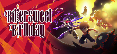
Bittersweet Birthday is a boss fight-only action adventure where every encounter is a unique and emotional showdown. Explore a colorful world full of endearing characters, uncover your memories, and battle your way through challenges that push skill, timing, and determination to their limits.

$17.99Positive(27)
Story RichBoss RushAction-Adventure
World Eater GamesNov 11, 2025

Bittersweet Birthday scores 72/100 — better than 44% of Story Rich capsules (n=3,563).

Positive (27 reviews) · $17.99 · Released Nov 11, 2025 · By World Eater Games

Quick text summary

Bittersweet Birthday scored 72/100 on Steam Analyzer — Good for a Story Rich capsule. Top priority fix: [uniqueness_polish] Incorporate a signature visual motif or recurring character/symbol prominent enough to become recognizable brand identity across store presence

Capsule scores by dimension

  • Genre Clarity: 7/10 — Action adventure with combat focus clear. Multiple character silhouettes in dynamic action poses against energetic backgrounds with glowing effects immediately signal action gameplay. At tiny size, the central figures and their combat stance remain readable, though the specific boss-fight-only mechanic is not visually distinct from standard action games. The colorful art style and character variety support the indie action adventure positioning.
  • Title Readability: 8/10 — Bold white title legible at all sizes. The 'Bittersweet Birthday' text uses a clean, chunky white serif font with strong outline contrast against the red-orange background, maintaining clarity from full header down to tiny thumbnail. The title sits in the upper left with controlled background space, avoiding texture interference. At tiny size the text remains recognizable despite some letter compression, though readability slightly softens.
  • Contrast & Color: 8/10 — Vibrant warm palette strong separation. Bright reds, oranges, and yellows with purple and dark accents create robust value separation against the Steam dark background #1b2838. Character silhouettes pop clearly with rim lighting and glowing effects, and the color saturation maintains visual impact even at small sizes. Grayscale test confirms sufficient luminance range between characters and background.
  • Uniqueness & Polish: 7/10 — Colorful character-driven style distinctive. The art direction features a vibrant, expressive anime-influenced aesthetic with stylized character designs and dynamic pose language that differentiates it from darker action competitors like Armored Core or Warhammer. The multiple character focus and emotional narrative hook are communicated through visual variety, though the execution remains somewhat generic within indie action space. The craft is solid but does not reach standout premium polish seen in titles like Hellblade II.
  • Brand Consistency: 6/10 — Competent color and style identity. The warm color palette, character-centric composition, and expressive animation style are internally consistent and suggest a recognizable visual identity. However, without reference to the full game library, the palette and character designs do not communicate a uniquely memorable brand signature that would enable instant recognition across multiple touchpoints. The style feels cohesive but not distinctly branded.
  • Composition: 7/10 — Clear focal point, balanced layout hierarchy. The three-character grouping in the center-right creates a strong focal point with the title positioned securely in the upper left clear zone. Foreground characters, midground action, and glowing background effects establish good depth layering that reads at small sizes. The composition remains resilient to Steam cropping, though the right edge characters push toward the margin and some right-side background detail may clip depending on viewport.

What works

  • Strong title contrast and placement. White serif text with outline sits cleanly in the upper left on controlled background, maintaining legibility from full header to tiny thumbnail without competing for attention.
  • Dynamic character pose language. Multiple action-ready silhouettes with varied poses and rim lighting immediately communicate boss-fight combat gameplay and convey energy at all viewing sizes.
  • Vibrant color palette pop. Warm reds, oranges, yellows, and purple accents provide excellent value separation against Steam dark background, ensuring visual impact during quick scroll discovery.
  • Clear depth and layering. Foreground characters, glowing midground effects, and background elements create visual hierarchy that prevents flatness and guides eye naturally to the action focus.

What hurts the capsule

  • Generic action game presentation. While technically competent, the colorful character-action composition lacks a distinctive hook or visual signature that sets it apart from other indie action titles at quick glance.
  • Emotional narrative not visually clear. Despite the 'Bittersweet Birthday' premise and emotional boss encounters being core to the game, the capsule reads as pure action spectacle without visual storytelling of the bittersweet/emotional angle.
  • Limited brand identity signals. No iconic character, recurring motif, or signature visual element is prominently featured that would enable future recognition or brand consistency across marketing materials.

Priority fixes

  1. [uniqueness_polish] Incorporate a signature visual motif or recurring character/symbol prominent enough to become recognizable brand identity across store presence
  2. [genre_clarity] Add subtle visual cue that emphasizes the boss-fight-only mechanic such as a trophy, arena stage element, or combat arena framing to differentiate from standard action games
  3. [brand_consistency] Reference the 29 store screenshots to identify and promote the most distinctive recurring art element or character trait to strengthen brand consistency in the capsule

Store copy priority fixes

  1. [feature_communication] Clarify the Memory system in one concrete sentence: e.g., 'Unlock Memories from defeated bosses and character encounters to adjust difficulty, pacing, and combat mechanics to your skill level.' This makes a vague feature tangible.
  2. [uniqueness] Add one sentence that articulates the core emotional differentiation, e.g., 'Each boss represents a fragment of your fragmented past—combat is narrative, and victory is self-discovery.' This elevates the game beyond 'boss-rush with story' to 'story-as-boss-rush.'
  3. [audience_targeting] Insert a sentence early in the detailed description addressing skill accessibility, e.g., 'Whether you're a Souls veteran or new to precision action games, the Memory system and adjustable difficulty ensure you can face challenges at your own pace.' This signals inclusivity without diluting appeal.
  4. [hook_strength] Strengthen the short description's emotional hook by replacing 'colorful world full of endearing characters' with something more specific tied to mystery, e.g., 'Explore a vibrant world full of cryptic allies, each holding clues to your lost identity.'

Related guides

Steam app ID: 1581100 · Tags: Story Rich, Boss Rush, Action-Adventure, Difficult, Psychological Horror