Scoring genre clarity...

Tiny Vikings capsule

Tiny Vikings

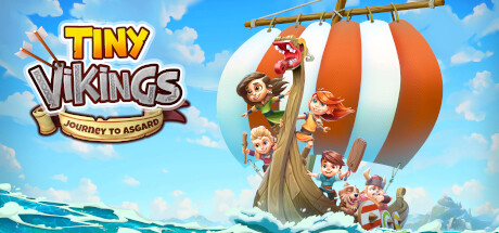
TINY VIKINGS: JOURNEY TO ASGARD is an action adventure game revolving around a gang of Viking children who embark on an adventurous journey to seek the favor of the gods and save their home village from an evil curse.

$29.99
Early AccessExploration3D Platformer
Game Art Brain GmbH, Play With Fire UGFeb 28, 2026

Tiny Vikings scores 87/100 — better than 99% of Early Access capsules (n=3,067).

$29.99 · Released Feb 28, 2026 · By Game Art Brain GmbH

Quick text summary

Tiny Vikings scored 87/100 on Steam Analyzer — Excellent for a Early Access capsule. Top priority fix: [title_readability] Consider slightly increasing tagline outline weight or repositioning it to ensure maximum legibility at 120x45 thumbnail size

Capsule scores by dimension

  • Genre Clarity: 9/10 — Viking action-adventure perfectly clear. The capsule immediately communicates Viking theme through multiple iconic cues: distinctive Viking ship with orange-white sail, child characters in Viking attire, stormy Nordic seascape, and adventure-ready composition. At tiny size, the bold ship silhouette and character cluster remain recognizable, and the Norse mythology context is unmistakable from the visual language alone.
  • Title Readability: 9/10 — Bold yellow title stands strong. The title 'TINY VIKINGS' uses thick yellow letterforms with dark brown outline positioned in the upper left against clear sky, ensuring legibility at all sizes. The tagline 'JOURNEY TO ASGARD' reads well at full size and remains visible at small size due to strong contrast and strategic placement above the main action.
  • Contrast & Color: 9/10 — Vibrant colors pop against dark. The bright blue sky, orange-white sail, and warm character tones create strong value separation against the Steam dark background. Yellow title with dark outline reads crisply, and the turquoise water provides excellent silhouette contrast that holds even at tiny thumbnail size with no muddy blending.
  • Uniqueness & Polish: 8/10 — Charming art style, distinctive appeal. The capsule features a cohesive, hand-crafted 2D art style with warm character design and dynamic composition that feels premium and intentional rather than generic. The concept of child Vikings on a mythological voyage is a clear unique selling point, though the overall aesthetic is fairly polished but not groundbreaking compared to top-tier indie adventure titles.
  • Brand Consistency: 8/10 — Consistent warm Viking aesthetic. The visual identity is internally cohesive with a warm color palette (yellows, oranges, earth tones), consistent character rendering style, and recognizable child-focused Viking protagonist design that would be identifiable across marketing materials. The iconic ship and character silhouettes serve as strong brand motifs.
  • Composition: 9/10 — Excellent focal hierarchy and balance. The composition uses clear depth layering with sky background, ship as midground centerpiece, and character cluster as primary focal point. The title occupies safe left margin space, the ship and characters create strong visual interest in the center-right without cluttering, and the composition remains readable and balanced at all sizes including tiny thumbnails.

What works

  • Strong genre communication. Viking ship, mythological setting, and child adventurers immediately signal action-adventure with Norse theme even at tiny size.
  • Excellent title legibility. Yellow letters with dark outline positioned on clear sky background ensure crisp readability across all viewing sizes.
  • Vibrant color contrast. Warm oranges, blues, and yellows pop distinctly against the Steam dark background with no muddy value overlap.
  • Clear visual hierarchy. Primary focal point (ship and characters) dominates center space while title occupies safe left margin, creating natural eye flow.

What hurts the capsule

  • Minor tagline visibility at tiny size. The 'JOURNEY TO ASGARD' tagline becomes challenging to parse at extreme thumbnail sizes due to smaller letterform weight.
  • Generic adventure composition template. While well-executed, the composition follows familiar action-adventure capsule patterns with hero-focused vessel imagery common in the genre.

Priority fixes

  1. [title_readability] Consider slightly increasing tagline outline weight or repositioning it to ensure maximum legibility at 120x45 thumbnail size
  2. [uniqueness_polish] Add a more distinctive visual hook or signature effect that sets it apart from other colorful adventure game capsules

Store copy priority fixes

  1. [hook_strength] Rewrite the opening line to lead with the most visually or narratively striking element; replace 'is an action adventure game revolving around' with a verb-forward hook such as 'Lead four unique Viking children through Asgard to break a curse—each with their own powers and flaws.' This creates immediate curiosity and agency.
  2. [audience_targeting] Add 1-2 sentences clarifying target playstyle and difficulty: e.g., 'Built for solo play with optional couch co-op' or 'Challenging puzzle design for ages 8+' to help players self-select and set expectations.
  3. [uniqueness] Add a concrete differentiator or comparison phrase such as 'Unlike typical platformers, every character has strengths *and* weaknesses that force creative problem-solving' or reference the ability-swapping as the core innovation.
  4. [feature_communication] Include estimated playtime, number of levels, or progression milestones in the detailed section to convey scope and value, especially important for early access positioning.

Related guides

Steam app ID: 1591560 · Tags: Early Access, Exploration, 3D Platformer, Puzzle Platformer, Puzzle