Scoring genre clarity...
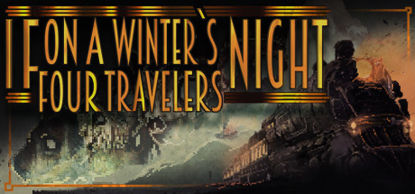
If On A Winter's Night, Four Travelers capsule

If On A Winter's Night, Four Travelers

If On A Winter's Night, Four Travelers is a narrative-driven point-and-click adventure with horror elements that explores the stories of four characters in a masked ball taking place aboard a train in the late 1920s.

Free to PlayOverwhelmingly Positive(24)
Point & ClickStory RichPixel Graphics
Dead Idle GamesSep 21, 2021

If On A Winter's Night, Four Travelers scores 77/100 — better than 78% of Point & Click capsules (n=1,749).

Overwhelmingly Positive (24 reviews) · Free to Play · Released Sep 21, 2021 · By Dead Idle Games

Quick text summary

If On A Winter's Night, Four Travelers scored 77/100 on Steam Analyzer — Good for a Point & Click capsule. Top priority fix: [composition] Simplify or reduce the opacity of the left-side gears and mechanical elements to reduce visual competition with the locomotive focal point [composition] Consider adding a subtle cursor, magnifying glass, or other point-and-click affordance element to the scene to reinforce gameplay type clarity [genre_clarity]

Capsule scores by dimension

  • Genre Clarity: 7/10 — Strong narrative adventure with horror mood. The capsule successfully conveys a 1920s mystery-adventure atmosphere through the period steam locomotive, warm amber lighting, and silhouetted figures in dramatic poses. At TINY size, the train and human figures read as a cinematic scene, clearly signaling narrative adventure rather than action-based gameplay. The Art Deco aesthetic and gothic lighting reinforce a darker, mystery-driven tone that matches the point-and-click adventure genre well.
  • Title Readability: 8/10 — Excellent contrast and bold serif letterforms. The title 'IF ON A WINTER'S NIGHT FOUR TRAVELERS' uses a striking Art Deco serif font in warm gold with black outlines against a dark background, maintaining legibility even at TINY thumbnail size. The outline stroke prevents letterforms from collapsing into the background, and the strategic placement in the upper-left avoids critical scene elements. At FULL size it dominates; at SMALL and TINY sizes the outline weight and value contrast keep it readable without strain.
  • Contrast & Color: 8/10 — Strong warm-cool separation with clear silhouettes. The composition uses a warm amber and orange gradient on the train and left-side elements against a cool blue-gray sky and shadows, creating excellent value separation against the Steam dark background #1b2838. The burning locomotive boiler and glowing windows provide bright highlights that cut through the midtones, while silhouetted figures maintain clear edges. In grayscale, the contrast remains strong and the train form is immediately recognizable even at TINY size.
  • Uniqueness & Polish: 8/10 — Distinctive Art Deco aesthetic with cinematic craft. The capsule stands apart through its intentional 1920s visual language, combining period-authentic typography, a stylized burning locomotive, and a carefully composed scene that suggests narrative intrigue rather than generic adventure. The color grading, smoke effects, and lighting show clear artistic direction; this is not a template or asset-flip approach. The Art Deco border frame and ornamental details elevate the premium feel and communicate a story-first design philosophy.
  • Brand Consistency: 8/10 — Cohesive period identity with recognizable visual motifs. The capsule establishes a clear 1920s-gothic brand identity through consistent use of Art Deco typography, warm amber color palette, period-authentic locomotive design, and shadowed human figures in formal attire. These elements would be immediately recognizable in future marketing; the ornamental gold frame and serif font create a signature look. The internal consistency between the title treatment, background, and scenic elements is strong, with no tonal conflicts or mismatched asset sources.
  • Composition: 7/10 — Clear focal hierarchy with train dominance. The composition anchors the viewer's eye on the burning locomotive in the right-center, with the silhouetted traveler at left providing a secondary human element that guides narrative intrigue. The title occupies the safe upper-left zone, leaving the dramatic scene unobstructed in the center and right. At SMALL and TINY sizes, the train remains the unmistakable primary subject; however, the leftmost gears/mechanical elements are slightly busy and could compete for attention at thumbnail scale.

What works

  • Period-authentic Art Deco visual language. The serif typeface, ornamental gold frame, and 1920s color palette create an instantly recognizable and premium brand identity that differentiates the capsule from generic adventure games.
  • Excellent contrast and readability at all sizes. The gold-on-dark title with black outlines and warm-cool color separation ensure the entire composition reads crisply at TINY thumbnail without blur or illegibility.
  • Strong cinematic focal point. The burning locomotive and silhouetted traveler immediately communicate narrative drama and mystery, drawing the eye and suggesting a story-driven experience rather than a generic scene.
  • Coherent atmospheric rendering. Smoke, fire glow, shadows, and lighting are all consistent in style and direction, reinforcing a polished, intentional art direction rather than a collage of unrelated elements.

What hurts the capsule

  • Left-side mechanical details create visual noise. The gears and industrial machinery on the left side add complexity that competes with the train focal point at TINY sizes and may distract from the primary scene.
  • Silhouetted traveler lacks distinct character read. While the human figure adds narrative interest, the black silhouette does not reveal character details, costume, or personality that could reinforce the four-traveler premise.
  • Minimal UI or gameplay affordance cues. The capsule is pure scene with no hint of point-and-click interface, which could leave players uncertain whether this is a visual novel, adventure game, or narrative experience.

Priority fixes

  1. [composition] Simplify or reduce the opacity of the left-side gears and mechanical elements to reduce visual competition with the locomotive focal point [composition] Consider adding a subtle cursor, magnifying glass, or other point-and-click affordance element to the scene to reinforce gameplay type clarity [genre_clarity]
  2. [uniqueness_polish] Introduce a small costume or silhouette detail on one traveler figure to hint at character diversity and reinforce the 'four travelers' narrative hook without losing the dramatic shadow effect [composition]
  3. [contrast_color] Verify the warm amber gradient maintains its brightness and saturation on a range of display profiles to ensure the locomotive remains the brightest, most eye-catching element [contrast_color]

Store copy priority fixes

  1. [hook_strength] Rewrite the short description to open with a high-concept hook like 'Four strangers. One night. Dark secrets aboard a masked ball train.' or lead with the psychological or supernatural danger rather than genre labels.
  2. [feature_communication] Add a sentence or two explaining how the four stories connect, whether there are puzzles/investigation mechanics, and what 'acts' means in terms of gameplay progression.
  3. [uniqueness] Clarify what makes the narrative structure distinctive—e.g., whether choices matter, whether stories merge, or whether there's a meta-narrative connecting the four acts.

Related guides

Steam app ID: 1603980 · Tags: Point & Click, Story Rich, Pixel Graphics, Dark, Atmospheric