Scoring genre clarity...

GNOSIA capsule

GNOSIA

The Gnosia lie. Pretending to be human, they’ll get in close, trick and deceive, and then eliminate one victim at a time...

$17.49Very Positive(67)
Visual NovelStory RichAnime
Petit DepottoJan 23, 2022

GNOSIA scores 65/100 — better than 19% of Visual Novel capsules (n=1,173).

Very Positive (67 reviews) · $17.49 · Released Jan 23, 2022 · By Petit Depotto

Quick text summary

GNOSIA scored 65/100 on Steam Analyzer — Solid for a Visual Novel capsule. Top priority fix: [title_readability] Redesign the title with thicker, bolder letterforms and remove decorative elements to ensure legibility at small and tiny sizes; test at 120x45 pixels to confirm readability.

Capsule scores by dimension

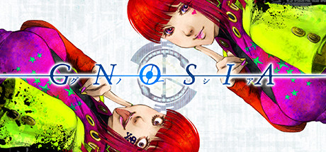
  • Genre Clarity: 7/10 — Anime social deduction game clear. The vibrant anime character art with expressive faces and the central circular compass/target symbol immediately signal a character-driven narrative game, likely social or mystery-focused. At tiny size, the bold red hair and colorful costume details remain visible enough to confirm stylized character-centric gameplay, though the specific deduction mechanic is not explicit. The visual language reads as Japanese-influenced adventure or simulation rather than action-oriented genre.
  • Title Readability: 5/10 — Title legible at full, fades at tiny. The title 'GNOSIA' uses a clean blue serif font with decorative horizontal lines and Japanese characters integrated into the design at full size, which is readable and styled appropriately. However, at small and tiny sizes, the thin letterforms and decorative elements collapse into a blurry streak; the Japanese characters become unreadable pixels, significantly impacting discoverability during quick scrolls. The title placement across the center competes visually with the character composition.
  • Contrast & Color: 7/10 — Vibrant but uneven value distribution. The neon magenta, lime yellow, and red accents create high saturation and pop strongly against dark backgrounds, particularly the character's red hair and bright costume elements. However, the pale/white character skin tones and the light gray background areas in the upper portion reduce overall contrast and create muddy mid-tones that blend slightly against the Steam dark background. At tiny size, the bright color blocks read better than any grayscale silhouette would, which partially compensates.
  • Uniqueness & Polish: 7/10 — Stylized anime identity, generic composition. The hand-drawn or high-quality anime art style with distinctive character rendering and the color saturation choices establish a premium, recognizable look that differentiates from typical indie game templates. The circular symbol with Japanese elements adds cultural identity and visual interest. However, the overall composition of two characters posed casually without a clear unique mechanical hook or story visual feels like a standard character showcase rather than communicating what makes Gnosia's social deduction gameplay distinct from competitors like Among Us or Werewolf variants.
  • Brand Consistency: 7/10 — Cohesive anime aesthetic, weak identity motif. The rendering style, color palette dominated by magenta-yellow-red, and anime character design are internally consistent and match a recognizable visual direction that could be associated with the game across promotional materials. The circular compass motif with concentric rings and Japanese character integration provides a signature symbol. However, without reference to the 10 store screenshots, it is difficult to confirm whether this capsule reinforces a memorable brand icon or unique visual hook that would make the game instantly recognizable among peers like Persona or other character-driven titles.
  • Composition: 6/10 — Balanced but scattered focal hierarchy. Two characters occupy the upper-left and center-right areas, creating a rough diagonal balance, with the title sandwiched horizontally across the composition. The circular symbol in the center provides a focal anchor point but competes with the character expressions for attention. At small and tiny sizes, the composition remains readable but feels scattered; no single hero element dominates, and the eye bounces between characters, title, and symbol without a clear primary focal point, which slightly weakens discoverability impact during quick scrolls.

What works

  • Vibrant color palette pops. Neon magenta, lime yellow, and red accents create instant visual appeal and stand out well against the Steam dark background, particularly the character's bright red hair and costume.
  • Premium anime art style. Hand-drawn character quality and expressive faces signal a polished, character-driven game that feels premium and distinct from generic asset-based indie templates.
  • Circular symbol adds cultural flavor. The central compass-like motif with Japanese character integration provides a memorable visual anchor and reinforces the game's thematic identity without being overly generic.

What hurts the capsule

  • Title collapses at small sizes. Thin letterforms, decorative lines, and integrated Japanese characters become unreadable at small and tiny sizes, severely hurting discoverability during quick scrolls.
  • No clear focal hierarchy at tiny. Multiple elements (two characters, title, central symbol) compete equally for attention, creating visual scatter that lacks a single dominant read at thumbnail size.
  • Generic character pose lacks narrative. The two characters casually posed do not visually communicate the social deception or mystery gameplay mechanic that defines Gnosia, feeling like a standard character showcase instead.
  • Inconsistent value contrast in background. Light gray and pale skin tones create muddy mid-tones that reduce silhouette clarity against the Steam background, partially undermining the vibrant color advantage.

Priority fixes

  1. [title_readability] Redesign the title with thicker, bolder letterforms and remove decorative elements to ensure legibility at small and tiny sizes; test at 120x45 pixels to confirm readability.
  2. [composition] Create a single dominant focal point by repositioning characters or enlarging the central symbol as the primary anchor, with title as secondary supporting element.
  3. [genre_clarity] Add a subtle visual cue such as a masked or shadowed second character face, or a deception/mystery UI element, to telegraph the social deduction mechanic rather than relying solely on character appeal.
  4. [contrast_color] Darken or add stronger edge definition to pale character skin tones using outline or shadow to improve silhouette separation and grayscale contrast against the Steam background.

Store copy priority fixes

  1. [feature_communication] Add a sentence explaining how many loops players typically experience and what triggers progression between loops (e.g., 'Unlock new loops by discovering specific clues or reaching certain endings').
  2. [uniqueness] Add a differentiator comparing the looping mechanic to traditional social deduction games (e.g., 'Unlike one-off deduction games, each loop rewrites the narrative, forcing you to adapt your strategy against evolving threats').
  3. [audience_targeting] Include a sentence signaling accessibility for newcomers (e.g., 'No prior social deduction experience needed; the game teaches mechanics through gameplay') or existing fan appeal.

Related guides

Steam app ID: 1608290 · Tags: Visual Novel, Story Rich, Anime, Time Travel, Sci-fi