Scoring genre clarity...

Space for Sale capsule

Space for Sale

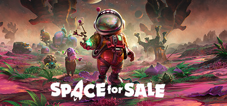
Space for Sale is an interplanetary, top-down Space Realty management game with a focus on problem-solving and exploration. Played either solo or with a friend, it's up to you to transform wild, uninhabited lands into bustling communities!

$19.99Mixed(136)
SimulationStrategyColony Sim
Mirage Game StudiosApr 15, 2025

Space for Sale scores 77/100 — better than 71% of Simulation capsules (n=5,188).

Mixed (136 reviews) · $19.99 · Released Apr 15, 2025 · By Mirage Game Studios

Quick text summary

Space for Sale scored 77/100 on Steam Analyzer — Good for a Simulation capsule. Top priority fix: [genre_clarity] Add subtle management or building UI elements (e.g., plot markers, small structures, or terraforming visual cue) to clarify the 'realty' and 'community building' core mechanics without compromising the alien world aesthetic.

Capsule scores by dimension

  • Genre Clarity: 7/10 — Clear sci-fi management with alien world setting. The astronaut protagonist in red suit, vibrant alien flora, floating spheres, and exotic landscape immediately signal a space-themed game with exploration and world-building mechanics. At TINY size, the red astronaut silhouette and colorful alien environment remain readable and distinct enough to suggest a sci-fi management game, though the specific 'realty' mechanic is not visually obvious from iconography alone.
  • Title Readability: 8/10 — Strong white sans-serif title with clever wordplay. The white 'SPACE for SALE' text is bold, well-spaced, and uses a slight glow outline that maintains legibility even at TINY size where the letterforms remain distinct. The strategic placement on the mid-lower third of the image avoids major visual clutter and the wordplay '/4' substitution adds personality without compromising clarity at any viewing size.
  • Contrast & Color: 8/10 — Vibrant palette pops against dark Steam background. The warm orange-pink sky gradient, bright acid-green vegetation, bold red protagonist suit, and purple rock formations create strong value separation and saturation that reads well against the #1b2838 Steam background. The white title text has excellent contrast and the silhouette of the astronaut remains crisp and defined even when mentally squinting or evaluating grayscale separation.
  • Uniqueness & Polish: 8/10 — Distinctive alien world with polished character design. The art style shows intentional craft with a cohesive pastel-meets-vibrant alien aesthetic that feels premium and distinctive compared to generic management simulators. The reflective helmet visor, detailed suit proportions, and layered background with multiple alien characters demonstrate visual storytelling of community building and exploration without feeling templated or cheap.
  • Brand Consistency: 7/10 — Recognizable alien aesthetic with strong visual identity. The red astronaut suit, iridescent helmet reflection, and signature magenta-pink landscape palette are cohesive internal elements that could establish brand recognition across future marketing. The distinctive alien world art style and character-focused composition show consistent rendering, though without reference to the 8 store screenshots, the broader brand identity signals are partially inferential from this single capsule.
  • Composition: 8/10 — Balanced focal point with clear hierarchy and depth. The red astronaut in the center-right position creates a strong primary focal point while supporting characters and landscape elements layer naturally into background and midground, creating readable depth without clutter. At SMALL and TINY sizes, the composition remains stable and the astronaut reads clearly; safe margins around the title prevent cropping issues and the balanced left-right distribution works well across view sizes.

What works

  • Striking color palette. Vibrant warm oranges, electric greens, and cool purples create a cohesive alien world that stands out distinctly against the Steam dark background and reads well at all sizes.
  • Clear protagonist silhouette. The red-suited astronaut with reflective helmet is immediately recognizable and remains the dominant focal point even at TINY scale, anchoring the visual hierarchy effectively.
  • Polished character rendering. The astronaut suit shows intentional detail work with metallic finishes, proper proportions, and personality that conveys a premium production level above generic management sims.
  • Title placement and legibility. The white 'SPACE for SALE' text uses strong contrast, strategic low placement, and sufficient outline clarity to remain readable at every viewing size without competing with the visual composition.

What hurts the capsule

  • Management mechanic not visually apparent. The capsule communicates 'alien exploration' more strongly than 'realty management or community building,' which could mislead players expecting city-building UI or property-focused visuals.
  • Supporting character clarity at tiny size. The smaller alien characters and creatures in the mid and background become difficult to distinguish individually at TINY size, reducing the sense of multiple agents or community presence.
  • Cooperative gameplay not signaled. The capsule shows a lone astronaut and does not visually communicate that this is a 2-player co-op experience, missing an opportunity to highlight that key selling point.

Priority fixes

  1. [genre_clarity] Add subtle management or building UI elements (e.g., plot markers, small structures, or terraforming visual cue) to clarify the 'realty' and 'community building' core mechanics without compromising the alien world aesthetic.
  2. [composition] Increase visual hierarchy of the community aspect by making at least one secondary character more prominent or adding a recognizable human-built structure element to reinforce the management gameplay loop.
  3. [brand_consistency] Reference the 8 store screenshots to identify and emphasize any recurring iconic motifs (e.g., character archetypes, UI panels, or environmental features) that could be subtly integrated into the capsule for stronger brand recognition.

Store copy priority fixes

  1. [tone_match] Relocate the cancellation announcement to a small, clearly separated section at the bottom of the page, or convert it to a brief, forward-facing note that doesn't consume the primary game description—the melancholy tone actively repels new players.
  2. [uniqueness] Add 1–2 sentences explaining how the 'space realty' premise creates distinct gameplay: e.g., 'Unlike traditional colony sims, every location you develop is a sellable property, forcing you to balance tenant demands with architectural compromise' or similar concrete differentiation.
  3. [hook_strength] Rewrite the short description to open with a stronger emotional or curiosity hook rather than a duty statement: e.g., 'Buy hostile alien planets, discover their secrets, and turn them into profitable real estate—before the locals eat you' would immediately signal why this matters.
  4. [feature_communication] Expand the 'Gadgets Galore' and 'Rich Exploration' sections into 2–3 sentences each with concrete examples of gadgets, exploration rewards, or mechanics so players understand what they will actually do.

Related guides

Steam app ID: 1624060 · Tags: Simulation, Strategy, Colony Sim, Sandbox, Space Sim