Scoring genre clarity...

Muck capsule

Muck

Muck is a survival-roguelike. Collect resources, find items & build a base to survive for as long as you can.

Free to PlayVery Positive(822)
SurvivalMultiplayerCrafting
DaniJun 5, 2021

Muck scores 62/100 — better than 3% of Survival capsules (n=1,903).

Very Positive (822 reviews) · Free to Play · Released Jun 5, 2021 · By Dani

Quick text summary

Muck scored 62/100 on Steam Analyzer — Solid for a Survival capsule. Top priority fix: [genre_clarity] Introduce a survival or roguelike visual cue—such as a character facing danger, darker environment, resource UI elements, or a threatening creature—to signal the action-survival tone rather than casual cozy game.

Capsule scores by dimension

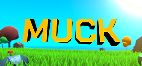
  • Genre Clarity: 5/10 — Ambiguous casual vs action tone. The bright, cartoony aesthetic with cute mushrooms, grass, and simple geometry suggests a cozy building or farming game rather than a survival-roguelike. At tiny size, the whimsical environment reads as family-friendly or casual puzzle rather than action-adventure survival. The visual language does not communicate resource scarcity, danger, or roguelike progression mechanics.
  • Title Readability: 8/10 — Large bold title, excellent contrast. The word 'MUCK' dominates in bright yellow with black outline, creating strong legibility at full size and remaining readable at small and tiny sizes. The thick letterforms and strategic placement on the clear sky background ensure the title never gets lost. However, the outline could be slightly thicker at the tiniest sizes for maximum durability.
  • Contrast & Color: 7/10 — Bright palette with good silhouettes. The cyan sky, lime-green grass, and yellow title create vibrant value separation that stands out against the dark Steam background. The foreground mushroom and simple shapes maintain clear silhouettes even when squinting. The overall brightness and saturation work well, though the mid-tone grass-to-sky transition could be sharper for absolute maximum separation.
  • Uniqueness & Polish: 5/10 — Competent but generic low-poly art. The capsule uses a polished low-poly 3D style that is clean and well-rendered, but this aesthetic is common across many indie games and does not communicate what makes Muck unique. There is no visual hook suggesting survival mechanics, roguelike progression, base-building, or resource management—just a pleasant pastoral scene. The craft is solid but the visual storytelling misses the core gameplay loop.
  • Brand Consistency: 6/10 — Consistent style with limited identity. The low-poly 3D aesthetic and bright color palette are internally cohesive and match the game's visual style seen in store screenshots. However, there are no iconic characters, symbols, or distinctive visual motifs that would make this capsule immediately recognizable as Muck versus any other cute indie game. The brand identity relies on art style alone, which is competent but not memorable.
  • Composition: 6/10 — Balanced layout, weak focal point. The composition is symmetrically balanced with the title centered and the landscape elements distributed evenly. The title has clear hierarchy, but there is no strong visual focal point drawing the eye to a protagonist or key mechanic at small or tiny sizes. The layout is safe and clean, though it lacks the depth layering or dynamic focal point that would elevate it to strong composition.

What works

  • Excellent title legibility. Large yellow 'MUCK' with black outline reads clearly at all sizes and maintains strong contrast against the sky background.
  • Vibrant color palette. Cyan, green, and yellow create good value separation that pops against the dark Steam background without muddy mid-tones.
  • Clean, polished execution. The low-poly 3D rendering is professional and free of artifacts or visual noise that would hurt scrolling clarity.

What hurts the capsule

  • Genre mismatch with visuals. The cute, peaceful aesthetic contradicts the survival-roguelike mechanics and does not communicate the core gameplay loop or tension.
  • No memorable brand identity. The capsule lacks an iconic character, symbol, or distinctive visual hook that would make Muck stand out from other indie games using similar low-poly art.
  • Weak focal point at small sizes. At tiny size, the distributed landscape elements and centered title offer no single clear subject that guides the eye or communicates unique gameplay.

Priority fixes

  1. [genre_clarity] Introduce a survival or roguelike visual cue—such as a character facing danger, darker environment, resource UI elements, or a threatening creature—to signal the action-survival tone rather than casual cozy game.
  2. [uniqueness_polish] Add a protagonist or distinctive character to the scene that becomes iconic and recognizable, creating a visual anchor that differentiates Muck from generic low-poly games.
  3. [composition] Create a stronger focal point by positioning a key character or mechanic element in the foreground at small/tiny sizes, layering depth more deliberately to guide attention.

Store copy priority fixes

  1. [uniqueness] Replace '& Much More!' with 2–3 concrete, differentiating features specific to Muck (e.g., 'Unlock permanent upgrades across runs' or 'Dynamic weather affects survival mechanics') to explain why this game stands out in a crowded genre.
  2. [feature_communication] Expand the Features section with 1–2 specific gameplay examples: instead of just 'Crafting,' write 'Craft and upgrade 50+ tools and weapons' or 'Build defensible bases with trap systems to survive waves of enemies.'
  3. [hook_strength] Strengthen the opening line by adding a unique survival twist: e.g., 'Muck is a survival-roguelike where each run you build permanent upgrades—escape the island or perish trying.'

Related guides

Steam app ID: 1625450 · Tags: Survival, Multiplayer, Crafting, Building, Roguelike