Scoring genre clarity...

The Plucky Squire capsule

The Plucky Squire

Storybook characters discover a three-dimensional world outside the pages of their book and must jump between 2D & 3D realms to save their friends in this charming action-adventure.

$9.89Very Positive(57)
Adventure3D PlatformerAction-Adventure
All Possible FuturesSep 17, 2024

The Plucky Squire scores 83/100 — better than 97% of Adventure capsules (n=8,134).

Very Positive (57 reviews) · $9.89 · Released Sep 17, 2024 · By All Possible Futures

Quick text summary

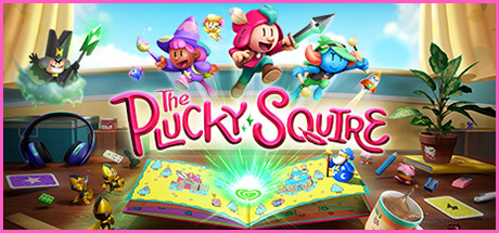
The Plucky Squire scored 83/100 on Steam Analyzer — Good for a Adventure capsule. Top priority fix: [composition] Simplify or push back foreground desktop props like headphones and small figures so they don't compete with the storybook focal point at small sizes

Capsule scores by dimension

  • Genre Clarity: 8/10 — Charming action adventure storybook. The open storybook centerpiece combined with jumping, action-posed characters immediately signals a whimsical adventure game with a storybook or fairy-tale hook. The 2D-to-3D mechanic is subtly implied by characters leaping out of the book into three-dimensional space. At tiny size the action poses and bright storybook read clearly as a lighthearted action-adventure, though the specific 2D/3D mechanic nuance is lost.
  • Title Readability: 8/10 — Legible bubbly logo at most sizes. The pink rounded bubbly script title 'The Plucky Squire' sits against a warm, lighter sky region in the mid-image area, giving decent contrast. At full size the letterforms are clear and personality-rich. At tiny size the word 'Plucky Squire' remains recognizable due to the bold thick strokes and consistent stroke weight, though 'The' becomes harder to parse as a separate word.
  • Contrast & Color: 8/10 — Warm bright palette pops on dark Steam. The warm golden-yellow background, bright sky blues, and vivid character colors create strong separation from Steam's dark #1b2838 background. Character silhouettes are distinct with saturated clothing colors against the lighter background. In grayscale the storybook glowing center and the lighter sky provide strong value contrast, though the rightmost blue character blends slightly into the blue sky at tiny size.
  • Uniqueness & Polish: 9/10 — Distinctive storybook concept, premium craft. The real-world desktop environment — headphones, coffee cup, plant, dice — surrounding an open glowing storybook is a genuinely distinctive and communicative visual hook that immediately differentiates this title from generic adventure capsules. Character designs are polished, expressive, and consistent with high-budget indie production quality. The concept-driven composition is memorable and communicates a unique selling point directly, elevating it well above genre norms.
  • Brand Consistency: 9/10 — Coherent storybook identity, strong palette. The warm pastel palette, rounded 3D character style, and storybook motif create a cohesive and recognizable visual identity that would carry across marketing materials. The pink bubbly logo with sparkle accents reinforces the whimsical brand tone. The desktop-meets-fantasy visual language is distinctive enough to serve as a recognizable brand signature across screenshots and thumbnails.
  • Composition: 8/10 — Strong focal hierarchy, slight crowd density. The glowing open storybook serves as a clear compositional anchor in the lower center, with the title placed prominently in the mid-section and four action characters forming a dynamic arc above. The layered depth — desktop foreground objects, storybook midground, characters and sky background — reads cleanly at full size. At small size the cluster of four jumping characters competes slightly for individual attention, and the foreground desktop items (headphones, yellow figures) introduce visual noise that reduces clarity at tiny size.

What works

  • Unique high-concept visual hook. The real-world desktop surrounding the storybook immediately communicates the game's core 2D/3D mechanic in a single glance.
  • Warm saturated palette pops on Steam dark UI. High value contrast between the bright golden-sky background and Steam's dark navy ensures the capsule catches the eye during scrolling.
  • Polished character lineup with clear personality. Four expressive, distinct characters in dynamic poses convey co-op or party-adventure energy without feeling cluttered at full size.
  • Strong layered depth creates visual richness. Background sky, midground storybook, and foreground desktop props create cinematic depth that reads as premium quality.

What hurts the capsule

  • Foreground clutter reduces tiny-size clarity. The headphones, small yellow figures, and coffee cup in the foreground corners add noise that competes with focal elements at tiny size.
  • Rightmost character blends into blue sky. The blue-toned character at far right loses silhouette definition against the similarly blue sky region, especially in grayscale or at small sizes.
  • Four-character cluster competes at small size. With four jumping characters of near-equal visual weight, no single hero character dominates, weakening the focal hierarchy at small capsule sizes.
  • The word 'The' in title risks being missed at tiny size. The smaller script rendering of 'The' above the main logo can be lost at tiny thumbnail resolution, potentially confusing the brand name.

Priority fixes

  1. [composition] Simplify or push back foreground desktop props like headphones and small figures so they don't compete with the storybook focal point at small sizes
  2. [contrast_color] Add a subtle dark outline or rim light to the rightmost blue character to separate its silhouette from the blue sky background in grayscale and at tiny size
  3. [composition] Elevate one character as a clear primary hero by making them slightly larger or more central to improve focal hierarchy at small capsule sizes
  4. [title_readability] Increase the contrast or weight of 'The' in the logo so the full title name reads as one cohesive unit at tiny thumbnail size

Store copy priority fixes

  1. [feature_communication] After 'Jump between 2D and 3D worlds,' add one sentence explaining how this mechanic creates distinct puzzle types or exploration opportunities rather than just listing disparate activities.
  2. [audience_targeting] Add a brief clause signaling difficulty or intended player type, e.g., 'perfect for puzzle-platformer fans of all ages' or 'accessible yet rewarding platforming challenges.'
  3. [uniqueness] Reframe the 2D/3D switching from a gimmick to a core design pillar by stating something like 'reorient levels, solve puzzles, and unlock secrets by shifting between dimensions' to show mechanical depth.

Related guides

Steam app ID: 1627570 · Tags: Adventure, 3D Platformer, Action-Adventure, 2D Platformer, Puzzle Platformer