Scoring genre clarity...
Railway Empire 2 capsule

Railway Empire 2

Don the coat of a clever entrepreneur, take over a small railway company in the early 1800s and turn your steam engines into the workhorses of the economy. Grow your company into the largest railway company of the continent and outsmart your competitors.

$49.99Mostly Positive(19)
SimulationStrategyTrains
Gaming Minds StudiosMay 25, 2023

Railway Empire 2 scores 87/100 — better than 97% of Simulation capsules (n=6,442).

Mostly Positive (19 reviews) · $49.99 · Released May 25, 2023 · By Gaming Minds Studios

Quick text summary

Railway Empire 2 scored 87/100 on Steam Analyzer — Excellent for a Simulation capsule. Top priority fix: [composition] Consider subtle background softening or reduced building detail density to ensure locomotives remain the uncontested focal point at tiny 120x45 size.

Capsule scores by dimension

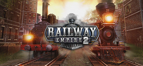
  • Genre Clarity: 9/10 — Strong industrial strategy theme. The dual steam locomotives centered in the frame with industrial Victorian-era architecture, glowing furnaces, and railway tracks unmistakably communicate a railway/industrial management sim. At tiny size, the iconic train silhouettes and industrial setting remain instantly recognizable as a strategy/simulation game about railway operations.
  • Title Readability: 9/10 — Excellent logo clarity and placement. The 'RAILWAY EMPIRE 2' badge is prominently centered with strong metallic 3D rendering, clean sans-serif letterforms, and dark outline that separates clearly from the bright background. At small and tiny sizes, the logo remains crisp and fully legible due to the strategic placement on the train shield emblem and high contrast treatment.
  • Contrast & Color: 9/10 — Outstanding value separation. Warm golden-orange locomotive lights and furnace glows create powerful value separation against the deep shadowed industrial architecture and steam dark background. The high-contrast lighting dramatically isolates the trains and key focal points, and this separation holds strong even at tiny size with clear silhouettes and no muddy mid-tone blending.
  • Uniqueness & Polish: 8/10 — Polished industrial authenticity. The capsule exhibits premium craftsmanship with detailed period-accurate locomotives, atmospheric volumetric lighting, and cohesive steampunk-industrial aesthetic that feels intentional rather than generic. The visual communicates the core mechanic of railway empire building without feeling like a template, though the composition is somewhat conventional for the genre.
  • Brand Consistency: 8/10 — Strong Victorian industrial identity. The capsule establishes clear brand identity through the signature Victorian-era railway setting, warm industrial color palette dominated by copper and gold tones, and the iconic dual-locomotive focal point that mirrors the '2' sequel positioning. These elements would be recognizable across marketing materials and reinforce the franchise's industrial heritage theme.
  • Composition: 9/10 — Excellent hierarchical balance. The composition creates strong hierarchy with the two locomotives as primary focal points, the badge logo as secondary anchor, and supporting industrial architecture framing the scene. The depth layering from foreground tracks through mid-ground locomotives to background city creates natural reading flow, and critical elements remain well within safe margins and resilient to Steam's crop variations.

What works

  • Iconic railway imagery. The dual steam locomotives are unmistakably recognizable and immediately communicate the game's core theme even at thumbnail size.
  • Premium lighting treatment. Warm golden furnace glows and atmospheric volumetric effects create visual depth and cinematic quality that elevates the capsule above generic strategy game presentations.
  • Clear visual hierarchy. The logo badge, locomotives, and supporting architecture are well-prioritized with no competing focal points, ensuring fast parsing during Steam browsing.
  • Strong period authenticity. The Victorian-industrial aesthetic feels intentional and thematic rather than a generic background, reinforcing the franchise identity clearly.

What hurts the capsule

  • Moderate visual busyness. The dense city architecture and multiple steam plumes create some visual clutter that could slightly obscure clarity at very small sizes despite the strong focal points.
  • Limited color palette variation. While the warm orange and gold tones are cohesive, the restricted palette reduces uniqueness compared to top-performing simulator capsules that use more dynamic secondary colors.

Priority fixes

  1. [composition] Consider subtle background softening or reduced building detail density to ensure locomotives remain the uncontested focal point at tiny 120x45 size.
  2. [uniqueness_polish] Introduce a complementary accent color (cool blue or teal) to the industrial scene to enhance visual distinctiveness and reduce reliance on warm tones alone.

Store copy priority fixes

  1. [uniqueness] Add a sentence explaining what Railway Empire 2 improves mechanically or strategically over the original game (e.g., 'Redesigned signal system,' 'AI personality overhaul,' 'Dynamic market changes'), not just visual or map scale upgrades.
  2. [hook_strength] Replace the second instance of 'don the coat of a clever entrepreneur' in the About section with a verb-forward teaser specific to the core challenge (e.g., 'Outmaneuver rivals by connecting untapped markets and racing to monopolize continental trade routes').
  3. [audience_targeting] Explicitly position the difficulty or player skill curve in the short description or opening—clarify whether this is for strategy veterans, sandbox builders, or all skill levels to reduce uncertainty for casual browsers.

Related guides

Steam app ID: 1644320 · Tags: Simulation, Strategy, Trains, Management, Transportation